1

Hey there I am trying to modify the ol list style like in that picture another website is allready dooing. enter image description here

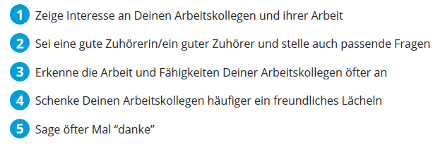
But with another CSS Image instead of the circle like the form (without text) in that picture enter image description here

I tried the following code to rebuild what the other website is dooing, but I have no idea how to change the blue circle into a that green symbol. Can you help me?

 .blog-blau-liste {
    position: relative;
    margin: 0.8em 0px 0px;
    list-style: outside none none;
    counter-reset: big-numba;
    padding-left: 0px;
}

.blog-blau-liste-item {
    position: relative;
    margin: 0.8em 0px 0px 1.9em;
    list-style: outside none none;
}

.blog-blau-liste-item::before {
    content: counter(big-numba, decimal);
    counter-increment: big-numba;
    position: absolute;
    top: -2px;
    font-size: 19px;
    left: -1.9em;
    box-sizing: border-box;
    width: 1.5em;
    height: 1.5em;
    line-height: 1.5;
    color: #FFF;
    background: #009DD9 none repeat scroll 0% 0%;
    font-weight: 600;
    text-align: center;
    border-radius: 50%;
}
    <ol class="blog-blau-liste">
 <li class="blog-blau-liste-item">Punkt Nummer 1</li>
 <li class="blog-blau-liste-item">Punkt Nummer 2</li>
 <li class="blog-blau-liste-item">Punkt Nummer 3</li></ol>

Is there a way to do so and build this green logo (only this kind of circle without text and white line) with css?

I found this code but it is not rounded and I dont know how to integrate that.

#burst-8 {
    background: red;
    width: 80px;
    height: 80px;
    position: relative;
    text-align: center;
    -webkit-transform: rotate(20deg);
       -moz-transform: rotate(20deg);
        -ms-transform: rotate(20deg);
         -o-transform: rotate(20eg);
}
#burst-8:before {
    content: "";
    position: absolute;
    top: 0;
    left: 0;
    height: 80px;
    width: 80px;
    background: red;
    -webkit-transform: rotate(135deg);
       -moz-transform: rotate(135deg);
        -ms-transform: rotate(135deg);
         -o-transform: rotate(135deg);
}
<div id="burst-8">1</div>
Krystian
  • 887
  • 5
  • 21
  • 52

4 Answers4

2

Using ::after and ::before pseudo elements to recreate shape

This approach combines both methods I wrote earlier (see old answers below). The only limitation is that you can only have 8 sides, otherwise you'd need to create extra HTML elements inside each li. This is the cleanest approach IMHO:

.vegan-list {
    list-style: none;
    counter-reset: vegan-list-number;
}

.vegan-list li { position: relative; margin-bottom: 20px;}

.vegan-list li::before, .vegan-list li::after {
  content: '';
  display:inline-block;
  vertical-align: middle;
  height: 50px;
  line-height: 50px;
  width: 50px;
  background: green;
  border-radius: 10px;
  font-size: 2em;
  color: #FFF;
  text-align: center;
}

.vegan-list li::before {
  content: counter(vegan-list-number, decimal);
  counter-increment: vegan-list-number;
  margin-right: 20px;
}

.vegan-list li::after {
  content: '';
  z-index: -1;
  position: absolute;
  left: 0;
  transform: rotate(45deg);
}
<ol class="vegan-list">
  <li>Punkt Nummer 1</li>
  <li>Punkt Nummer 2</li>
  <li>Punkt Nummer 3</li>
</ol>

jsFiddle: https://jsfiddle.net/azizn/Lda7hwkj/

As you can see, the transform is applied to the ::after element so that the number is not affected. Adding z-index: -1 makes sure that ::after does not overlap ::before.


Original Answer:

You can apply the image as a background to each li's ::before pseduo element:

.vegan-list {
    list-style: none;
}

.vegan-list li::before {
  content: '';
  display:inline-block;
  vertical-align: middle;
  height: 50px;
  width: 50px;
  background: url("https://i.stack.imgur.com/qWoRZ.png") no-repeat center;
  background-size: contain;
  margin-right: 10px;
}
<ol class="vegan-list">
  <li>Punkt Nummer 1</li>
  <li>Punkt Nummer 2</li>
  <li>Punkt Nummer 3</li>
</ol>

jsFiddle: https://jsfiddle.net/azizn/ffyrhu7o/


Edit: If you wanted to recreate that shape with pure CSS, you can use border-radius to have the edges rounded/smooth:

body {margin:3em;}

.burst {
  background: green;
  width: 80px;
  height: 80px;
  line-height: 80px;
  font-size: 2em;
  color: #FFF;
  position: relative;
  text-align: center;
  border-radius: 10px;
}

.burst::before, .burst::after {
  content: "";
  position: absolute;
  z-index:-1;
  top: 0; left: 0; bottom: 0; right: 0;
  background: inherit;
  border-radius: inherit;
  transform: rotate(27deg);
}

.burst::after {
  transform: rotate(-30deg);
}
<div class="burst">1</div>

play with it - jsfiddle: https://jsfiddle.net/azizn/r3wtjemr/

Aziz
  • 7,685
  • 3
  • 31
  • 54
0

You could just add this png image before each of your sentences. It won't cost a lot to your page and will be a lot of simpler. You will be able to customize it as you wish. If you want to make it dynamic you can use :

Community
  • 1
  • 1
Paul Leclerc
  • 1,117
  • 1
  • 14
  • 18
0
ol{ 
    list-style-image: url("YourImage.png") 
}
0

    .vegan-list {
        list-style: none;
      counter-reset: section;
    }

    .vegan-list li::before {
       counter-increment: section;
    content: counter(section);
      display:inline-block;
      vertical-align: middle;
      height: 50px;
      width: 50px;
      background: url("https://i.stack.imgur.com/qWoRZ.png") no-repeat center;
      background-size: contain;
       line-height: 50px;
    text-align: center;
    font-size: x-large;
    color: brown;
    }
    <ol class="vegan-list">
      <li>Punkt Nummer 1</li>
      <li>Punkt Nummer 2</li>
      <li>Punkt Nummer 3</li>
    </ol>
Naresh Teli
  • 138
  • 1
  • 12