1

OK so here is my code

<html>
<head>
<style>
.div1{
 height:40px;
 width:40px;
 background-color:red;
 display:block;
 float:left;
} 
.div2{
 height:40px;
 width:40px;
 background-color:green;
 display:block;
 
}
.div3{
 height:40px;
 width:40px;
 background-color:yellow;
 display:block;
}
</style>
</head>

<body>
<div class="div1"></div>
<div class="div2"></div>
<div class="div3"></div>

</body>

</html>

I want my website to look like this: first square is red, next to is green, and below red is yellow square. I thought that float left on first element should make next one jump right next to him. Why doesn't it work?

Rush ThaMan
  • 111
  • 1
  • 2

3 Answers3

4

Add float: left; to .div2 and clear:left to .div3

<html>
<head>
<style>
.div1{
 height:40px;
 width:40px;
 background-color:red;
 display:block;
 float:left;
} 
.div2{
 height:40px;
 width:40px;
 background-color:green;
 display:block;
 float: left;
}
.div3{
 height:40px;
 width:40px;
 background-color:yellow;
 display:block;
    clear: left;
}
</style>
</head>

<body>
<div class="div1"></div>
<div class="div2"></div>
<div class="div3"></div>

</body>

</html>

You need to add float:left to the green box in order to make the element stand next to red. If you added the float:left to the yellow square, it would stand next to green. We added clear: left to "clear" the left floats.

Read more about floats.

Jakub Rożek
  • 2,110
  • 11
  • 12
  • Yea, but why doesn't my work? When i float left first element shouldn't next one come automaticly next to him? – Rush ThaMan May 05 '16 at 20:23
  • No, you have to add float: left to all the elements that should stand next to that element. If you want to get rid of "float" in the next element add `clear: left` (if it was `float: left`) or `clear: right` (if it was a `float: right`). If you mixed floats you can add `clear:both`. – Jakub Rożek May 05 '16 at 20:26
3

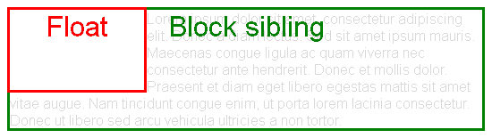
The problem is that floating elements are out-of-flow:

An element is called out of flow if it is floated, absolutely positioned, or is the root element.

Therefore, they don't impact surrounding elements as an in-flow element would.

This is explained in 9.5 Floats:

Since a float is not in the flow, non-positioned block boxes created before and after the float box flow vertically as if the float did not exist. However, the current and subsequent line boxes created next to the float are shortened as necessary to make room for the margin box of the float.

enter image description here

html {
  width: 550px;
  border: 1px solid;
}
body {
  font-family: sans-serif;
  color: rgba(0,0,0,.15);
}
body:after {
  content: '';
  display: block;
  clear: both;
}
div {
  position: relative;
}
div:after {
  font-size: 200%;
  position: absolute;
  left: 0;
  right: 0;
  top: 0;
  text-align: center;
}
.block-sibling {
  border: 3px solid green;
}
.block-sibling:after {
  content: 'Block sibling';
  color: green;
}
.float {
  float: left;
  border: 3px solid red;
  height: 90px;
  width: 150px;
  z-index: 1;
}
.float:after {
  content: 'Float';
  color: red;
}
<div class="float"></div>
<div class="block-sibling">
  Lorem ipsum dolor sit amet, consectetur adipiscing elit. Donec a diam lectus. Sed sit amet ipsum mauris. Maecenas congue ligula ac quam viverra nec consectetur ante hendrerit. Donec et mollis dolor. Praesent et diam eget libero egestas mattis sit amet vitae augue. Nam tincidunt congue enim, ut porta lorem lacinia consectetur. Donec ut libero sed arcu vehicula ultricies a non tortor.
</div>

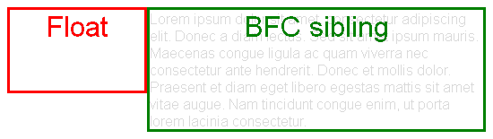
There is an exception to that problematic behavior: if a block element establishes a Block Formatting Context (is a BFC root), then it won't overlap the float:

The border box of a table, a block-level replaced element, or an element in the normal flow that establishes a new block formatting context […] must not overlap the margin box of any floats in the same block formatting context as the element itself.

enter image description here

html {
  width: 550px;
  border: 1px solid;
}
body {
  font-family: sans-serif;
  color: rgba(0,0,0,.15);
}
body:after {
  content: '';
  display: block;
  clear: both;
}
div {
  position: relative;
}
div:after {
  font-size: 200%;
  position: absolute;
  left: 0;
  right: 0;
  top: 0;
  text-align: center;
}
.block-sibling {
  border: 3px solid green;
}
.block-sibling.bfc-root:after {
  content: 'BFC sibling';
  color: green;
}
.float {
  float: left;
  border: 3px solid red;
  height: 90px;
  width: 150px;
  z-index: 1;
}
.float:after {
  content: 'Float';
  color: red;
}
.bfc-root {
  overflow: hidden;
}
<div class="float"></div>
<div class="block-sibling bfc-root">
  Lorem ipsum dolor sit amet, consectetur adipiscing elit. Donec a diam lectus. Sed sit amet ipsum mauris. Maecenas congue ligula ac quam viverra nec consectetur ante hendrerit. Donec et mollis dolor. Praesent et diam eget libero egestas mattis sit amet vitae augue. Nam tincidunt congue enim, ut porta lorem lacinia consectetur.
</div>

For example, you can establish a BFC with overflow different than visible, e.g. hidden

.div2 {
  overflow: hidden;
}

.div1 {
  height: 40px;
  width: 40px;
  background-color: red;
  display: block;
  float: left;
}
.div2 {
  height: 40px;
  width: 40px;
  background-color: green;
  display: block;
  overflow: hidden;
}
.div3 {
  height: 40px;
  width: 40px;
  background-color: yellow;
  display: block;
}
<div class="div1"></div>
<div class="div2"></div>
<div class="div3"></div>
Oriol
  • 274,082
  • 63
  • 437
  • 513
  • See [this other answer](http://stackoverflow.com/a/32301823/1529630) for more information about BFCs and the problems they solve. – Oriol May 05 '16 at 20:28
  • +1 for mentioning the BFC Sibling but I recommend using the display:inline-block in your example. It's easier to understand cause overflow (although it is valid) but just does not make sense in the context. – codedme May 05 '16 at 21:02
  • @codedme `display: inline-block` also establishes a BFC, but I didn't use it because of the ["extra space below" problem](http://stackoverflow.com/q/5804256/1529630), which would need `vertical-align`. – Oriol May 05 '16 at 21:11
0
<html>
<head>
<style>
.div1{
    height:40px;
    width:40px;
    background-color:red;
    display:block;
    float:left;
}   
.div2{
    height:40px;
    width:40px;
    background-color:green;
    display:block;
    float:left;

}
.div3{
    height:40px;
    width:40px;
    background-color:yellow;
    display:block;
    float:left;
    clear: both; 
}
</style>
</head>

<body>
<div class="div1"></div>
<div class="div2"></div>
<div class="div3"></div>

</body>

</html>

This will do what you want, but, there is much to improve in that code to make it more simple and more DRY, this will be a short answer, if you want to see a better and smaller style to do the same just ask, and gladly will help.

  • How to make this simple webpage even more simpler? I mean its just 3 squares – Rush ThaMan May 05 '16 at 20:26
  • Not the page the code, for example if you see the 3 divs have almost the same properties, so if you create a clase square you can add there all your styles as height:40px; width:40px;display:block; float:left; and the for each just add the colours and the clear. As I said before, just a suggestion to have smaller and readable code – Damian Cardozo May 05 '16 at 20:31