Yes, it's possible with CSS. In fact, it's quite easy with flexbox, which is designed for such a task.
* {
padding: 0;
margin: 0;
}
#container {
display: flex; /* establish flex container */
}
#a {
flex: 0 0 150px; /* don't grow, don't shrink, fixed at 150px width */
background-color: red;
}
#b {
flex: 1; /* consume all available free space in the row */
background-color: aqua;
}
#c {
flex: 0 0 40%; /* don't grow, don't shrink, fixed at 40% width */
background-color: yellow;
}
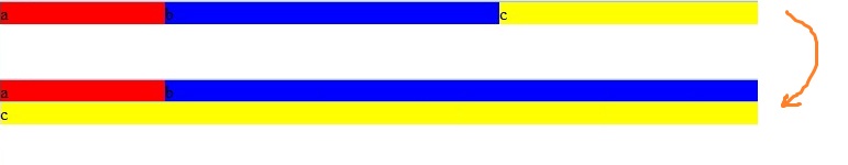
@media (max-width: 600px) {
#container { flex-wrap: wrap; } /* allow flex items to wrap */
#b { flex-basis: calc(100% - 150px); } /* take full width less width of #a */
#c { flex-grow: 1; } /* consumer all available free space in the row */
}
<div id="container"><!-- children ordered chronologically; no need to reverse order -->
  <div id="a">a</div>
  <div id="b">b</div>
  <div id="c">c</div>
</div>
To learn more about flexbox visit:
Benefits of flexbox:
- minimal code; very efficient
- centering, both vertically and horizontally, is simple and easy
- equal height columns are simple and easy
- multiple options for aligning flex elements
- it's responsive
- unlike floats and tables, which offer limited layout capacity because they were never intended for building layouts, flexbox is a modern (CSS3) technique with a broad range of options.
Browser support:
Flexbox is supported by all major browsers, except IE 8 & 9. Some recent browser versions, such as Safari 8 and IE10, require vendor prefixes. For a quick way to add all the prefixes you need, use Autoprefixer. More details in this answer.