I created a website layout using flexbox. Here's my previous question on how to do so: HTML 100% Height with multiple inline scrolling divs
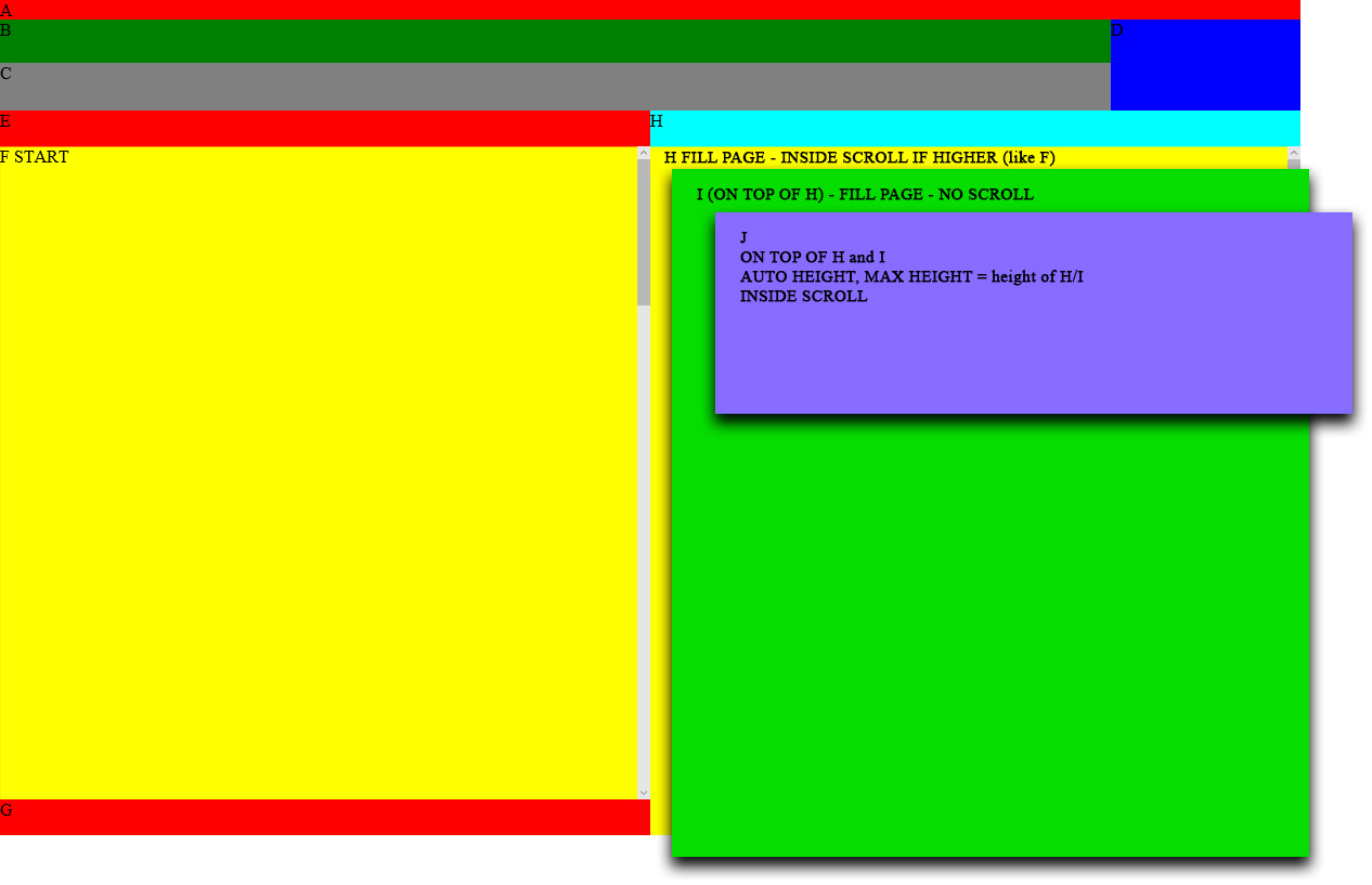
Now I would like to modify the right column (container H): Instead of just one full height scrollable DIV as it is now, I need three layers one above each other, same size and position. Container H should remain the one on the bottom, still taking up all the height and be scrollable. The one in the middle (container I) should fill the page but not be scrollable. The one on top (container J) should be as high as needed, but not exceed the page, and be scrollable if higher.
Any idea on how to do so? I tried making the container relative and the divs absolute, but it totally breaks my layout.
CSS:
html, body {
        height: 100%;
        width: 100%;
    }

    body {
        padding: 0;
        margin: 0;
    }

    main {
        display: flex;
        flex-direction: column;
        flex-wrap: nowrap;
        align-content: stretch;
        align-items: stretch;
        width: 1200px;
        height: 100%;
        margin: 0 auto;
    }

    header {
        display: flex;
        flex-wrap: nowrap;
        min-height: 84px;
        height: 175px;
        max-height: 175px;
        flex: 1 0 auto;
        position: relative;
    }

        header #headerWrapper {
            display: flex;
            flex-direction: column;
            flex: 1 0 auto;
            background-color: magenta;
            overflow: hidden;
        }

            header #headerWrapper nav {
                min-height: 40px;
                height: 40px;
                max-height: 40px;
                background-color: green;
                overflow: hidden;
            }

            header #headerWrapper #toggleFilter {
                display: none;
                position: absolute;
                right: 195px;
                bottom: 0px;
                width: 16px;
                height: 38px;
                background-color: red;
            }

            header #headerWrapper #filterContainer {
                min-height: 44px;
                height: 135px;
                max-height: 135px;
                background-color: gray;
                flex: 1 0 auto;
                overflow: hidden;
            }

        header #clipboardContainer {
            width: 175px;
            height: 175px;
            background-color: blue;
            overflow: hidden;
            -webkit-transition: height 0.2s;
            -moz-transition: height 0.2s;
            -ms-transition: height 0.2s;
            -o-transition: height 0.2s;
            transition: height 0.2s;
        }

    header.filter-collapse #headerWrapper #toggleFilter {
            display: inline-block;
        }

        header.filter-compact {
            height: 84px;
            max-height: 84px;
        }

            header.filter-compact #headerWrapper #filterContainer {
                height: 44px;
                max-height: 44px;
            }

            header.filter-compact #clipboardContainer {
                height: 84px;
            }

                header.filter-compact #clipboardContainer:hover {
                    height: 175px;
                    position: absolute;
                    right: 0px;
                }

    #contentWrapper {
        display: flex;
        flex: 1 1 auto;
        align-content: stretch;
        align-items: stretch;
        overflow: auto;
    }

        #contentWrapper #contentLeftWrapper, #contentWrapper #contentRightWrapper {
            flex: 1 0 50%;
            display: flex;
            flex-direction: column;
        }

        #contentWrapper #contentLeftWrapper #contentLeftContainer, #contentWrapper #contentRightWrapper #contentRightContainer {
            flex: 1 1 auto;
        }

            #contentWrapper #contentLeftWrapper {
                background-color: red;
            }

            #contentWrapper #contentRightWrapper {
                background-color: aqua;
            }

            #contentWrapper #headerLeftContainer, #contentWrapper #headerRightContainer, #contentWrapper #footerLeftContainer {
                min-height: 33px;
                height: 33px;
                max-height: 33px;
            }

            #contentWrapper #contentLeftWrapper #contentLeftContainer, #contentWrapper #contentRightWrapper #contentRightContainer {
                overflow: auto;
            }
HTML:
<main>
    <div style="background: red;">
        A
    </div>

    <header class="filter-compact">
        <div id="headerWrapper">
            <nav>B</nav>
            <span id="toggleFilter"></span>
            <div id="filterContainer">
                C
            </div>
        </div>
        <div id="clipboardContainer">D</div>
    </header>

    <div id="contentWrapper">
        <div id="contentLeftWrapper">
            <div id="headerLeftContainer">E</div>
            <div id="contentLeftContainer" style="background-color: yellow;">
                F                </div>
            <div id="footerLeftContainer">G</div>
        </div>
        <div id="contentRightWrapper">
            <div id="headerRightContainer">H</div>
            <div id="contentRightContainer" style="background-color: yellow;">
                H                </div>
        </div>
    </div>
</main>
Fiddle: https://jsfiddle.net/davidedesantis/mqmgad4w/
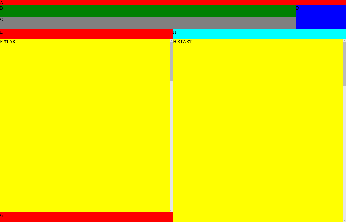
Since it's quite hard to understand, I have included two picture. The first shows how it is now:
And this is what it should look like: