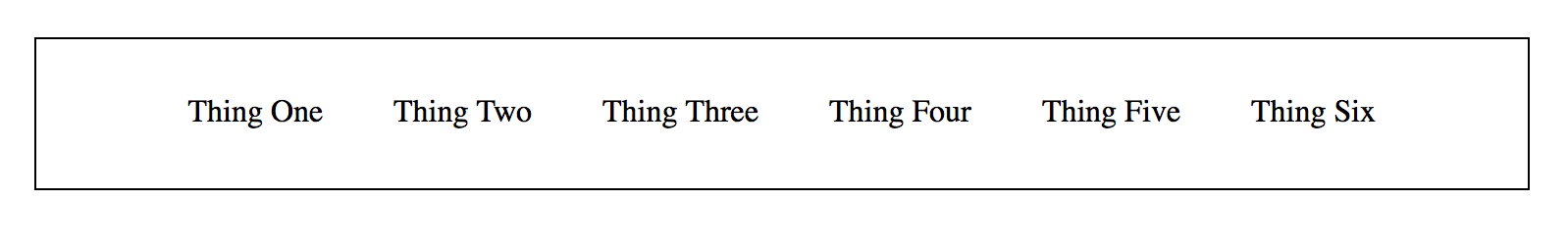
I have a responsive menu, laid out as an unordered list. At larger sizes, it's inline and looks nice:
 But as the window shrinks, it breaks and looks awkward:
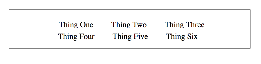
 Ideally, I'd like it to break evenly in half when it overflows, like this:
 Using a
 <wbr> in the list doesn't seem to do anything and I'm out of ideas. This question/solution, which suggests using inline-block, works well for paragraphs but doesn't seem to work with lists.
Here's a CodePen example that demonstrates the breaking issue:
http://codepen.io/anon/pen/xVoLov?editors=1100