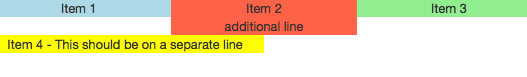
What I have
I have some Bootstrap 3 Grid columns with different heights:
<div class="row">
  <div class="col-xs-4">Item 1</div>
  <div class="col-xs-4">Item 2 <br/> additional line
  </div>
  <div class="col-xs-4">Item 3</div>
  <div class="col-xs-6">Item 4 - This should be on a separate line</div>
</div>
Which looks like this:
What I want
I want to add an additional class (e.g. .row-aligned) to .row to achieve that all abreast "cols" have the same height.
Which should look like this:
My attempt
Because I don't need to support old browsers I can use flexbox. My attempt is quiet easy and works in all browsers but not in Safari (version 9.1, Mac OSX 10.10):
.aligned-row {
  display: flex;
  flex-flow: row wrap;
}
Safari Bug
As I said, Safari cannot handle this flexbox style and the result looks like this:

(I found out that adding margin-left: -1px seems to fix the issue, but it is not a good solution, because it will move everything 1 pixel left which can hide borders or something else.)
My question
Do you have any idea how I can fix this bug in Safari? Or do I use flexbox wrong? Or is there a better solution without using flexbox?