Is it possible to Transpose a HTML table in Mobile/Tablet so we can display all the columns in Mobile as well. Below image is the example what i am trying to achieve.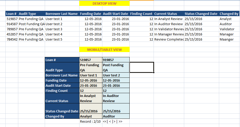
Asked
Active
Viewed 3,919 times
1
Gufran Khan
- 63
- 1
- 7
-
Possible duplicate of [How to invert (transpose) the rows and columns of an HTML table?](http://stackoverflow.com/questions/6297591/how-to-invert-transpose-the-rows-and-columns-of-an-html-table) – Shiran Dror May 26 '16 at 14:13
3 Answers
1
Try to add a class table-responsive to the table tag of your html.
It's a bootstrap class to make tables responsive.
Hardik Jain
- 184
- 8
0
This is all you need. Its great for your need, you will love it.
Check this link - foo table library/plugin : https://css-tricks.com/footable-a-jquery-plugin-for-responsive-data-tables/
Murlidhar Fichadia
- 2,589
- 6
- 43
- 93
-
This is an option but but i do not want to hide any column...as User decision will be based on all the fields. – Gufran Khan May 27 '16 at 11:43
-
Then you can implement this creating a custom table with a pagination. Onclick next you can load new data values with ajax. What is the language you want to implement in? Php – Murlidhar Fichadia May 27 '16 at 22:33
-
nope, i want to do this using AngularJS, and api will be sending JSON array. – Gufran Khan Jun 06 '16 at 13:10
-
@GufranKhan Can you explain what is that you want? responsive foo table in angularJS using json array as table values? – Murlidhar Fichadia Jun 06 '16 at 16:03
-
@GufranKhan its just matter of adding jquery and foo-table css style sheet and then you make tables just like normal html tables with few class names and data attributes. and you deal with json array as you normally do using ng-repeat you loop through data to fill rows of data. – Murlidhar Fichadia Jun 06 '16 at 16:10
-
i want to achieve a responsive table where on mobile view i don't want to hide fields rather i want to transpose table. i will hide rows instead of columns. and using pagination user can view next set of records. – Gufran Khan Jul 21 '16 at 13:05
0
This link will help you need
index.html
<table>
    <thead>
        <tr>
            <th>Code</th>
            <th>Company</th>
            <th class="numeric">Price</th>
            <th class="numeric">Change</th>
            <th class="numeric">Change %</th>
            <th class="numeric">Open</th>
            <th class="numeric">High</th>
            <th class="numeric">Low</th>
            <th class="numeric">Volume</th>
        </tr>
    </thead>
    <tbody>
        <tr>
            <td>AAC</td>
            <td>AUSTRALIAN AGRICULTURAL COMPANY LIMITED.</td>
            <td class="numeric">$1.38</td>
            <td class="numeric">-0.01</td>
            <td class="numeric">-0.36%</td>
            <td class="numeric">$1.39</td>
            <td class="numeric">$1.39</td>
            <td class="numeric">$1.38</td>
            <td class="numeric">9,395</td>
        </tr>
    </tbody>
</table>
css.css
@media only screen and (max-width: 800px) {
    #unseen table td:nth-child(2),
    #unseen table th:nth-child(2) {display: none;}
}

@media only screen and (max-width: 640px) {
    #unseen table td:nth-child(4),
    #unseen table th:nth-child(4),
    #unseen table td:nth-child(7),
    #unseen table th:nth-child(7),
    #unseen table td:nth-child(8),
    #unseen table th:nth-child(8){display: none;}
}
JMF
- 1,083
- 7
- 17