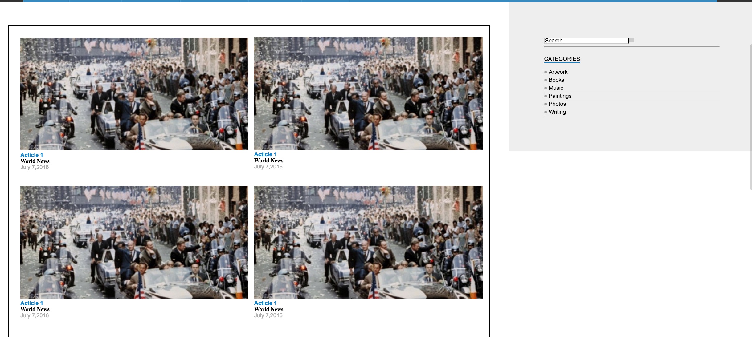
You might use a flex layout to style your page.
Everything on the page could be inside a flex container <div id="flex-outer">
That container holds its content as 3 columns (header, container and footer) using the flex-direction: column; property. With height: 100vh; we make the page fill the screen.
The <div id="container"> is another flex container itself, which holds your content and your sidebar.
This container must fill the vertical space of your page (flex-grow: 1;), to make the footer remains at the bottom and the sidebar have a 100% height. You also probably want your sidebar to maintain its width (flex-shrink: 0;) and the content to fill the rest of the width (flex-grow: 1;).
body {
  margin: 0;
}

#flex-outer {
  height: 100vh;
  display: flex;
  flex-direction: column;
}

header {
  height: 150px;
  background-color: #E6E6E6;
}

#container {
  display: flex;
  background-color: pink;
  flex-grow: 1;
}

.content {
  flex-grow: 1;
}

aside {
  background-color: grey;
  width: 300px;
  flex-shrink: 0;
}

footer {
  background-color: cyan;
  height: 50px;
}
<div id="flex-outer">

 <header>This is the header</header>

 <div id="container">

  <div class="content">
    <p>This is the content</p>
  </div>

  <aside>
    <ul>
      <li>Categories</li>
      <li>Links</li>
      <li>etc...</li>
    </ul>
  </aside>

 </div>

 <footer>This is the footer</footer>

</div>