I'm having a very peculiar problem that I've been trying to solve for the last 2 days to no avail. The page I'm building has the following structure:
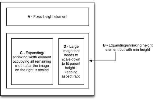
I can easily achieve the A-B layout with the overall parent having display: flex; flex-direction: column; align-items: stretch and setting A to be flex: 0 0 auto and B to be flex: 1 1 0; min-height: 100px;
However I'm having real trouble layout out C and D inside B. I feel like the flex/row is the right approach for B, but I just can't get the specifics. So I'm trying:
.B {
    display: flex;
    flex-direction: row;
    align-items: stretch;
    justify-content: space-between;
}

.C {
    flex: 1 1 0;
}

.D {
    object-fit: scale-down;
}
But clearly this is not sufficient. The image either doesn't scale down at all, scales down but distorted or leaves a lot of space around if I set it to also have flex: 1 1 0 with min width.
Any ideas how I can achieve what I need here?
UPDATE: I tried putting jsfiddle together here - https://jsfiddle.net/2gsrzwwq/3/ - but for some reason it wouldn't even honour height:100% on the parent. As far as the image fitting goes, I need the image to scale down to the height of the D div and then have the D block decrease in width to just contain the scaled down image - and for C block to occupy the remaining width.