5

I'm trying to create the following layout in CSS.

enter image description here

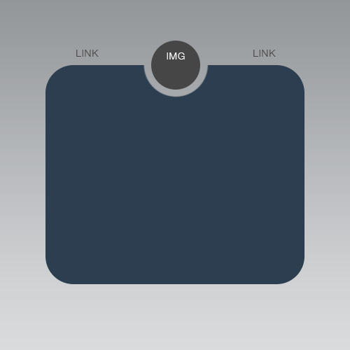
This would usually be easy to do, however because the background is an image (illustrated in my image as a gradient), I can't simply add a absolute positioned div at the top and color the 'cut away'. I've been struggling to work out how to do this for the last few hours.

I've looked up some examples using the ::before and ::after pseudo selectors, however can't work out how do it while keeping the border radius on the main content div (blue).

<div class="content">
<div class="header">
  <a class="left" href="#">LINK 1</a>
  <!--
  Stuck with how to position this so it clips
  <img class="logo" src="https://placehold.it/100x100">
  -->
  <a class="right" href="#">LINK 2</a>
</div>

<p>Some text content</p>

.content {
  position: fixed;
  top: 50%;
  left: 50%;
  transform: translate(-50%, -50%);
  border-radius: 20px;
  background-color: blue;
  height: 300px;
  width: 400px;
  padding: 20px;
}

.header {
  position: relative;
  top: -50px;
  padding: 0 20px;
}

.header .right {
  float: right;
}

Demo: http://jsbin.com/saxunecidu/1/edit?html,css,output

Benedict Lewis
  • 2,733
  • 7
  • 37
  • 78
  • The div-to-cut does have some background color? Couldn't it be not color but an image of this shape? – nicael Jun 05 '16 at 17:52
  • That's not possible with current CSS. The only way I could think of would be to have a second circle behind the "IMG" circle. And that background circle would use a `background-image` that is the same as the main background image. Then you would need to position the circle's background image exactly at the same spot as the main background, so that they exactly match and the background circle becomes "invisible" (indistinguishable from the real background image). – C14L Jun 05 '16 at 17:54
  • See http://caniuse.com/#search=clip-path and my (fairly old) answer http://stackoverflow.com/questions/14717432/making-part-of-a-div-transparent/14717531#14717531. Some of the other answers show a radial gradient option, although the edges look pretty choppy in Chrome 51. – Tim M. Jun 05 '16 at 18:00
  • @DavidThomas Added – Benedict Lewis Jun 05 '16 at 18:14
  • 1
    Also related - http://stackoverflow.com/questions/36913730/css-cut-out-circle-from-a-rectangular-shape/36914106#36914106 – Paulie_D Jun 05 '16 at 18:53
  • Indeed that is much likely a duplicate ( http://stackoverflow.com/questions/36913730/css-cut-out-circle-from-a-rectangular-shape/36914106) , you should update the duplicate link ;) @Paulie_D but still doesnt answer to the links position ... – G-Cyrillus Jun 05 '16 at 21:05

2 Answers2

4

Radial gradient for rescue!

#test{
  padding:10px;
  background:rgb(100,100,240);
  color:white;
  font-size:25px;
  -webkit-mask-image: radial-gradient(circle at top, transparent 30px, black 31px);
  border-radius:15px;
  width:600px;
  height:150px;
  margin:10px;
}
body{
  background: radial-gradient(lightgrey,black);//just an example gradient
}
<div id="test">Something there</div>
nicael
  • 18,550
  • 13
  • 57
  • 90
1

You may use a pseudo and a hudge box shadow to paint background-color and cut off a curve.

For the nav on top, flex can easily do it.

.cut {
  margin: 1em auto 1em;
  padding :40px 1em 1em;
  color:white;
  height: 75vh;
  /* demo purpose */
  width: 70vw;
  /*demo purpose */
  border-radius: 1em;
  overflow: hidden;
  position:relative;
}
.cut:before {
  content:'';
  width:80px;
  border-radius:50%;
  height:80px;
  display:block;
  margin:-80px auto 0;
  box-shadow:0 0 0 3000px #2D3E50
}
.rd {
  display: flex;
  /* demo purpose */
  width: 70vw;
  margin: 1em auto -45px;;
  border-radius: 50%;
}
.rd img {
  margin :0 auto ;
  flex-shrink:0;
  border-radius:50%;
}
.rd a {
  margin: 0 auto auto; /* put links at top */
}
body {
 background:linear-gradient(to top, #ccc,#999);
<nav class="rd"><a href >link</a> <img src="http://dummyimage.com/60x60/464646/&text=image" /><a href >link</a>
</nav>

<div class="cut">
content in here to set away from curve
</div>
G-Cyrillus
  • 101,410
  • 14
  • 105
  • 129