I am trying whole the time to align button center within "col-md-12" But I don't have solution for responsive design. This solution must be placed by button
#player-list-button {
    width: 200px;
    margin-left: auto;
    margin-right: auto;
}
This solution is good, but not for responsive. That means, when I resize browser smaller, this button stay not in the middle of col-md-12, it disappears. Must be placed by col-md-12
#notResponsitiv{
    margin-lef:34%;
}
Sorry, here is my code. My DropDown Buttom i wanna align center.
<div class="col-md-12">
    <div class="collapse navbar-collapse" id="myNavbar">
        <ul class="nav navbar-nav">
            <li class="dropdown">
                <button type="button" id="player-list-button" class="btn btn-primary btn-main-style" data-toggle="dropdown">MyItems<span class="caret"></span></button>
                <ul class="dropdown-menu">
                    <li>item</li>
                    <li>item</li>
                    <li>item</li>
                </ul>
            </li>
        </ul>
    </div>
</div>
Version 3 Sadly it does not works.
#player-list-button {
    margin: 0 auto;
    display: block;
    text-align: center;
}
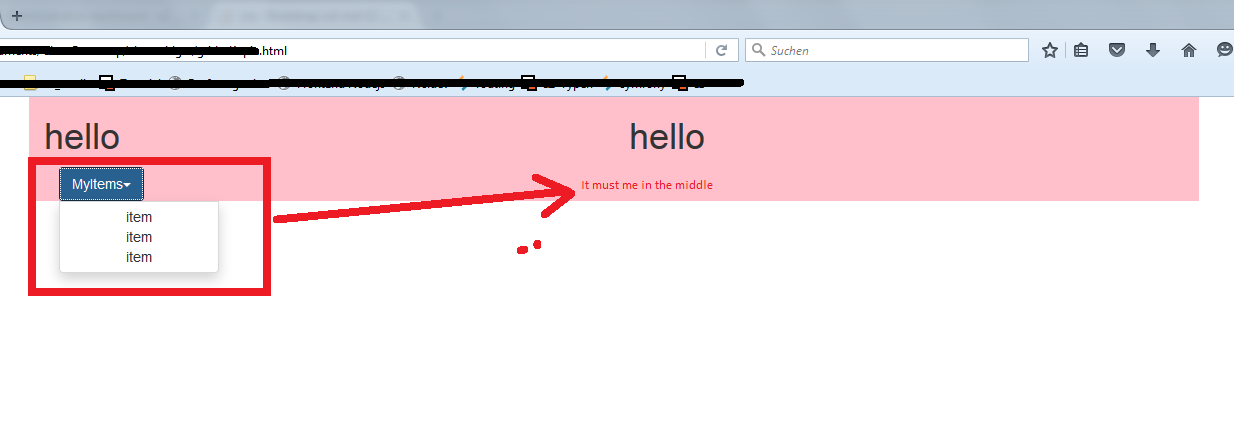
When i use 2 rows, like in following html, the button is on the left side by desktop and if i resize the window, button will disappear:
<div class="container">
   <div class="row">
        <div class="col-md-6" style="background-color:pink">
            <h1>hello</h1>
        </div>
        <div class="col-md-6" style="background-color:pink">
            <h1>hello</h1>
        </div>
    </div>
    <div class="row">
        <div class="col-md-12" style="background-color:pink">
            <div class="collapse navbar-collapse" id="myNavbar">
                <ul class="nav navbar-nav">
                    <li class="dropdown">
                        <button type="button" id="player-list-button" class="btn btn-primary btn-main-style" data-toggle="dropdown">MyItems<span class="caret"></span></button>
                        <ul class="dropdown-menu">
                            <li>item</li>
                            <li>item</li>
                            <li>item</li>
                        </ul>
                    </li>
                </ul>
            </div>
        </div>
  </div>
</div>
Version 4