17

I would like my table to be 100% width, and for each column of the table to only take up the space it needs. If it overflows, then an ellipsis will appear.

Without Table-Layout: Fixed;

html, body {
   margin: 0;
   padding: 0;
   font-family: sans-serif; */
}

.account-products-container .table {
   width: 100%;
   max-width: 100%;
   margin: 20px 0;
   border-collapse: collapse;
   border-spacing: 0;
   display: table;
   table-layout: auto;
}

.account-products-container .table-striped>tbody>tr:nth-of-type(odd) {
   background-color: #eee;
}

.account-products-container .table>thead>tr>th {
   padding: 8px;
   line-height: 1.428571429;
   font-weight: 600;
   text-transform: uppercase;
   vertical-align: bottom;
   border-bottom: 1px solid #DDD;
   text-align: left;
}

.account-products-container .table>tbody>tr>td {
   padding: 8px;
   line-height: 1.428571429;
   vertical-align: top;
   border-top: 1px solid #DDD;
   overflow: hidden;
   text-overflow: ellipsis;
   white-space: nowrap;
   cursor: pointer;
}
<div class="account-products-container">
  <table class="table table-striped">
   <thead>
     <tr>
       <th>ID</th>
       <th>Product</th>
     </tr>
   </thead>
   <tbody>
     <tr>
       <td>123456789</td>
       <td>This is the name of a product that is long</td>
     </tr>
     <tr>
       <td>549490309</td>
       <td>This is a product title that is even longer than the first one and longer than the second one because the second one is short, so of course it's longer.</td>
     </tr>
     <tr>
       <td>005948333</td>
       <td>This one is short</td>
     </tr>
   </tbody>
 </table>
</div>

This is how I want the column's to look, but without table-layout: fixed;, the table overflows instead of resizing due to the white-space: nowrap;.

enter image description here

With Table-Layout: Fixed;

html, body {
   margin: 0;
   padding: 0;
   font-family: sans-serif; */
}

.account-products-container .table {
   width: 100%;
   max-width: 100%;
   margin: 20px 0;
   border-collapse: collapse;
   border-spacing: 0;
   display: table;
   table-layout: fixed;
}

.account-products-container .table-striped>tbody>tr:nth-of-type(odd) {
   background-color: #eee;
}

.account-products-container .table>thead>tr>th {
   padding: 8px;
   line-height: 1.428571429;
   font-weight: 600;
   text-transform: uppercase;
   vertical-align: bottom;
   border-bottom: 1px solid #DDD;
   text-align: left;
}

.account-products-container .table>tbody>tr>td {
   padding: 8px;
   line-height: 1.428571429;
   vertical-align: top;
   border-top: 1px solid #DDD;
   overflow: hidden;
   text-overflow: ellipsis;
   white-space: nowrap;
   cursor: pointer;
}
<div class="account-products-container">
  <table class="table table-striped">
   <thead>
     <tr>
       <th>ID</th>
       <th>Product</th>
     </tr>
   </thead>
   <tbody>
     <tr>
       <td>123456789</td>
       <td>This is the name of a product that is long</td>
     </tr>
     <tr>
       <td>549490309</td>
       <td>This is a product title that is even longer than the first one and longer than the second one because the second one is short, so of course it's longer.</td>
     </tr>
     <tr>
       <td>005948333</td>
       <td>This one is short</td>
     </tr>
   </tbody>
 </table>
</div>

This responds well, and has the ellipsis, but my column's no longer take up the minimal space.

enter image description here

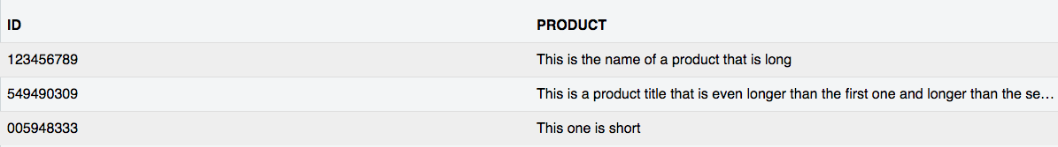
How can I make the column's only take up the space they need, while having my table respond well?

If you want to play around with it: JSFiddle

Hunter Turner
  • 6,804
  • 11
  • 41
  • 56
  • Basically you want the first one to have the ellipsis like the second one? – Cave Johnson Jun 07 '16 at 17:47
  • The answer to [this question](https://stackoverflow.com/questions/9789723/css-text-overflow-in-a-table-cell) suggests using `max-width:0`. I tried in in your fiddle and it looks like it works. See: https://jsfiddle.net/knf913xL/ – Cave Johnson Jun 07 '16 at 17:52
  • I want the ellipsis to show if it's too long, yes. But I don't want the large space between the different column's. I want each column to take up the width of it's largest `` and no more (like my first example), while also having the whole table resize instead of overflowing (like my second example). – Hunter Turner Jun 07 '16 at 17:52
  • 1
    Sorry, actually that didn't work. The columns aren't the right size. – Cave Johnson Jun 07 '16 at 17:53

1 Answers1

15

You can

  • Use auto layout in order to take content into account
  • Set the width of the table to 100%. It will be treated as a minimum width.
  • Set the width of the second column to 100%. Then it will grow taking all available space, if any.
  • To prevent the second column from growing more due to the contents, wrap them inside absolutely positioned containers.

html, body {
  margin: 0;
  padding: 0;
  font-family: sans-serif; */
}

.account-products-container .table {
  width: 100%;
  max-width: 100%;
  margin: 20px 0;
  border-collapse: collapse;
  border-spacing: 0;
  display: table;
  table-layout: auto;
}

.account-products-container .table-striped>tbody>tr:nth-of-type(odd) {
  background-color: #eee;
}

.account-products-container .table>thead>tr>th {
  padding: 8px;
  line-height: 1.428571429;
  font-weight: 600;
  text-transform: uppercase;
  vertical-align: bottom;
  border-bottom: 1px solid #DDD;
  text-align: left;
}

.account-products-container .table>tbody>tr>td {
  padding: 8px;
  line-height: 1.428571429;
  vertical-align: top;
  border-top: 1px solid #DDD;
  cursor: pointer;
  white-space: nowrap;
}
td:nth-child(2) {
  width: 100%;
  position: relative;
}
td:nth-child(2):not(:empty)::after {
  /* Prevent row from collapsing vertically if the first column is empty */
  content: '';
  display: inline-block;
}
td:nth-child(2) > span {
  position: absolute;
  left: 0;
  right: 0;
  overflow: hidden;
  text-overflow: ellipsis;
}
<div class="account-products-container">
  <table class="table table-striped">
   <thead>
     <tr>
       <th>ID</th>
       <th>Product</th>
     </tr>
   </thead>
   <tbody>
     <tr>
       <td>123456789</td>
       <td><span>This is the name of a product that is long</span></td>
     </tr>
     <tr>
       <td>549490309</td>
       <td><span>This is a product title that is even longer than the first one and longer than the second one because the second one is short, so of course it's longer.</span></td>
     </tr>
     <tr>
       <td>005948333</td>
       <td><span>This one is short</span></td>
     </tr>
   </tbody>
 </table>
</div>
Oriol
  • 274,082
  • 63
  • 437
  • 513
  • In your code sample, the column is still much wider than its content. Your code snippet looks just like my second example. https://jsfiddle.net/b38vcwzL/ – Hunter Turner Jun 07 '16 at 18:00
  • @HunterTurner Chrome needs `width: 100%` on the second column. – Oriol Jun 07 '16 at 18:18
  • 4
    Nice take. Unfortunately this doesn't work for 3 cells where the first cell should be minimum and the other two should split the remaining space equally. – Robin Wieruch Oct 08 '20 at 08:12