You can install ggplot2 in your solution in the Visual Studio extension Open R (https://www.visualstudio.com/en-us/features/rtvs-vs.aspx) through this line of code and visualize it within the R Plot window in Visual Studio after creating your R-project:
install.packages('ggplot2', dep = TRUE)

library(ggplot2)
The reason I have «library(ggplot2)» is to check if the package got successfully installed, else you would get an error like this: Error in library(ggplot2) : there is no package called ‘ggplot2’
So if you don’t get that error; you should be good to go.
For your question about how to output charts; you simply have to populate the ggplot2 charts from a datasource, like in my example below (csv-file):
dataset1 <- read.csv("Adult Census Income Binary Classification dataset.csv", header = TRUE, sep = ",", quote = "", fill = TRUE, comment.char = "")
head(dataset1)
install.packages('ggplot2', dep = TRUE)
library(ggplot2)
names(dataset1) <- sub(pattern = ',', replacement = '.', x = names(dataset1))
foo = qplot(age, data = dataset1, geom = "histogram", fill = income, position = "dodge");
print(foo)
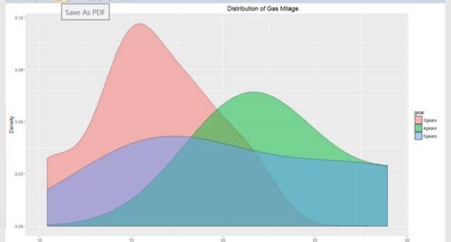
bar = qplot(age, data = dataset1, geom = "density", alpha = 1, fill = income);
print(bar)
Here you can see that I create two charts, one histogram and one density-chart.

In Azure ML, the same charts (this time I included a histogram for Relationships as well), would look like this:
// Map 1-based optional input ports to variables

dataset1 <- maml.mapInputPort(1) # class: data.frame

library(ggplot2)

library(data.table)

names(dataset1) <- sub(pattern=',', replacement='.', x=names(dataset1))

// This time we need to specify the X to be sex; which we didn’t need in Visual Studio

foo = qplot(x=sex, data=dataset1, geom="histogram", fill=income, position="dodge");

print(foo)

foo = qplot(x=relationship, data=dataset1, geom="histogram", fill=income, position="dodge");

print(foo)

foo = qplot(x=age, data=dataset1, geom="density", alpha=0.5, fill=income);

print(foo)

// Select data.frame to be sent to the output Dataset port maml.mapOutputPort("dataset1");
Remember to put all of this in a “Execute R Script module” in order to run it correctly. After that, you can right lick the module and visualize the result.

