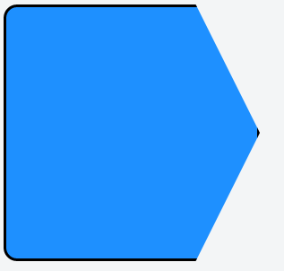
The border property goes around the outside of an element, and the clip-path property applies a mask to an element. So, as far as other CSS rules are concerned, you're still dealing with a rectangle. Because of this, you can't simply apply a border.
It's not impossible to get very close to the effect you want, however. Using (and abusing) CSS pseudo-elements, borders, and filters you can create the same shape plus an outline with only a single HTML div.
div {
  position: relative;
  width: 210px;
  height: 280px;
  background: #1e90ff;
  border-bottom-left-radius: 15px;
  border-top-left-radius: 15px;
  filter:
    drop-shadow( 0px  3px 0 black)
    drop-shadow( 0px -3px 0 black)
    drop-shadow( 3px  0px 0 black)
    drop-shadow(-3px  0px 0 black);
  -webkit-filter:
    drop-shadow( 0px  3px 0 black)
    drop-shadow( 0px -3px 0 black)
    drop-shadow( 3px  0px 0 black)
    drop-shadow(-3px  0px 0 black);
}
div::after {
  position: absolute;
  display: block;
  content: '';
  width: 0;
  height: 0;
  left: 210px;
  top: 0;
  border-left: 70px solid #1e90ff;
  border-right: 70px solid transparent;
  border-top: 140px solid transparent;
  border-bottom: 140px solid transparent;
}
<div>
</div>
So, what's going on here?
The main div element is just the rectangular portion of the shape (with rounded top-left and bottom-left corners). It also has an ::after pseudo-element which creates the triangle shape. The triangle shape is done using the CSS border-triangle hack.
Okay, so that creates the shape without having to mask off any of the element, but a border still can't be applied directly, since I've already (ab)used the border to create the triangle. Using a CSS outline or box-shadow would be the next logical choice, but both properties go all the way around the element's bounding-box... ignoring features like rounded corners or hacky transparent borders.
Enter the CSS filter property. This provides a family of post-processing filters. The important thing to note is that they treat the element as a transparency mask when being applied, rather than respecting the element's bounding-box... and there is a drop-shadow filter!
Unfortunately, it's not quite as flexible as the box-shadow property in that it doesn't have a "spread" parameter which can be used to create solid shapes that are larger than the element. To get around this, we need to cast a drop-shadow in every direction: up, down, right, and left. That's where this monstrosity comes in:
filter:
  drop-shadow( 0px  3px 0 black)
  drop-shadow( 0px -3px 0 black)
  drop-shadow( 3px  0px 0 black)
  drop-shadow(-3px  0px 0 black);
Ta-da!
Expanding on this: this works on any shape you can manage to create (as long as it done without clipping). Just apply a drop-shadow filter to the element, or to a parent/wrapper div (if it's a multi-element shape) to get a border.