These answers helped me a lot in getting to my final result. Thank you.
So I figured I would share it. Seeing the colour of my text is light, I needed a darker "border" at the top to make it pop.
Also while 'ems' are harder to work with (as opposed to px), I found that the transition of colours for the text-shadow looks a lot smoother as I wanted to make it a gradient as well :)
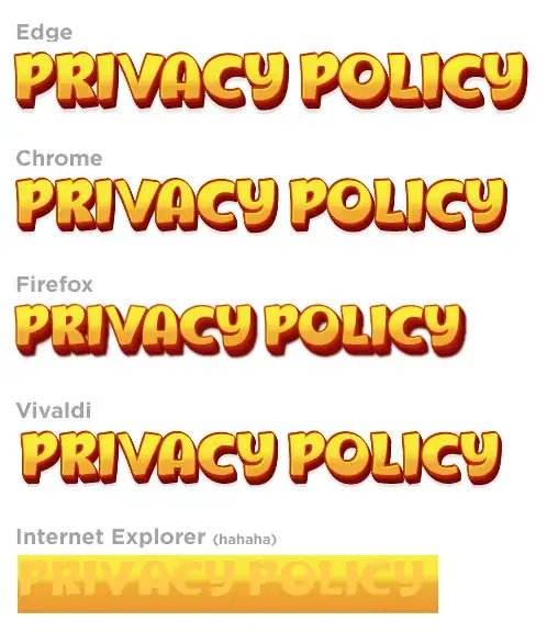
Works on Edge, Chrome, Vivaldi and FireFox, a little blurry though.
    <h1 class="text3d">Privacy Policy</h1>

      .text-3d{
      background-image:linear-gradient(to bottom,#f7eb3b 30%,#f5d839 40%,#eead34 50%, #eb9531 100%);
      -webkit-background-clip: text;
      -webkit-text-fill-color: transparent;
      filter:
        drop-shadow(-0.015em -0.015em 0 #ffff00)
        drop-shadow(-0.015em -0.015em 0 #bf290c)
        drop-shadow(0 -0.005em 0 #bf290c)
        drop-shadow(0.010em 0.025em 0 #bf290c)
        drop-shadow(0.015em 0.030em 0 #b6240b)
        drop-shadow(0.020em 0.035em 0 #a91d0b)
        drop-shadow(0.025em 0.040em 0 #8d0d09)
        drop-shadow(0.030em 0.045em 0 #830708)
        drop-shadow(0.035em 0.050em 0 #680a07)
        drop-shadow(0.01em 0.08em 0.01em rgba(0,0,0,0.10))
    }
