15

I would like to use a custom image in an input-group instead of a Bootstrap glyphicon without padding bottom (my image touch the bottom of the button), as you can see on this picture:enter image description here


Actually, I use Bootstrap's glyphicon glyphicon-search:

<div class="input-group">
      <input type="text" class="form-control" placeholder="Rechercher un produit, une référence ..."/>
      <span class="input-group-addon">
        <span aria-hidden="true" class="glyphicon glyphicon-search"></span>
        <span class="hidden-xs text-upper-style">
          Rechercher</span>
      </span>
</div>

enter image description here

My issue is that I fail to replace glyphicon by my picture in my search bar.

I've tried to create CSS to mimic those of Bootstrap, but it always render bad:


CSS

.glyphi {
    position: relative;
    top: 1px;
    display: inline-block;
    font-style: normal;
    font-weight: normal;
    line-height: 1;
    float: left;
    display: block;
}
.glyphi.search {
    background: url(../img/header/search.png);
    background-size: cover; 
}
.glyphi.normal { 
    width: 28px; //But Bootstrap glyphicon is 16x16...
    height: 16px;
}

HTML

<span class="glyphicon glyphicon-search"></span>

Note that my image is not square (60x37 px).

Here is the picture that should replace the glyphicon:

enter image description here

What is the best Bootstrap way to do that? Here is a Bootply of my code.

Thanks! :)

Mistalis
  • 17,793
  • 13
  • 73
  • 97

8 Answers8

8

You can use simple img inside .input-group-addon instead of span.glyphicon and with some negative margins you can get the result you want.

HTML

<div class="input-group">
   <input type="text" class="form-control" placeholder="Rechercher un produit, une référence ...">      
   <span class="input-group-addon">
       <img src="https://i.stack.imgur.com/vr0uy.png">
       <span class="hidden-xs text-upper-style">Rechercher</span>
   </span>      
</div>

CSS

.rechercheProduit .input-group-addon img{
  height: 24px;
  margin-right: -16px;
  margin-bottom: -6px;
  vertical-align:text-bottom; /* align the text */
}

Updated Bootply

Mistalis
  • 17,793
  • 13
  • 73
  • 97
tmg
  • 19,895
  • 5
  • 72
  • 76
5

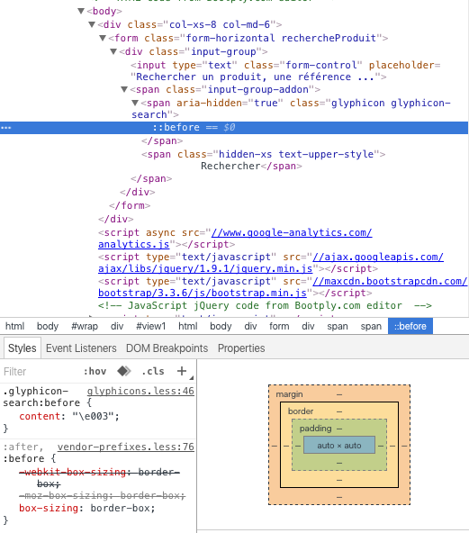
You should have a look on how the glyphicon span works: If you inspect it, you will see that the interesting part in this span is actually its pseudo-element, the :before that calls a font of icons as a content.

Screenshot of the Glyphicon span behaviour in the DOM


A few solutions are actually possible to resolve your problem.

Override

  1. One of the solution would be to override that pseudo element by redeclaring its content:

    .rechercheProduit .input-group-addon {
      /* Declaring the parent as relative so the .glyphicon-search child span 
         as a position absolute to its parent.. 
         That probably doesn't make any sense. */
      position: relative;
    }
    .rechercheProduit .glyphicon-search {
      /* 'absolute' in the .input-group-addon context */
      position: absolute; 
      top: auto;
      bottom: 0;
      left: 5px;
      height: 80%;
      width: auto; 
      overflow: hidden;
    }
      .rechercheProduit .glyphicon-search:before {
        content: '';
        display: block;
        width: 50px; /* Generic width */
        height: 100%;
        background: url('https://i.stack.imgur.com/vr0uy.png') no-repeat;
        background-size: auto 100%;
      }
    .rechercheProduit .text-upper-style {
      /* relative to its context. Especially here to deal with the display order. */
      position: relative;
      margin-left: 20px;
    } 
    

    Demo 1


Custom span

  1. Another solution, which would probably be better, would be to actually create your own span with your own pseudo-element (CSS is similar to the last example, renaming the .glyphicon-search part obviously):

    <span class="input-group-addon">
      <span class="search-icon"></span>
      <span class="hidden-xs text-upper-style">
      Rechercher</span>
    </span>
    

    Demo 2


Image

  1. Even if I personally prefer having the icon as a background image here (have a look on this question and its answers), declaring the icon as an image is another solution that works.

    c.f. the answer of tmg about that.


About the rest

To go beyond with your code, you should think about the fact that you are working in a form with an input[type="text"] as main input.

You’ll have to submit this form and unless you deal with a click event on this main span to submit your form, you’ll have to declare your rechercher span as an input as well (type=“submit”).

That would be semantically more correct and easier for you to deal with this button action in the future.

My final proposition would then be: (also considering the "custom" span icon solution)

<div class="input-group">
  <input type="text" class="form-control" placeholder="Rechercher un produit, une référence ...">
  <label class="input-group-addon">
    <span class="search-icon"></span>
    <input type="submit" value="Rechercher" class="hidden-xs text-upper-style" />
  </label>
</div>

-

.text-upper-style {
  background: none;
  text-transform: uppercase;
  border: 0;
  outline: 0;
}
.rechercheProduit .input-group-addon {
  border: 0;
}

Demo 3

About the responsive, just declare a min-width on your label:

.rechercheProduit .input-group-addon {
  min-width: 40px;
  overflow: hidden;
}

Hope this makes sense. I'm open to any kind of suggestion, edit, etc...

Bon chance!

Community
  • 1
  • 1
Alexis B.
  • 1,105
  • 8
  • 13
  • Hey, thanks for your (complete) answer! I enjoyed reading the different ideas that you mention. I liked the second way your purpose, but on a [small screen it rendered bad](http://img15.hostingpics.net/pics/700328Capture.png) :-(. Dont worry it does not need to be posted, this searchbar just update an [AngularJS ng-model](https://docs.angularjs.org/api/ng/directive/ngModel)! PS : URL of your solution #1 gaves 404. – Mistalis Jul 07 '16 at 06:11
  • The 3 demos are now updated so the first link works and the 2 lines about the responsive (`min-width` and `overflow: hidden`) are now declared everywhere. Glad it helped though. – Alexis B. Jul 07 '16 at 08:45
  • Mistalis, did you manage to fix your issue? Which way did you chose at the end? – Alexis B. Jul 08 '16 at 09:22
  • You have presented a wide range of solutions, so I gave you the bounty for that. Your #2 solution really render well, but tmg's one seemed simpler (less code, more reusable) and better matches what I want in this specific case! :-) – Mistalis Jul 08 '16 at 09:43
2

You have to hide the default glyphicon then use custom image. Try these lines:

.glyphicon-search::before {
    content:none!important;
}
.glyphicon-search {
    background-image:url(../ur-image);
    height:20px;
    width:20px;
    background-repeat:no-repeat;
    background-size:cover;
}
Mistalis
  • 17,793
  • 13
  • 73
  • 97
hdev
  • 203
  • 3
  • 11
  • I would prefer not to override Bootstrap's classes (I may use `glyphicon-search` in a normal way)... Moreover, your answer does not bring more than [Sanjeev K's answer](http://stackoverflow.com/a/38050120/4927984). – Mistalis Jun 28 '16 at 08:31
2

It's as easy as replace span glyphicon tag for your custom image tag forcing correct height and deleting top and bottom padding from text 'rechercher'.

So, add this to your html:

  <span class="input-group-addon">
    <img height="25" src="https://i.stack.imgur.com/vr0uy.png" alt="custom-magnifier">
    <span class="hidden-xs text-upper-style">
      Rechercher</span>
  </span>

So, add this to your css:

.rechercheProduit .input-group-addon {
  padding: 0 12px;
}
.rechercheProduit .input-group-addon {
  vertical-align: bottom;
}

Here you have an example: http://www.bootply.com/CAPEgZTt3J

1

Here is the css that will replace the search icon

.glyphi {
 background: rgba(0, 0, 0, 0) url("https://i.stack.imgur.com/vr0uy.png") no-repeat scroll 0 0 / contain;
 display: inline-block;
 font-style: normal;
 font-weight: 400;
 height: 16px;
 line-height: 1;
 position: relative;
 top: 1px;
 width: 60px;
 }

You also need to resize the search icon because the parent element has padding.

Sanjeev Kumar
  • 3,113
  • 5
  • 36
  • 77
  • Thanks for your answer. What would you suggest to `resize the search icon because the parent element has padding`? :) – Mistalis Jun 27 '16 at 09:22
  • The height of the icon should be max 16 pixels as per your bootply. – Sanjeev Kumar Jun 27 '16 at 09:35
  • Please take a look to the first screenshot of my answer: the image is more bigger. With your code it is pretty small :) – Mistalis Jun 27 '16 at 11:07
  • actually I had to resize it to fit in space available. you can try resizing, but make sure to expand the same height to input box as well – Sanjeev Kumar Jun 27 '16 at 11:10
  • @Mistalis I have found another approach to doing this, instead of using glyohicon icon, I used CSS Pseudo-element, take a look at this Fiddle : https://jsfiddle.net/sanjeevks121/cppgw36p/2/ – Sanjeev Kumar Jul 05 '16 at 09:11
1

One way would be to use a background-image on the input-group-addon + some padding-left and remove the glyphicon entirely:

* {
  border-radius: 0 !important;
}
.rechercheProduit .input-group-addon {
  border: 0px;
  color: #ffffff;
  background: #004392;
  cursor: pointer;
}
.rechercheProduit:hover {
  color: #fbba00;
}
.rechercheProduit .form-control,
.rechercheProduit .input-group-addon {
  border: solid 2px #004392;
}
.rechercheProduit .input-group-addon {
  -moz-border-radius: 0;
  -webkit-border-w: 0;
  border-radius: 0;
  color: #ffffff;
  background: #004392;
  cursor: pointer;
  background-image: url("https://i.stack.imgur.com/vr0uy.png");
  background-position: 6px 3px;
  background-repeat: no-repeat;
  background-size: contain;
  padding-left: 38px;
}
.rechercheProduit .input-group-addon:hover {
  color: #fbba00;
}
.text-upper-style {
  text-transform: uppercase;
}
<link href="https://maxcdn.bootstrapcdn.com/bootstrap/3.3.6/css/bootstrap.min.css" rel="stylesheet" />
<div class="col-xs-8 col-md-6">
  <form class="form-horizontal rechercheProduit">
    <div class="input-group">
      <input class="form-control" placeholder="Rechercher un produit, une référence ..." type="text">
      <span class="input-group-addon">
        <span class="text-upper-style">
          Rechercher</span>
      </span>
    </div>
  </form>
</div>

You need of course to change the background-position, background-size, padding-left so it fits your image.

Adjust the background-size to define the size of the image, change the background-position to position the image inside the span and change the padding-left value to move the text further to the right.

Quack
  • 361
  • 1
  • 8
  • Thanks for your answer, but one of my main goal is `without padding bottom (my image touch the bottom of the button), as you can see on this picture` as I said in my question :-) It seems [your code](http://www.bootply.com/lypqqz9C3j) does not match this condition – Mistalis Jul 01 '16 at 06:50
  • There's acutally no padding. Like I said: You just need to adjust the background-size (for example to "contain"). I edited my answer to show you what I mean. – Quack Jul 01 '16 at 21:17
1

This is my attemp, i hope this one can help you. i use absolute. Just try to view in full page, i working the responsive design.

* {
    border-radius: 0 !important;
}
.rechercheProduit .input-group-addon {
  border: 0px;
  color: #ffffff;
  background: #004392;
  cursor: pointer;
}
.rechercheProduit:hover {
  color: #fbba00;
}
.rechercheProduit .form-control,
.rechercheProduit .input-group-addon {
  border: solid 2px #004392;
}
.rechercheProduit .input-group-addon {
  -moz-border-radius: 0;
  -webkit-border-w: 0;
  border-radius: 0;
  color: #ffffff;
  background: #004392;
  cursor: pointer;
}
.rechercheProduit .input-group-addon:hover {
  color: #fbba00;
}

.text-upper-style {
  text-transform: uppercase;
  padding-left: 20px;
}
.glyphicon-search:before {
    background: url(https://i.stack.imgur.com/vr0uy.png)center center;
    background-size: contain;
    background-repeat: no-repeat;
    height: 25px;
    width: 42px;
    content: '';
    z-index: 99;
    position: absolute;
    top: -15px;
    left: -8px;
}
.glyphicon-search:before{
  content: '' !important;
}
@media screen and (max-width: 767px){
  .cus-icon{
    padding: 0 10px;
  }
  
}
<link href="https://maxcdn.bootstrapcdn.com/bootstrap/3.3.6/css/bootstrap.min.css" rel="stylesheet"/>
<div class="col-xs-8 col-md-6">
  <form class="form-horizontal rechercheProduit">
    <div class="input-group">
      <input type="text" class="form-control" placeholder="Rechercher un produit, une référence ...">
      <span class="input-group-addon">
        <span aria-hidden="true" class="glyphicon glyphicon-search cus-icon"></span>
        <span class="hidden-xs text-upper-style">
          Rechercher</span>
      </span>
    </div>
  </form>
</div>
mmativ
  • 1,414
  • 14
  • 25
  • Interesting. Do you think this code can be used to change another Bootstrap's glyyhicon, or is it too specific? – Mistalis Jul 04 '16 at 07:03
1

You can override .glyphicon and set your image as a background for it and remove its icon

.rechercheProduit .input-group-addon span.glyphicon{
    background: url(https://i.stack.imgur.com/vr0uy.png);
    background-size: 100% 100%;
    height: 24px;
    width: 38px;
    vertical-align: text-bottom;
    margin: -6px -13px 0 0;
    top: auto;
    bottom: -6px;
    z-index: 0;
}

.rechercheProduit .input-group-addon span.glyphicon:before{
    content:'';  // To remove its default icon
}

https://jsfiddle.net/ms5e0535/

Ahmed Salama
  • 2,795
  • 1
  • 11
  • 15
  • According to you, what is the benefit of this solution compared to [tmg's](http://stackoverflow.com/a/38138885/4927984)? :-) – Mistalis Jul 07 '16 at 06:13
  • Tmg's solution is the best in this case of course. I just add my solution just in case you can't or don't want to change your HTML. But if it possible to make a change in your HTML structure so the other solution is the best for you. – Ahmed Salama Jul 07 '16 at 12:17