I have a checkbox column which should only be visible on desktop and not on Mobile or Tabs.
There are no options available in the documentation to hide/show any columns based on the devise.
Can we do this?
I have a checkbox column which should only be visible on desktop and not on Mobile or Tabs.
There are no options available in the documentation to hide/show any columns based on the devise.
Can we do this?
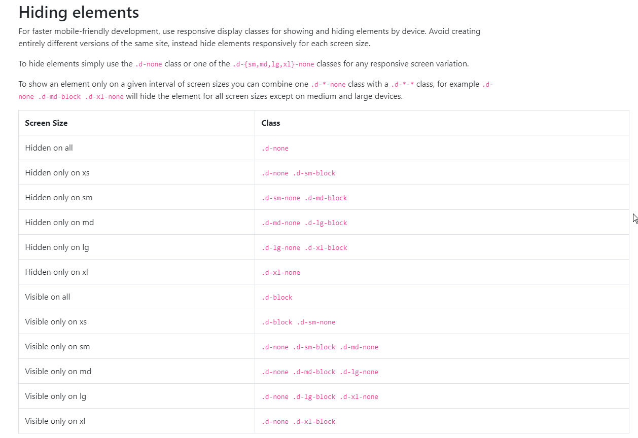
This is now (4.2) done as explained here: https://getbootstrap.com/docs/4.1/utilities/display/#hiding-elements
For table cells you have to use e.g.
<th class="d-none d-lg-table-cell">
This will display the table cell only on large displays an upwards.
You can use the following
hidden-sm : Hidden on small devices ( Tablets ( >= 768 px))
hidden-xs: Hidden on extra small devices ( Phones ( <768 px))
example
<th class="hidden-xs hidden-sm">Your Column</th>

<td class="hidden-xs hidden-sm">Value </td>
After Bootstrap v4.0+ a good approach is
<th scope="col" class="d-none d-sm-table-cell">Column</th>
d-none hides the element on XS (mobile) viewports and d-sm-table-cell keeps it visible SM onwards (tablets and bigger)
I might be late to this but I been using bootstrap's .d classes for mobile-friendly development to hide/show few things, hope this helps! BootStrap 4
Here is codepen example for table
<link href="https://stackpath.bootstrapcdn.com/bootstrap/4.4.1/css/bootstrap.min.css" rel="stylesheet"/>

<script src="https://code.jquery.com/jquery-3.4.1.slim.min.js" integrity="sha384-J6qa4849blE2+poT4WnyKhv5vZF5SrPo0iEjwBvKU7imGFAV0wwj1yYfoRSJoZ+n" crossorigin="anonymous"></script>
<script src="https://cdn.jsdelivr.net/npm/popper.js@1.16.0/dist/umd/popper.min.js" integrity="sha384-Q6E9RHvbIyZFJoft+2mJbHaEWldlvI9IOYy5n3zV9zzTtmI3UksdQRVvoxMfooAo" crossorigin="anonymous"></script>
<script src="https://stackpath.bootstrapcdn.com/bootstrap/4.4.1/js/bootstrap.min.js" integrity="sha384-wfSDF2E50Y2D1uUdj0O3uMBJnjuUD4Ih7YwaYd1iqfktj0Uod8GCExl3Og8ifwB6" crossorigin="anonymous"></script>

<h2>Good Table</h2>

<table class="table">
    <thead>
        <tr>
            <th style="display:none">Column 1</th>
            <th>Column 2</th>
            <th>Column 3</th>
        </tr>
    </thead>
    <tbody>
        <tr>
            <td style="display:none">Data 1.1</td>
            <td>Data 1.2</td>
            <td>Data 1.3</td>
        </tr>
        <tr>
            <td style="display:none">Data 2.1</td>
            <td>Data 2.2</td>
            <td>Data 2.3</td>
        </tr>
        <tr>
            <td style="display:none">Data 3.1</td>
            <td>Data 3.2</td>
            <td>Data 3.3</td>
        </tr>
    </tbody>
</table>

<h2>Bad Table</h2>

<table class="table">
    <thead>
        <tr>
            <th style="display:none">Column 1</th>
            <th>Column 2</th>
            <th>Column 3</th>
        </tr>
    </thead>
    <tbody>
        <tr>
            <td style="display:none">Data 1.1</td>
            <td>Data 1.2</td>
            <td>Data 1.3</td>
        </tr>
        <tr>
            <td>Data 2.1</td>
            <td>Data 2.2</td>
            <td>Data 2.3</td>
        </tr>
        <tr>
            <td style="display:none">Data 3.1</td>
            <td>Data 3.2</td>
            <td>Data 3.3</td>
        </tr>
    </tbody>
</table>
Use the hideColumn() method to hide the column you want and triggering it via JavaScript or JQuery when the viewport goes to mobile.
Here's a related issue example of your question: https://github.com/wenzhixin/bootstrap-table-examples/blob/master/issues/220.html
For Bootstrap 4 use the .d-* classes.
E.g. <th class="d-block d-sm-none" ..> to only display a column on a small device.
This example https://live.bootstrap-table.com/code/marceloverdijk/3269 shows a country column and and for sm(all) devices it shows the 2 char code like US and for non small devices it shows United States.
From Bootstrap documentation for Display Property: https://getbootstrap.com/docs/5.0/utilities/display/
hide on sm and wider screens hide on screens smaller than sm
I think visible and cardVisible options can help you: http://bootstrap-table.wenzhixin.net.cn/documentation/#column-options.