I am coding a site with AngularJS and SCSS. I am in the mobile-phase of development and I quickly discovered (for this project) that I needed a way to target multiple breakpoints using a @media query. So I found via this SO answer and this CSS Tricks Post as well as multiple other answers on SO. Then I implemented the solutions I found into a test-case, see snippet below for the test.
main {
    background-color: grey;
    height: 100%;
    min-height: 1000px;

    @media (max-width: 992px) {
        background-color: red
    }

    @media (max-width: 768px) {
        background-color: lightcoral
    }

    @media (max-width: 992px), (max-width: 992px) and (orientation: landscape) {
        background-color: lightgreen;
    }

    @media (max-width: 768px),
    (max-width: 768px) and (orientation: landscape) {
        background-color: lightblue;
        // Reset the min-height here, because we no longer have the sticky search bar.
        min-height: 450px;
    }
}
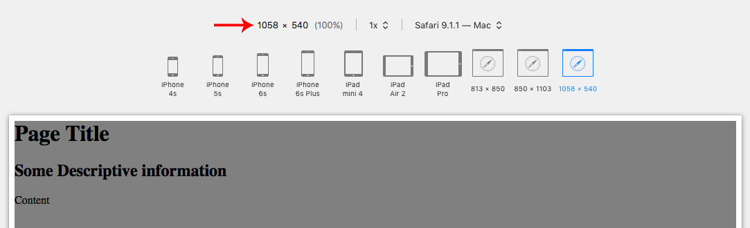
<main>
    <h1>Page Title</h1>
    <h2>Some Descriptive information</h2>

    <div>Content</div>
</main>
But I haven't been able to get it to work. What I am trying to do, ultimately, is have styles that are applied when the user is in landscape on a tablet, or phone. However, I don't know if I am doing it right, or using the or operator correctly.
It plain doesn't work, well, the first statement (for example: (max-width: 992px)) works, but the second one doesn't evaluate to true. According to Mozilla:
Comma-separated lists behave like the logical operator or when used in media queries. When using a comma-separated list of media queries, if any of the media queries returns true, the styles or style sheets get applied. Each media query in a comma-separated list is treated as an individual query, and any operator applied to one media query does not affect the others. --- Mozilla Documentation
Even if I break the code into two separate media queries:
@media (max-width: 992px) {
     background-color: lightgreen;
}
@media (max-width: 992px) and (orientation: landscape) {
     background-color: lightgreen;
}
It still doesn't work. So I don't know if I am targeting the wrong width (when in landscape) or what I am doing wrong. Can any other Front-End developers out there tell me why my comma seperated media queries aren't working?
EDIT: Here is the native SCSS code:
main {
    background-color: $mono-90;
    height: 100%;
    min-height: 1000px;

    @media screen and (max-width: map_get($grid-breakpoints, 'md')) {
        // Reset the min-height here, because we no longer have the sticky search bar.
        min-height: 450px;
    }

    @media
    (max-width: map_get($grid-breakpoints, 'lg')),
    (max-width: map_get($grid-breakpoints, 'lg')) and (orientation: landscape){
        background-color: lightgreen;
    }

    @media
    (max-width: map_get($grid-breakpoints, 'md')),
    (max-width: map_get($grid-breakpoints, 'md')) and (orientation: landscape){
        background-color: lightblue;
    }

    @media
    (max-width: map_get($grid-breakpoints, 'sm')),
    (max-width: map_get($grid-breakpoints, 'sm')) and (orientation: landscape){
        background-color: lightcoral;
    }
}
EDIT: Per the recommendation of @Godwin, I simplified my @media queries to this:
main {
    background-color: $mono-90;
    height: 100%;
    min-height: 1000px;

    @media screen and (max-width: map_get($grid-breakpoints, 'md')) {
        // Reset the min-height here, because we no longer have the sticky search bar.
        min-height: 450px;
    }

    @media screen and (max-width: map_get($grid-breakpoints, 'lg')) {
        background-color: lightgreen;
    }

    @media screen and (max-width: map_get($grid-breakpoints, 'md')) {
        background-color: lightblue;
    }

    @media screen and (max-width: map_get($grid-breakpoints, 'sm')) {
        background-color: lightcoral;
    }
}
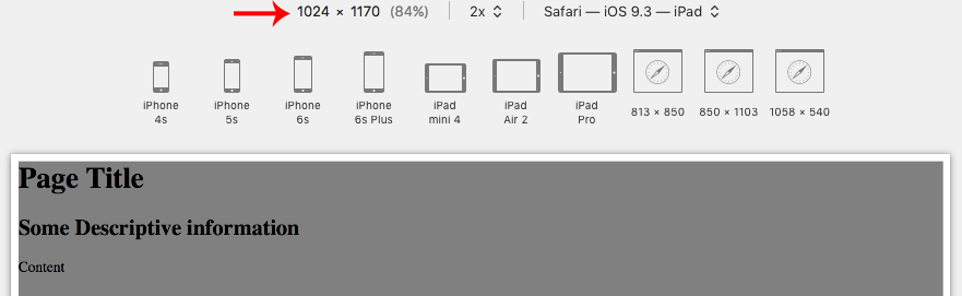
However, it doesn't work on iPad Landscape (1024x768). I don't want it to show on Laptops, but do want it to show on iPads in Landscape position.
