I am working on this graph in R:

However as you see I am getting these solid dashes instead of nice lines. Here is the code I used to make this graph:
par(mar = c(5,5,2,5))
    with(bedtimes, plot(trap, funestus, type="l", col="red3",
                 ylab=expression(italic(p))),
                 ylim=c(0,3))

    par(new = T)
    with(bedtimes, plot(trap, bed, pch=16, axes=F, xlab=NA, ylab=NA, cex=1.2))
    axis(side = 4)
    mtext(side = 4, line = 3, 'Proportion in bed')
    polygon(bedtimes$bed,col=transp("gray", 0.3), border = NA)
And here is the dput of the data I am using:
(removed)
I realise that this is occurring because my x axis is a factor and not numeric. However, trying to change this (e.g. using as.POSIXct(paste0("2016-07-12",bedtimes$trap)) is causing me all sorts of problems, as I had to ake sure R plotted these factors in the correct order originally by using bedtimes$trap <- factor(bedtimes$trap, levels = bedtimes$trap)
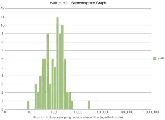
How can I produce this same graph but with lines instead of these dashes? I eventually want a graph that looks similar to this, to give you an idea (though not exactly the same):

Thank you!
