Two questions:
I found a pretty cool font animation on Codepen, but lost the link for it. I have been looking for it online for the past hour and with no luck!
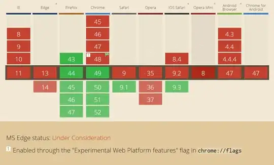
But anyways, there is a issue with this code. Firefox won't give me the results I want. I have tried adding -moz- to most of the code, but the same background image appears like in the picture I have below.
Is this just not possible with Firefox?

My second question is: I wanted the font to change text with a kind of fade in effect when you hover over a button. I managed that but the animation on the hover text does not move. I am guessing this is because there are two animations attached to the div; is there a way around this?
How can I fix these issues? Thanks for your time.
.font{
position:fixed;
width: 100%;
left: 5%;
top: 5%;
}
.font:before{
position:absolute;
content:"TEST";
top: -10px;
  font: 700 5em/1 "Orbitron", sans-serif;
  letter-spacing: 0;
  padding:.25em 0.325em;
display: block;
margin: 0 auto;
  text-shadow: 0 0 80px rgba (255,255,255,.5);
background: url(https://media.24ways.org/2008/02/pattern-howto01.gif) repeat-y;
-moz-background-clip: text;
-moz-text-fill-color: transparent;
-moz-animation: aitf 10s linear infinite;
-moz-transform: translate3d(0,0,0);
-moz-backface-visibility: hidden;
-webkit-background-clip: text;
-webkit-text-fill-color: transparent;
-webkit-animation: aitf 10s linear infinite;
-webkit-transform: translate3d(0,0,0);
-webkit-backface-visibility: hidden;
}
@keyframes aitf {
0% { background-position: 0% 50%; }
100% { background-position: 100% 50%; }
}
@-webkit-keyframes aitf {
0% { background-position: 0% 50%; }
100% { background-position: 100% 50%; }
}
@-moz-keyframes aitf {
0% { background-position: 0% 50%; }
100% { background-position: 100% 50%; }
}
.icon {
position: relative;
width: 50px;
height: 50px;
top: 150px;
border-radius: 50%;
border: solid 5px black;
cursor: pointer;
font-size: 30px;
text-align: center;
vertical-align: middle;
line-height: 50px;
margin: 0 0.8%;
background: #730A0C;
}
.icon:hover ~ .font:before{
content:"TEST2";
animation: fadein 2s;
-moz-animation: fadein 2s;
-webkit-animation: fadein 2s;
-o-animation: fadein 2s;
background-position: center;
}
/*Fade Inn Animation*/
@keyframes fadein {
from {
    opacity:0;
}
to {
    opacity:1;
}
}
@-moz-keyframes fadein { /* Firefox */
from {
    opacity:0;
}
to {
    opacity:1;
}
}
@-webkit-keyframes fadein { /* Safari and Chrome */
from {
    opacity:0;
}
to {
    opacity:1;
}
}
@-o-keyframes fadein { /* Opera */
from {
    opacity:0;
}
to {
    opacity: 1;
}
}
/*Fade Inn Animation*/
<div class="icon"> </div>
<div class="font"> </div>