My data is like this :
id <- c('a','a','b','b')
var <- c('Var1','Var2','Var1','Var2')
value <- c(123,421,2132,633)
df <- cbind(id,var,value)
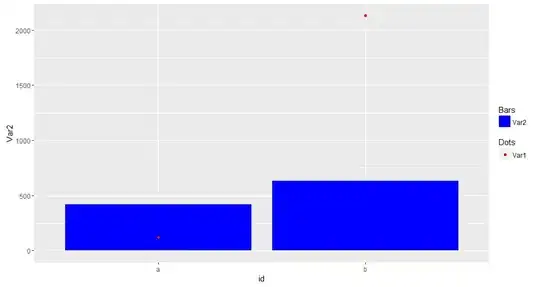
I would like to plot a scatter plot of Var1 and a bar chart of Var2, with a legend showing that the dot is Var1 and the Bar is Var2
I have tried these code :
g <- ggplot(data = df, aes(x=id, y=value, fill=var)
g + stat_identity(geom = c("point","bar"))
But both Var1 and Var2 are showed in scatter point in this way.
I also tried to create two seprate data for Var1 and Var2.
id = c('a','b')
Var1 = c(123,2132)
Var2 = c(421,633)
df1 = cbind.data.frame(id, Var1)
df2 = cbind.data.frame(id, Var2)

g <- ggplot()
g + geom_point(data = df1, aes(x=id, y=Var1),stat = "identity")) +
    geom_bar(data = df2, aes(x=id, y=Var2),stat = "identity"))
In this way, I can combine a scatter point with a bar chart, but there is no legend and I don't know how to make the legend telling readers that the dot is Var1 and the bar is Var2
