-1

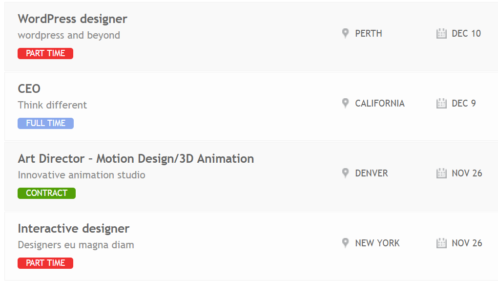
I have a list that has three rows. For each row, I have three columns: First column shows the detail of a job that includes three line:Job name, job description, and job type, the second row shows the location and last row is the due date. My expected result is as follows:

enter image description here I am using w3.css to do it.

<link rel="stylesheet" href="http://www.w3schools.com/lib/w3.css">

In which, I created three columns in a row. For each row, I insert the detail as follows

<div class="w3-row-padding"> 
    <div class="w3-third" style="width:50%">
        <h2>Wordpress desiger</h2>
        <p class="desc">Wordpress and beyond </p>  
        <span class="jobtype">Part time</span>  
    </div> 
    <div class="w3-third" style="width:30%">
        <p class="location">NY.</p>
    </div> 
    <div class="w3-third" style="width:20%">
        <p class="time">Jan.</p>
    </div> 
</div>

My issue is that I cannot align the text location, and time to the center of a row. Could you help me to fix it? How can I achieve as my expected result (add some icon behind the location and time)?

This is my CSS code

    body{
     font-family: 'Arial', sans-serif;
     font-size: 12px;
     overflow-x: hidden;
    }
    
    a { text-decoration: none; }
    
    /** content display **/
    #view { display: block; padding: 0; margin: 0; height:600px;  overflow:hidden; overflow-y:scroll;}
    #container { display: block; margin-top: 0px; }
    #container ul a li { 
     display: block;
     width: 100%;
     border-bottom: 1px solid #b9b9b9;
     border-top: 1px solid #f7f7f7;
     background: #FFF;
     
    }
    span.jobtype{
      background-color: red;
      border-radius: 5px;
      border: 5px solid red;
      color: #FFFFFF;
    }
 <!DOCTYPE html>
<html>
<head>
<title>HTML5, CSS3 and JavaScript demo</title>
</head>
<meta name="viewport" content="width=device-width, initial-scale=1">
<link rel="stylesheet" href="http://www.w3schools.com/lib/w3.css">
<body>
 <div id="view"> 
  <div id="container">
   <ul>
    <!-- row 01 -->
    <a href="#"><li class="clearfix">
     <div class="w3-row-padding"> 
      <div class="w3-third" style="width:50%">
       <h2>Wordpress desiger</h2>
       <p class="desc">Wordpress and beyond </p>  
       <span class="jobtype">Part time</span>  
      </div> 
      <div class="w3-third" style="width:30%">
       <p class="location">NY.</p>
      </div> 
      <div class="w3-third" style="width:20%">
       <p class="time">Jan.</p>
      </div> 
     </div> 
    </li></a>

    <!-- row 02 -->
    <a href="#"><li class="clearfix">
     <div class="w3-row-padding">  
      <div class="w3-third" style="width:50%">
       <h2>CEO</h2>
       <p class="desc">Think different</p>
       <span class="jobtype">Contract</span>
      </div>
      <div class="w3-third" style="width:30%">                              
       <p class="location">Denver</p>
      </div>
      <div class="w3-third" style="width:20%">
       <p class="time">Feb.</p>    
      </div> 
                     </div>
    </li></a>
   </ul>
  </div>
 </div>
</body>
</html>
unor
  • 92,415
  • 26
  • 211
  • 360
user3051460
  • 1,455
  • 22
  • 58

3 Answers3

3

Use flexbox: Add/edit class .w3-row-padding

.w3-row-padding {
  display:flex;
  align-items:center;
  }

body{
     font-family: 'Arial', sans-serif;
     font-size: 12px;
     overflow-x: hidden;
    }
    
    a { text-decoration: none; }
    
    /** content display **/
    #view { display: block; padding: 0; margin: 0; height:600px;  overflow:hidden; overflow-y:scroll;}
    #container { display: block; margin-top: 0px; }
    #container ul a li { 
     display: block;
     width: 100%;
     border-bottom: 1px solid #b9b9b9;
     border-top: 1px solid #f7f7f7;
     background: #FFF;
     
    }
    span.jobtype{
      background-color: red;
      border-radius: 5px;
      border: 5px solid red;
      color: #FFFFFF;
    }
.w3-row-padding {
  display:flex;
  align-items:center;
  }
<!DOCTYPE html>
<html>
<head>
<title>HTML5, CSS3 and JavaScript demo</title>
</head>
<meta name="viewport" content="width=device-width, initial-scale=1">
<link rel="stylesheet" href="http://www.w3schools.com/lib/w3.css">
<body>
 <div id="view"> 
  <div id="container">
   <ul>
    <!-- row 01 -->
    <a href="#"><li class="clearfix">
     <div class="w3-row-padding"> 
      <div class="w3-third" style="width:50%">
       <h2>Wordpress desiger</h2>
       <p class="desc">Wordpress and beyond </p>  
       <span class="jobtype">Part time</span>  
      </div> 
      <div class="w3-third" style="width:30%">
       <p class="location">NY.</p>
      </div> 
      <div class="w3-third" style="width:20%">
       <p class="time">Jan.</p>
      </div> 
     </div> 
    </li></a>

    <!-- row 02 -->
    <a href="#"><li class="clearfix">
     <div class="w3-row-padding">  
      <div class="w3-third" style="width:50%">
       <h2>CEO</h2>
       <p class="desc">Think different</p>
       <span class="jobtype">Contract</span>
      </div>
      <div class="w3-third" style="width:30%">                              
       <p class="location">Denver</p>
      </div>
      <div class="w3-third" style="width:20%">
       <p class="time">Feb.</p>    
      </div> 
    </li></a>
   </ul>
  </div>
 </div>
</body>
</html>
Rohit
  • 1,794
  • 1
  • 8
  • 16
  • Perfect. I got it. Is it possible to insert a icon (location/time) behind the text as above – user3051460 Jul 22 '16 at 06:06
  • Yes, you can use fontawesome for icons like this: For eg: [http://fontawesome.io/icon/map-marker](http://fontawesome.io/icon/map-marker/) – Rohit Jul 22 '16 at 06:10
  • 1
    As you are using `w3.css`, read this [http://www.w3schools.com/w3css/w3css_icons.asp](http://www.w3schools.com/w3css/w3css_icons.asp) – Rohit Jul 22 '16 at 06:12
0

Use display:flex to vertical align your div.

.w3-row-padding {
    align-items: center;
    display: flex;
}

    body{
     font-family: 'Arial', sans-serif;
     font-size: 12px;
     overflow-x: hidden;
    }
    
    a { text-decoration: none; }
    
    /** content display **/
    #view { display: block; padding: 0; margin: 0; height:600px;  overflow:hidden; overflow-y:scroll;}
    #container { display: block; margin-top: 0px; }
    #container ul a li { 
     display: block;
     width: 100%;
     border-bottom: 1px solid #b9b9b9;
     border-top: 1px solid #f7f7f7;
     background: #FFF;
     
    }
    span.jobtype{
      background-color: red;
      border-radius: 5px;
      border: 5px solid red;
      color: #FFFFFF;
    }
 <!DOCTYPE html>
<html>
<head>
<title>HTML5, CSS3 and JavaScript demo</title>
</head>
<meta name="viewport" content="width=device-width, initial-scale=1">
<link rel="stylesheet" href="http://www.w3schools.com/lib/w3.css">
<body>
 <div id="view"> 
  <div id="container">
   <ul>
    <!-- row 01 -->
    <a href="#"><li class="clearfix">
     <div class="w3-row-padding"> 
      <div class="w3-third" style="width:50%">
       <h2>Wordpress desiger</h2>
       <p class="desc">Wordpress and beyond </p>  
       <span class="jobtype">Part time</span>  
      </div> 
      <div class="w3-third" style="width:30%">
       <p class="location">NY.</p>
      </div> 
      <div class="w3-third" style="width:20%">
       <p class="time">Jan.</p>
      </div> 
     </div> 
    </li></a>

    <!-- row 02 -->
    <a href="#"><li class="clearfix">
     <div class="w3-row-padding">  
      <div class="w3-third" style="width:50%">
       <h2>CEO</h2>
       <p class="desc">Think different</p>
       <span class="jobtype">Contract</span>
      </div>
      <div class="w3-third" style="width:30%">                              
       <p class="location">Denver</p>
      </div>
      <div class="w3-third" style="width:20%">
       <p class="time">Feb.</p>    
      </div> 
    </li></a>
   </ul>
  </div>
 </div>
</body>
</html>
Mukesh Ram
  • 6,248
  • 4
  • 19
  • 37
-1

use text-align: center; to place the text in center.

Akash Agrawal
  • 2,219
  • 1
  • 17
  • 38