-2

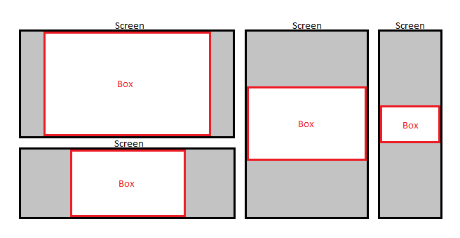
also make it so it'll always be centered horizontally and vertically, and the width will always be 1.5x bigger than the height. here is an illustration. The height on my code is not responsive.

html

<body>
    <div id='box'></div>
</body>

css

body{
  border: 3px solid black;
}
#box{
   border: 3px solid red;
   width:60vw;
   height: 40vw;
   vertical-align: middle;
   margin:0 auto;
}

enter image description here

Mohammad
  • 21,175
  • 15
  • 55
  • 84
lys916
  • 307
  • 2
  • 5
  • 18
  • code is
    .. you get the idea.
    – lys916 Jul 22 '16 at 22:12
  • I "get the idea" that you haven't read the Stack Overflow help docs on how to ask an appropriate question. Are you expecting someone to just write the code for you? – Wes Foster Jul 22 '16 at 22:13
  • well that's all the code i've got.. i didn't think i would need to post it up since its only a div with a box id. sorry if i didn't make it clear enough. – lys916 Jul 22 '16 at 22:16
  • You should try to accomplish your task yourself, researching as much as you can, then come here to get help on specific problems. There isn't much to go off of here, unfortunately. – Wes Foster Jul 22 '16 at 22:17
  • yes of course. thanks for the help – lys916 Jul 22 '16 at 22:27
  • Markup sure appears responsive here... perhaps the issue is with your *testing* methods... not the markup?? – Scott Jul 22 '16 at 22:45
  • Possible duplicate of [Maintain aspect ratio of div but fill screen width and height in CSS?](http://stackoverflow.com/questions/20590239/maintain-aspect-ratio-of-div-but-fill-screen-width-and-height-in-css) – showdev Jul 22 '16 at 22:47
  • showdev, thank you so much for pointing me to this post, exactly what i was looking for. i did some research but didn't know what the keywords are. thanks again. – lys916 Jul 22 '16 at 22:56

1 Answers1

0

you can go with your styles and flexbox like demonstrated in this fiddle: https://jsfiddle.net/s1rsjbn2/ to have your #box full width on the two screens that look like tablet and mobile just use a media query to set

#box{width:100vw;height:66.666667vw;}
Simon Kraus
  • 736
  • 4
  • 14