0

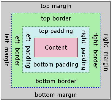
I have designed a page layout with HTML and CSS but when I put padding for “Left for logo” div then the height of this div increases and I lose the arrangement of page.

In addition, because I’m a beginner for CSS layout, please let me know that my page is correct.

HTML

<!doctype html>
<html lang="fa">
    <head>
        <meta charset="utf-8">
        <title>homepage</title>
        <link href="css/home-stylesheet.css" rel="stylesheet" type="text/css" />
    </head>
    <body>
        <header class="header-container">
            <div class="header-area"></div>
            <div class="logo-ads">
                <div class="left">
                    Left for logo  <!-- Set Div As your requirement -->
                </div>
                <div class="right">
                    Right for ads<!-- Set Div As your requirement -->
                </div>
            </div>
        </header><!-- end of header -->
        <div class="navigation">
            navigation
        </div><!-- end of nav -->
        <div class="main">
            main content
        </div><!-- end of main -->
        <div class="footer-container">
            <div class="footer-end">
                footer
            </div>
        </div><!-- end of footer -->
    </body>
</html>

CSS

@charset "utf-8";
/* CSS Document */
body {
    margin-left: 0px;
    margin-top: 0px;
    margin-right: 0px;
    margin-bottom: 0px;
}
/* header elements */
.header-container {
    width: 100%;
}
.header-area {
    height: 35px;
    width: 100%;
    background-color: #bb0700;
    padding-right: 0px;
}
.logo-ads {
    height: 110px;
    width: 1000px;
    background-color: #CFD1A9;
    padding-right: 0px;
    margin-top: 0px;
    margin-right: auto;
    margin-left: auto;
    margin-bottom: 0px;
    z-index: 0;
}

.left {
    float: left;
    height: 110px;
    width: 30%;
    background-color: #F9F9E4;
    padding-right: 0px;
    margin-top: 0px;
    margin-right: auto;
    margin-left: auto;
    margin-bottom: 0px;
    box-sizing: border-box;
}
.right {
    float: right;
    width: 70%;
    height: 110px;
}
.navigation {
    height: 35px;
    width: 1000px;
    background-color: #2A2929;
    padding-right: 0px;
    margin-top: 0px;
    margin-right: auto;
    margin-left: auto;
    margin-bottom: 0px;
    color: #fff;
    z-index: 1;
}
.main {
    height: 1000px;
    width: 1000px;
    background-color: #F7E3E3;
    padding-right: 0px;
    margin-top: 0px;
    margin-right: auto;
    margin-left: auto;
    margin-bottom: 0px;
    z-index: 2;
}
.footer-container {
    height:35px;
    width: 1000px;
    background-color: #F2F1F1;
    padding-right: 0px;
    margin-top: 0px;
    margin-right: auto;
    margin-left: auto;
    margin-bottom: 0px;
    z-index: 3;
}
.footer-end {
    height: 35px;
    width: 1000px;
    background-color: #bb0700;
    padding-right: 0px;
    margin-top: 0px;
    margin-right: auto;
    margin-left: auto;
    margin-bottom: 0px;
    z-index: 4;
}
dakab
  • 5,379
  • 9
  • 43
  • 67
Kaveh
  • 2,530
  • 7
  • 29
  • 34
  • I believe you're looking for this: http://stackoverflow.com/questions/779434/how-do-i-prevent-the-padding-property-from-changing-width-or-height-in-css. – Martijn Jul 23 '16 at 20:50
  • Ah, you just got bitten by the [box-sizing](https://developer.mozilla.org/en-US/docs/Web/CSS/CSS_Box_Model/Introduction_to_the_CSS_box_model) thingy! You could set the [box-sizing](https://developer.mozilla.org/en/docs/Web/CSS/box-sizing) or change your height. – some Jul 23 '16 at 22:22
  • @user3593846,thanks yes that is good solution. – Kaveh Jul 24 '16 at 08:16

3 Answers3

2

I can see you are starting to understand CSS and are trying to learn more by doing. I hope this helps you a bit and you keep asking questions until you get awesome, then you come back and help newcomers, we've all been there.

First, let's make sure you understand the CSS box model CSS BOX MODEL

Every element consists of content + padding + size (width/height) + border + margin. If you don't want those elements to be taken into account, you can use

element {box-sizing: border-box;} // The width and height properties (and min/max properties) includes content, padding and border, but not the margin

No need for unities in 0 quantities

You don't need to declare unities in any 0 values, since 0em, 0px, 0% are all the same. 0. save your time and file-size.


Shorthand

Shorthand in css greatly reduces not only your time writing, but the size of the file, it is a good practice to always reduce where you can. Instead of writing:

div {
  padding-top:10px;
  padding-right:8px;
  padding-bottom:5px;
  padding-left:3px;
}

You could shorthand it, always following the sequence: TOP, RIGHT, BOTTOM, LEFT

div {
  padding:10px 8px 5px 3px;
}

Floats are the devil's way of laughing at you

You should not rely on floats when layouting a website. If you have an image inside a section that should be floated left/right, or something as simple, that is fine; but managing layout with floats will take your time and your soul. There are simply many issues that come with floats and it is not worth the trouble of fixing everything. There are plenty of grid systems and frameworks like Bootstrap and Foundation that cover all those for you. Those troubles may include:

  • browsers rendering some types of elements differently
  • different display types (inline, inline-block and block are the most common) position themselves differently
  • you must clear your floats or your layout will become a mess
  • there are no easy way to vertically center elements using floats or equal heights
  • you won't be able to rearrange them easily with media queries
  • They are slow to render in the DOM

So your best shot is to layout using a grid-system and arranging elements using flexbox

Understanding Grid Systems

In case you’re new to CSS grid systems, we’ll start with a quick definition. In basic terms, a grid system is a structure that allows for content to be stacked both vertically and horizontally in a consistent and easily manageable fashion. Additionally, grid system code is project-agnostic giving it a high degree of portability so that it may be adopted on new projects.

Understanding Flexbox

The CSS3 Flexible Box, or flexbox, is a layout mode providing for the arrangement of elements on a page such that the elements behave predictably when the page layout must accommodate different screen sizes and different display devices

So flexbox is highly supported nowadays: http://caniuse.com/#search=flex, with the exception of Internet Explorer 9 and lower, and even then there are polyfills for that, you can search for one if you want to support it, they are quite easy to implement as well.

If you want to learn the awesome stuff you can do with flexbox, Wes Bos has a really nice tutorial on his website

I hope these tips help you out, bump me if you need anything else.

Community
  • 1
  • 1
Pedro Ferrari
  • 313
  • 3
  • 10
  • Thanks Pedro,i have 2 question: – Kaveh Jul 24 '16 at 07:48
  • Thanks Pedro,i have 3 question: 1-Please let me know about my page layout and css codes is there that i must consider? 2-I have a site which is design with html4 and css and php+mysql but instead of
    i used table and i reconstruct it with html5+css3 using
    so first i want practice with
    and the modify it for responsive mobile,because i can't mix new design with responsive design,am i in right place? 3-I have had some suggestion that i use Bootstrap,but since we must add link of style sheet of Bootstrap to our pages,is it good and we lose our independence? thanks
    – Kaveh Jul 24 '16 at 08:10
  • 1- Your code is alright, nothing wrong with it and probably better than many 100k+ visits/month websites I have worked with. 2- Table design is really dead for responsive websites. Although in HTML5 divs should be used as a LAST RESOURCE. The key code in html5 is semantics. You have not only header/footer, but also main/section/article/aside/nav and many other elements that fit better. This is key to accessibility, and If i know right, google might even give you a rank boost for properly using these tags. – Pedro Ferrari Jul 24 '16 at 21:01
  • 3- Bootstrap is a framework that is intended to easy your way into development, you will put bootstrap stylesheet before your own stylesheet. Due to the "cascading" part of CSS, if your style is either after or more specific, your css will prevail. Most importantly, try to never use !important to do this job for you. It is really rare that you would need it. – Pedro Ferrari Jul 24 '16 at 21:06
0

The padding property defines the distance between the content and the border. So if you add 10px padding left, the element will have 10px more space between the left and the right border. If you want to add padding but keep the size of the border, just decrease the height/weight property by your padding

#example{
height:70%;
padding-top:30%;
}
Jonas Wilms
  • 132,000
  • 20
  • 149
  • 151
0

All you have to do is to add overflow: hidden; to the container of the logo and ads div. that is .logo-ads. then you can add how much padding you need to your 'Left for logo'(.left) using padding

.logo-ads {
    height: 110px;
    overflow: hidden;
    width: 1000px;
    background-color: #CFD1A9;
    padding-right: 0px;
    margin-top: 0px;
    margin-right: auto;
    margin-left: auto;
    margin-bottom: 0px;
    z-index: 0;
}

Add the overflow: hidden; to your .logo-ads class

Ninoop p george
  • 678
  • 5
  • 22