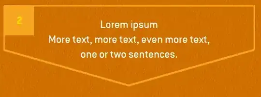
I tried to draw border around an HTML text block that is arrow-like pointed at the bottom side (turning it into a pentagon), like so:
As I don't know the box's dimensions the irregular border must be as flexible as a standard one. After trying some things with SVG and backgrounds and discarding CSS Shapes for lack of browser support I came up with a solution:
I added an absolutely positioned div element to the original box, drew a regular border around this border-holder on three sides and added the pointed bottom as an SVG background to an ::after-pseudo-element.
.border-holder {
    position: absolute;
    z-index: -1;
    height: calc(100% - 100px);
    top: 0;
    left: 0;
    width: calc(100% + 6px);
    border-width: 3px 3px 0;
    border-style: solid;
    border-color: #f7a522;
}

.border-holder::after {
    content: '';
    position: absolute;
    bottom: -68.5px;
    left: -1.5px;
    width: calc(100% + 3px);
    height: 70px;
    background-repeat: no-repeat;
    background-size: 100% auto;
    background-image: url("data:image/svg+xml;utf-8,%3Csvg ... %3C/svg%3E");
}
See http://codepen.io/wortwart/pen/YWvQWX
This works with some minor flaws (browsers are not very accurate in sizing SVG backgrounds so the borders don't fit always exactly; high zoom levels don't look good). Anyway, I have the nagging feeling that there must be a better solution for such a rather basic requirement. Has anybody an idea how to make this simpler and more robust?
