18

I have data that is mostly centered in a small range (1-10) but there is a significant number of points (say, 10%) which are in (10-1000). I would like to plot a histogram for this data that will focus on (1-10) but will also show the (10-1000) data. Something like a log-scale for th histogram.

Yes, i know this means not all bins are of equal size

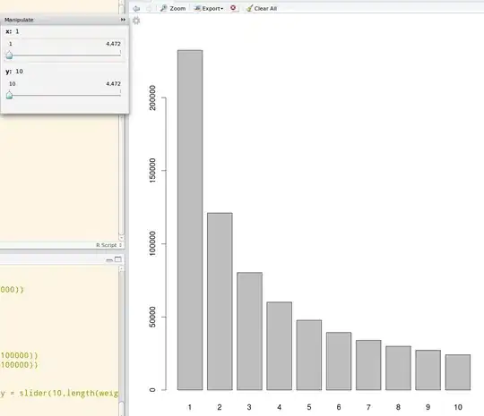
A simple hist(x) gives alt text while hist(x,breaks=c(0,1,1.1,1.2,1.3,1.4,1.5,1.6,1.7,1.8,1.9,2,3,4,5,7.5,10,15,20,50,100,200,500,1000,10000))) gives alt text

none of which is what I want.

update following the answers here I now produce something that is almost exactly what I want (I went with a continuous plot instead of bar-histogram):

breaks <- c(0,1,1.1,1.2,1.3,1.4,1.5,1.6,1.7,1.8,1.9,2,4,8)
ggplot(t,aes(x)) + geom_histogram(colour="darkblue", size=1, fill="blue") + scale_x_log10('true size/predicted size', breaks = breaks, labels = breaks)![alt text][3]

alt text the only problem is that I'd like to match between the scale and the actual bars plotted. There two options for doing that : the one is simply use the actual margins of the plotted bars (how?) then get "ugly" x-axis labels like 1.1754,1.2985 etc. The other, which I prefer, is to control the actual bins margins used so they will match the breaks.

David B
  • 29,258
  • 50
  • 133
  • 186
  • @Marek my question to log x-axis (or similar), not values (y-axis) – David B Oct 05 '10 at 09:57
  • possible duplicate of : http://stackoverflow.com/questions/1245273/histogram-with-logarithmic-scale – Joris Meys Oct 05 '10 at 11:17
  • @Joris Meys same comment as for Marek: I'm looking for a log x-axis, not log of the values (y). – David B Oct 05 '10 at 11:46
  • @David: my solution gives you an x-axis representing the original values, but with a logaritmic scale. I even keep the breaks you defined. How is that not what you asked? – Joris Meys Oct 05 '10 at 12:36
  • @David : what you ask can't be done easily. ggplot2 ignores the breaks when making a histogram on a log scale. You can set binwidth, but that's a single value. So all bars will be equal size. If you don't want that to happen, use the basis plotting. – Joris Meys Oct 05 '10 at 14:03
  • @Joris Thanks Joris. If I remove the `breaks` and `labels` in the `scale_x_log10` I got something satisfiable, except that the values are shown as exponents. Can I show the as decimal numbers? – David B Oct 05 '10 at 14:26
  • @David: Those are default settings which -afaik- cannot be changed. That's the disadvantage of ggplot: it gives nice graphs, but you can't tweak them completely. – Joris Meys Oct 05 '10 at 14:32
  • @Joris Meys that makes the graphs useless for me :( – David B Oct 05 '10 at 14:48
  • @David : I've reconstructed that plot more or less using the base package. See my updated answer. Hope you can use it. Play around with it a bit to get the values like you want them (the breaks and the major.) – Joris Meys Oct 05 '10 at 15:34

3 Answers3

10

Log scale histograms are easier with ggplot than with base graphics. Try something like

library(ggplot2)
dfr <- data.frame(x = rlnorm(100, sdlog = 3))
ggplot(dfr, aes(x)) + geom_histogram() + scale_x_log10()

If you are desperate for base graphics, you need to plot a log-scale histogram without axes, then manually add the axes afterwards.

h <- hist(log10(dfr$x), axes = FALSE) 
Axis(side = 2)
Axis(at = h$breaks, labels = 10^h$breaks, side = 1)

For completeness, the lattice solution would be

library(lattice)
histogram(~x, dfr, scales = list(x = list(log = TRUE)))

AN EXPLANATION OF WHY LOG VALUES ARE NEEDED IN THE BASE CASE:

If you plot the data with no log-transformation, then most of the data are clumped into bars at the left.

hist(dfr$x)

The hist function ignores the log argument (because it interferes with the calculation of breaks), so this doesn't work.

hist(dfr$x, log = "y")

Neither does this.

par(xlog = TRUE)
hist(dfr$x)

That means that we need to log transform the data before we draw the plot.

    hist(log10(dfr$x))

Unfortunately, this messes up the axes, which brings us to workaround above.

Richie Cotton
  • 118,240
  • 47
  • 247
  • 360
7

Using ggplot2 seems like the most easy option. If you want more control over your axes and your breaks, you can do something like the following :

EDIT : new code provided

x <- c(rexp(1000,0.5)+0.5,rexp(100,0.5)*100)

breaks<- c(0,0.1,0.2,0.5,1,2,5,10,20,50,100,200,500,1000,10000)
major <- c(0.1,1,10,100,1000,10000)


H <- hist(log10(x),plot=F)


plot(H$mids,H$counts,type="n",
      xaxt="n",
      xlab="X",ylab="Counts",
      main="Histogram of X",
      bg="lightgrey"
)
abline(v=log10(breaks),col="lightgrey",lty=2)
abline(v=log10(major),col="lightgrey")
abline(h=pretty(H$counts),col="lightgrey")
plot(H,add=T,freq=T,col="blue")
#Position of ticks
at <- log10(breaks)

#Creation X axis
axis(1,at=at,labels=10^at)

This is as close as I can get to the ggplot2. Putting the background grey is not that straightforward, but doable if you define a rectangle with the size of your plot screen and put the background as grey.

Check all the functions I used, and also ?par. It will allow you to build your own graphs. Hope this helps.

alt text

Joris Meys
  • 106,551
  • 31
  • 221
  • 263
  • breaks defines where you put the ticks and the labels, major defines where you put the major vertical lines. With some extra code, you can add ticks and lines where you want. an extra command axis() with labels=NA does the trick I guess. – Joris Meys Oct 05 '10 at 15:46
1

A dynamic graph would also help in this plot. Use the manipulate package from Rstudio to do a dynamic ranged histogram:

library(manipulate)
data_dist <- table(data)
manipulate(barplot(data_dist[x:y]), x = slider(1,length(data_dist)), y = slider(10, length(data_dist)))

Then you will be able to use sliders to see the particular distribution in a dynamically selected range like this: enter image description here

Bipa
  • 189
  • 2
  • 3
  • 14
xgdgsc
  • 1,367
  • 13
  • 38