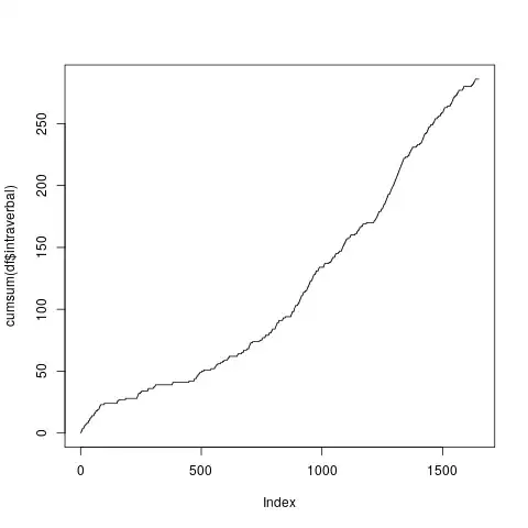
I'm trying to create a cumulative graph as shown here, with another caveat. The steps should be based 2 minute time intervals, whereby an interval may have multiple or even no entries.
I used rowSums to create the column for the value to be used in cumsum, e.g.,
df_so $intraverbal <- rowSums(df_so[-1] == "intraverbal")
df_so$tact <- rowSums(df_so[-1] == "tact")
df_so$mand <- rowSums(df_so[-1] == "mand")
df_so$echoic <- rowSums(df_so[-1] == "echoic")
The graph worked out well enough using plot:
plot(cumsum(df_so$intraverbal), type="s")
However, there are a couple ways it falls short. Ideally, the data would be tallied and labeled according to the "time bin". At the very least, the time bins should be on the x-label, but the increments aren't continuous. Hypothetically, I should be using dplyr or lapply to melt and combine them - but I'm not sure how. Perhaps, something as described here.
It would be nice to accomplish this with ggplot, so that the varying cumsums can be on the same graph, e.g., like here, or perhaps with stat_bin as here.
Here's a small working sample of the data:
df_so <- structure(list(time.bin = structure(c(1L, 1L, 1L, 1L, 1L, 1L,1L, 124L, 124L, 124L), .Label = c("0:00:00", "0:02:00", "0:04:00","0:06:00", "0:08:00", "0:10:00", "0:12:00", "0:14:00", "0:16:00","0:18:00",
         "0:20:00", "0:22:00", "0:24:00", "0:26:00", "0:28:00","0:30:00", "0:32:00", "0:34:00", "0:36:00", "0:38:00", "0:40:00","0:42:00", "0:44:00", "0:46:00", "0:48:00", "0:50:00", "0:52:00","0:54:00", "0:56:00", "0:58:00",
         "1:00:00", "1:02:00", "1:04:00","1:06:00", "1:08:00", "1:10:00", "1:12:00", "1:14:00", "1:16:00","1:18:00", "1:20:00", "1:22:00", "1:24:00", "1:26:00", "1:28:00","1:30:00", "1:32:00", "1:34:00", "1:36:00", "1:38:00",
         "1:40:00","1:42:00", "1:44:00", "1:46:00", "1:48:00", "1:50:00", "1:52:00","1:54:00", "1:56:00", "1:58:00", "2:00:00", "2:02:00", "2:04:00","2:06:00", "2:08:00", "2:10:00", "2:12:00", "2:14:00", "2:16:00","2:18:00",
         "2:20:00", "2:22:00", "2:24:00", "2:26:00", "2:28:00","2:30:00", "2:32:00", "2:34:00", "2:36:00", "2:38:00", "2:40:00","2:42:00", "2:44:00", "2:46:00", "2:48:00", "2:50:00", "2:52:00","2:54:00", "2:56:00", "2:58:00",
         "3:00:00", "3:02:00", "3:04:00","3:06:00", "3:08:00", "3:10:00", "3:12:00", "3:14:00", "3:16:00","3:18:00", "3:20:00", "3:22:00", "3:24:00", "3:26:00", "3:28:00","3:30:00", "3:32:00", "3:34:00", "3:36:00", "3:38:00", "3:40:00","3:42:00", "3:44:00", "3:48:00", "3:50:00", "3:52:00", "3:54:00","3:56:00", "3:58:00", "4:00:00", "4:02:00", "4:04:00", "4:06:00","4:08:00"), class = "factor"),
         Primary.VB = structure(c(1L,3L, 1L, 3L, 1L, 3L, 1L, 1L, 1L, 1L), .Label = c("", "echoic","intraverbal", "mand", "tact"), class = "factor"),
         Secondary.VB = structure(c(1L,1L, 1L, 5L, 1L, 1L, 1L, 1L, 1L, 1L), .Label = c("", "echoic","intraverbal", "mand", "tact"), class = "factor"),
         Tertiary.VB = structure(c(1L,1L, 1L, 3L, 1L, 1L, 1L, 1L, 1L, 1L), .Label = c("", "intraverbal","mand", "tact"), class = "factor"), intraverbal = c(0, 1, 0,1, 0, 1, 0, 0, 0, 0),
         tact = c(0, 0, 0, 1, 0, 0, 0, 0, 0, 0),mand = c(0, 0, 0, 1, 0, 0, 0, 0, 0, 0),
         echoic = c(0, 0,0, 0, 0, 0, 0, 0, 0, 0)), .Names = c("time.bin", "Primary.VB","Secondary.VB","Tertiary.VB","intraverbal",
         "tact", "mand", "echoic"), row.names = c(1L, 2L,3L, 4L, 5L, 6L, 7L, 1648L, 1649L, 1650L), class = "data.frame")
