-2

I'm working part time on a website for a small nonprofit, and I'm having trouble getting a few divs/elements to be aligned for the various screen sizes.

I'm using media queries and padding to center things by eye, but thats making it impossible to have it work as the window resizes. I guess I realise that using percentage padding to center the elements isnt the right way to go, but I'm at a loss as to the proper practise.

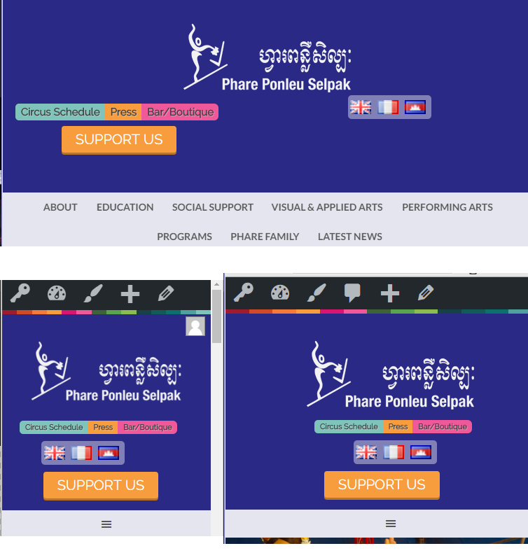
Here is a screenshot of the elements in question:

enter image description here

And here is the site.

I won't all of the elements in the image to stack on top of each other in the centre of the header, but only at smaller sizes, but I can't really figure the CSS out. Could anyone point me in the right direction?

Thanks

c3066521
  • 61
  • 1
  • 1
  • 7
  • Simple, modern technique: [Center Elements Vertically and Horizontally with Flexbox](http://stackoverflow.com/a/33049198/3597276) – Michael Benjamin Aug 04 '16 at 03:27
  • perhaps look at using an out of the box grid system like http://getbootstrap.com/ to give you the alignment you need – haxxxton Aug 04 '16 at 03:30
  • 1
    Please provide a [MCVE](https://stackoverflow.com/help/mcve). A link to a site that is going to change is useless for future users. Trying to debug an entire page is painful, even more so if you are changing it as we try to work out what is going on. – Jon P Aug 04 '16 at 04:49
  • Questions seeking code help must include the shortest code necessary to reproduce it **in the question itself**. Although you have provided a [**link to an example or site**](http://meta.stackoverflow.com/questions/254428/something-in-my-web-site-or-project-doesnt-work-can-i-just-paste-a-link-to-it), if the link were to become invalid, your question would be of no value to other future SO users with the same problem. – Paulie_D Aug 04 '16 at 08:54

1 Answers1

0

There are many ways you could do this. The easiest would probably be to use containers for the left and right sides, set their widths to 50% and float them left. Then use your media query to make them full width at a certain size.

css:

.half {float:left; width:50%; text-align:center;}

@media screen and (max-width:800px) {
  .half {width:auto; float:none;}
}

html:

<div class="half">
  <img src="http://placehold.it/350x150">
</div>
<div class="half">
  <img src="http://placehold.it/350x150">
</div>

Like this JSFiddle

user500665
  • 1,220
  • 1
  • 12
  • 38