1

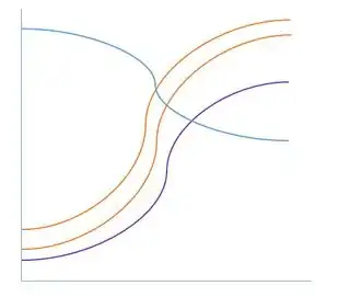
I'd like to create a sankey-like plot that I can create in ggplot2 where there are curved lines between my start and end locations. Currently, I have data that looks like this:

df <- data.frame(Line = rep(letters[1:4], 2),
                 Location = rep(c("Start", "End"), each=4),
                 X = rep(c(1, 10), each = 4),
                 Y = c(c(1,3, 5, 15), c(9,12, 14, 6)),
                 stringsAsFactors = F)

ex:

  Line Location  X Y
1    a    Start  1 1
2    a      End 10 9

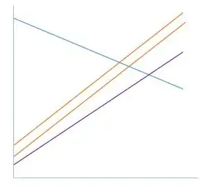
and creates a plot that looks something like this:

library(ggplot2)
ggplot(df) +
  geom_path(aes(x= X, y= Y, group = Line))

have

I would like to see the data come out like this:

enter image description here

This is another option for setting up the data:

df2 <- data.frame(Line = letters[1:4],
                  Start.X= rep(1, 4),
                  Start.Y = c(1,3,5,15),
                  End.X = rep(10, 4),
                  End.Y = c(9,12,14,6))

ex:

  Line Start.X Start.Y End.X End.Y
1    a       1       1    10     9

I can find examples of how to add a curve to the graphics of base R but these examples don't demonstrate how to get a data frame of the points in between in order to draw that curve. I would prefer to use dplyr for data manipulation. I imagine this will require a for-loop to build a table of the interpolated points.

These examples are similar but do not produce an s-shaped curve:

Plotting lines on map - gcIntermediate

http://flowingdata.com/2011/05/11/how-to-map-connections-with-great-circles/

Thank you in advance!
Community
  • 1
  • 1
yake84
  • 3,004
  • 2
  • 19
  • 35

1 Answers1

3

The code below creates curved lines via a logistic function. You could use whatever function you like instead, but this is the main idea. I should note that for other than graphical purposes, creating a curved line out of 2 points is a bad idea. It implies that the data show a certain type of relation while it actually doesn't imply that relation.

df <- data.frame(Line = rep(letters[1:4], 2),
                 Location = rep(c("Start", "End"), each=4),
                 X = rep(c(1, 10), each = 4),
                 Y = c(c(1,3, 5, 15), c(9,12, 14, 6)),
                 stringsAsFactors = F)

# logistic function for curved lines
logistic = function(x, y, midpoint = mean(x)) {
  ry = range(y)
  if (y[1] < y[2]) {
    sign = 2
  } else {
    sign = -2
  }
  steepness = sign*diff(range(x)) / diff(ry)
  out = (ry[2] - ry[1]) / (1 + exp(-steepness * (x - midpoint))) + ry[1]
  return(out)
}

# an example
x = c(1, 10)
y = c(1, 9)
xnew = seq(1, 10, .5)
ynew = logistic(xnew, y)
plot(x, y, type = 'b', bty = 'n', las = 1)
lines(xnew, ynew, col = 2, type = 'b')

# applying the function to your example
xnew = seq(min(df$X), max(df$X), .1) # new x grid
m = matrix(NA, length(xnew), 4) # matrix to store results

uniq = unique(df$Line) # loop over all unique values in df$Line
for (i in seq_along(uniq)) {
  m[, i] = logistic(xnew, df$Y[df$Line == uniq[i]])
}
# base R plot
matplot(xnew, m, type = 'b', las = 1, bty = 'n', pch = 1)

# put stuff in a dataframe for ggplot
df2 = data.frame(x = rep(xnew, ncol(m)), 
                 y = c(m), 
                 group = factor(rep(1:ncol(m), each = nrow(m))))

library(ggplot2)
ggplot(df) +
  geom_path(aes(x= X, y= Y, group = Line, color = Line)) +
  geom_line(data = df2, aes(x = x, y = y, group = group, color = group))

enter image description here

Vandenman
  • 3,046
  • 20
  • 33
  • I don't fully understand how this works but it seems to do the trick! I'll take note of your comment re: the relationship this suggests. I also want to acknowledge the speed with which you answered this question, it's quite admirable! – yake84 Aug 26 '16 at 00:12