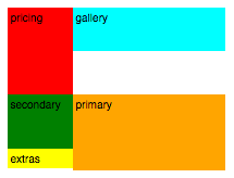
I am working on a product page layout that has two columns with various height items. I am trying to avoid nesting the items in two column containers, so that I can have optimal order of elements on small screens that go to one column.
The problem I am running into is that sometimes the second block (floated left) is longer than the first block (floated right), and sometimes the opposite is true. The problem occurs when the third block is given clear: left to make sure it's as far right as it can go, the fourth block will not go above the top of the third block.
Here is a CodePen with the code: http://codepen.io/anon/pen/jAQdEK?editors=1100#anon-login