I have three elements, see picture below
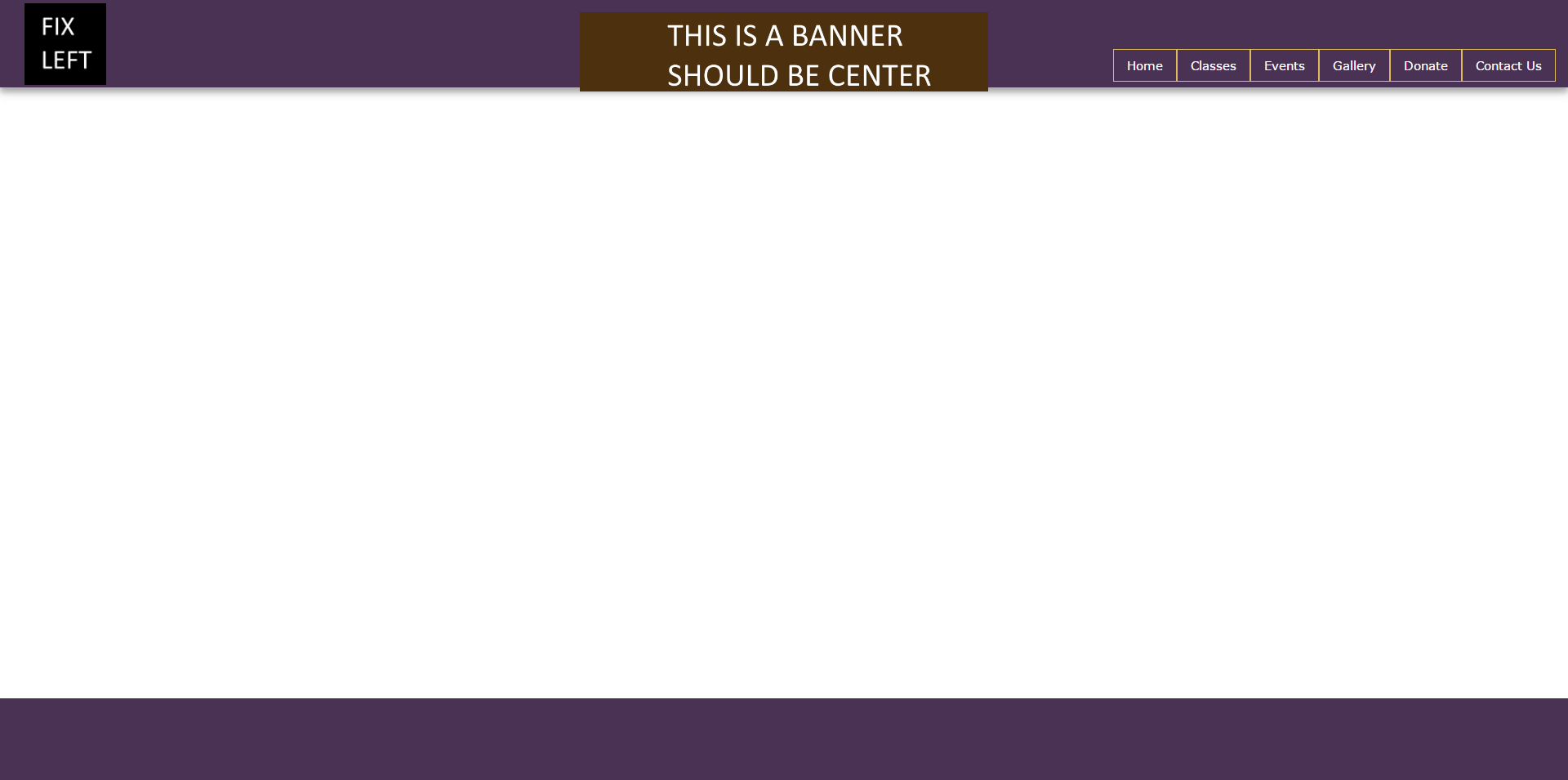
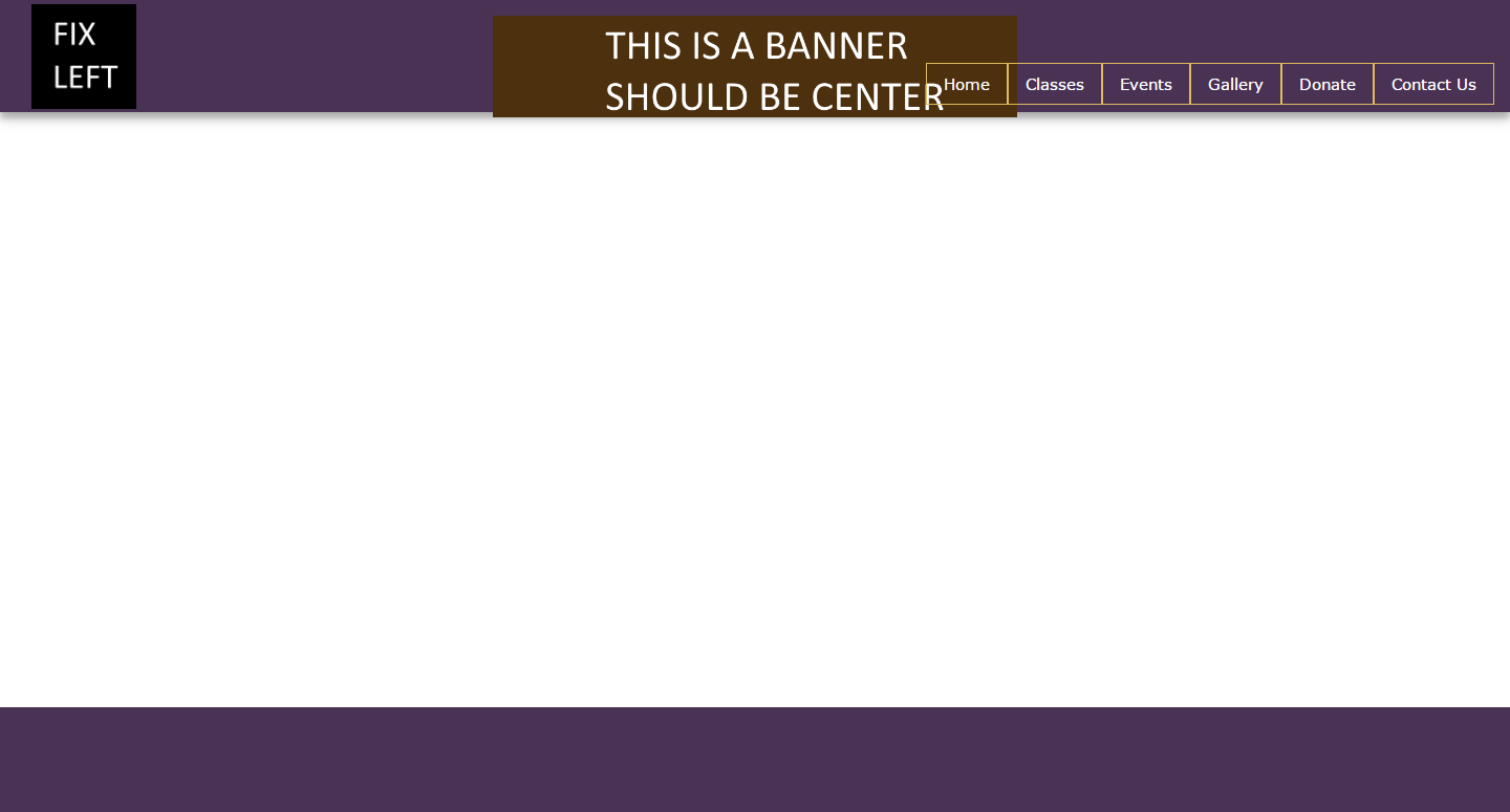
This is a 1080p screen and it works fine. However, on smaller screens, the right side overlaps the center banner, see picture below
How can i fix this? Below is my code
<link href="http://www.w3schools.com/lib/w3.css" rel="stylesheet"/>
<div class="w3-container aq-purple" style="box-shadow: 0 6px 8px 0 rgba(0, 0, 0, 0.2), 0 6px 20px 0 rgba(0, 0, 0, 0.19);">


                <img src="images/ficon.png" style="position:absolute;left:30px;top:4px;width:100px">
                <div align="center">
                    <img src="fbanner.png" style="margin-top:15px;width:100%;max-width:500px;">
                </div>
                <div  style="position:absolute;right:15px;top:60px;bottom:0px">
                    <ul class="w3-navbar" style="position:relative;bottom:0px;height:40px">
                        <li>
                            <a class="w3-hover-amber w3-border aq-border-gold" href="#">
                                Home
                            </a>
                        </li>
                        <li>
                            <a class="w3-hover-amber w3-border aq-border-gold" href="gallery.html">
                                Classes
                            </a>
                        </li>
                        <li>
                            <a class="w3-hover-amber w3-border aq-border-gold" href="events.html">
                                Events
                            </a>
                        </li>
                        <li>
                            <a class="w3-hover-amber w3-border aq-border-gold" href="gallery.html">
                                Gallery
                            </a>
                        </li>
                        <li>
                            <a class="w3-hover-amber w3-border aq-border-gold" href="donations.html">
                                Donate
                            </a>
                        </li>
                        <li>
                            <a class="w3-hover-amber w3-border aq-border-gold" href="contact.html">
                                Contact Us
                            </a>
                        </li>
                    </ul>
                </div>
The icon on the left, and navbar on the right are correct. The middle banner needs to be centered in the screen. However, when the screen is small, it overlaps. I need it to move over if theres a lack of space