0

I have a wireframe below and want to see what's the best way to code this with flexbox.

I have coded a simple flexbox grid system but my wireframe requires more customization than what I have on my grid system.

enter image description here

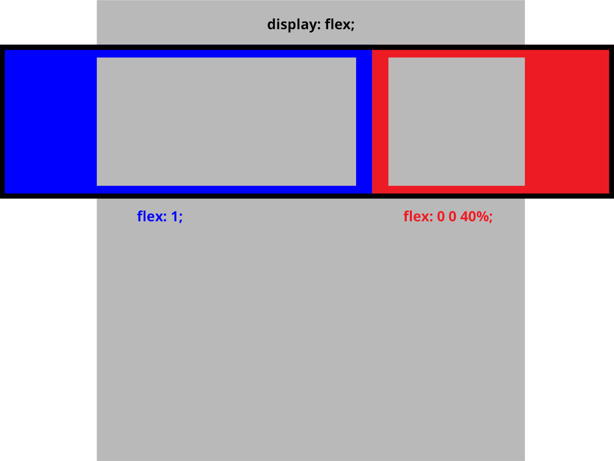
I have parent div has display: flex and have 2 child divs have flex:1 and flex: 0 0 40%. What is the best way to add content div(gray boxes inside on blue and red) that will stay with rest of main wrapper(entire gray box sets to max-width: 1400px)?

Thank you.

Paulie_D
  • 107,962
  • 13
  • 142
  • 161
Ohsik
  • 261
  • 3
  • 10
  • Duplicate - http://stackoverflow.com/questions/28565976/css-how-to-overflow-from-div-to-full-width-of-screen – Paulie_D Aug 12 '16 at 18:53
  • @Paulie_D yes, there will be a background image and color. It's completely different question(layout) and the other one does not even use `flexbox` – Ohsik Aug 12 '16 at 18:56
  • At the moment this is either a duplicate or opinion based and likely to get closed. If you can remove the "best way" part of the question and get down to the practical problem you are having it might receive more positive attention. Even so, I think it's a duplicate of the Q & A that I linked. – Paulie_D Aug 12 '16 at 18:57
  • @Paulie_D They are completely DIFFERENT questions lol – Ohsik Aug 12 '16 at 19:00
  • Not really the technique would be the same. A positioned pseudo-element for each side with appropriate width and positioning...same principle. – Paulie_D Aug 12 '16 at 19:01
  • @Paulie_D if you say so, can you please prove it with your code? instead of just saying it's same principle. with using `flexbox` – Ohsik Aug 12 '16 at 19:04
  • Sure...there you are. – Paulie_D Aug 12 '16 at 19:18

1 Answers1

1

Here's the general idea.

Positioned pseudo-elements, one for each section of the row. With a suitable width (note that the body should have overflow-x:hidden) and appropriate positioning values.

* {
  box-sizing: border-box;
}
body {
  overflow-x: hidden;
}
.wrapper {
  min-height: 100vh; /* for demo purposes */
  width: 60%;
  margin: auto;
  background: grey;
  display: flex;
  flex-direction: column;
}
header {
  height: 20vh;
  background: green;
}
.inner {
  height: 30vh;
  display: flex;
}
main {
  background: blue;
  flex: 1;
  border: 2px solid black;
}
aside {
  background: red;
  flex: 0 0 40%;
  border: 2px solid black;
}
.other {
  background: pink;
  flex: 1;
}
/* magic section */

.extend {
  position: relative;
}
.extend::after {
  content: '';
  position: absolute;
  width: 100vw;
  top: 0;
  height: 100%;
  background: inherit;
  z-index: -1;
}
.left::after {
  right: 0;
}
.right::after {
  left: 0;
}
<div class="wrapper">
  <header></header>
  <div class="inner">
    <main class="extend left"></main>
    <aside class="extend right"></aside>
  </div>
  <div class="other"></div>
</div>
Paulie_D
  • 107,962
  • 13
  • 142
  • 161