Is there any simple way using CSS to make this shape? 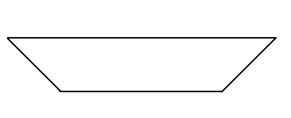
Asked
Active
Viewed 319 times
-3
Nenad Vracar
- 118,580
- 15
- 151
- 176
Lukáš Unzeitig
- 439
- 8
- 23
-
using svg its possible you want it ?? – shubham khandelwal Aug 26 '16 at 08:31
-
1This is a dupe and would have been easy to find with a simple search. Research before just asking! – Stewartside Aug 26 '16 at 08:55
-
But another found solutions look a complex.. for one div three div styles. I have a lot of divs with similiar styles but still different and it 'll be a lot of codes... because of this i am looking for something more simple. – Lukáš Unzeitig Aug 26 '16 at 09:16
2 Answers
0
Yes it can be done. see the below code.
.shape {
    width: 200px;
    height: 100px;
    background: #000;
    margin: 20px 150px;
    position: relative;
}

.shape:after {
        content: '';
    line-height: 0;
    font-size: 0;
    width: 0;
    height: 0;
    border-top: 50px solid #000000;
    border-bottom: 50px solid #fff;
    border-left: 50px solid #000000;
    border-right: 50px solid #fff;
    position: absolute;
    top: 0;
    right: -99px;
}

.shape:before {
        content: '';
    line-height: 0;
    font-size: 0;
    width: 0;
    height: 0;
    border-top: 50px solid #000000;
    border-bottom: 50px solid #fff;
    border-left: 50px solid #fff;
    border-right: 50px solid #000000;
    position: absolute;
    top: 0;
    left: -99px;
}
<div class="shape"></div>
JeetDaloneboy
- 399
- 2
- 16
0
You can use rotateX() and perspective() to create shape like this.
.shape {
  width: 250px;
  height: 70px;
  border: 2px solid black;
  border-top: 1px solid black;
  margin: 50px;
  transform: perspective(10px) rotateX(-2deg);
}
<div class="shape"></div>
Nenad Vracar
- 118,580
- 15
- 151
- 176
-
-
4You're a high enough rep user with enough CSS upvotes to know this should have been a dupe.... – Stewartside Aug 26 '16 at 08:54
-
-
@Lukáš Unzeitig Not sure if this is what you mean but you can set `transform-style: preserve-3d;` on parent and then reverse transforms on child https://jsfiddle.net/Lg0wyt9u/1151/ – Nenad Vracar Aug 26 '16 at 09:15