I am using four divs to display some services:
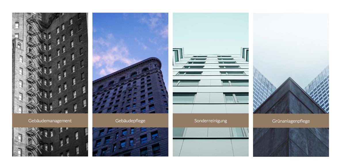
I want to use a background image for the four images like in this example:
How can I do it? The resolution should be responsive so I can't use the crop tool to cut the image.
I am using four divs to display some services:
I want to use a background image for the four images like in this example:
How can I do it? The resolution should be responsive so I can't use the crop tool to cut the image.
Here is the updated Demo
it's actually a play with position: absolute. the example site you are given also doing the same way. its actually <img> tag, not background
here is the Code:
.container{
 max-width: 600px;
 position: absolute;
 top: 10px;
}
img{
 max-width: 600px;
}
.divider{
 width: 10px;
 position: absolute;
 top: 0px;
 height: 100%;
 background: white;
}
.one{
 left: 150px;
}
.two{
 left: 300px;
}
.three{
 left: 450px;
}
<div class="container">
<img src="https://static.wixstatic.com/media/b2c0a7_a44d01e99b665e19effb29e4fc36ded3.jpg/v1/fill/w_880,h_500,al_c,q_85/b2c0a7_a44d01e99b665e19effb29e4fc36ded3.jpg" alt="">
<div class="divider one"></div>
<div class="divider two"></div>
<div class="divider three"></div>
</div>
For responsive images i would suggest you to try bootstrap :
http://www.w3schools.com/bootstrap/bootstrap_images.asp
<img class="img-responsive" src="img_chania.jpg" alt="Chania">Or you can use css to do it, follow the link : http://www.w3schools.com/css/css_rwd_images.asp
In that example, the divs are transparent and let a background image shine through.
Imagine you have four windows. You put one huge picture behind them all. That's what these are.
You can do some more research on the value "background: transparent" to get experience.
Just helped perhaps you can use this method
*,:before,:after {
  -webkit-box-sizing: border-box;
  -moz-box-sizing: border-box;
  box-sizing: border-box;
}

.container {
  width: 100%;
  position: relative;
  display: inline-block;
  height: 400px;
}

.container img {
  position: absolute;
  top: 0;
  left: 0;
  right: 0;
  width: 100%;
  height: 100%;
}

.divider {
  width: 25%;
  border: 10px solid #fff;
  position: relative;
  display: inline-block;
  float: left;
  top: 0px;
  height: 100%;
}

.btn {
  background: green;
  color: white;
  width: 100%;
  position: absolute;
  bottom: 3em;
  padding: 1em;
  text-align: center;
  text-decoration: none;
}
<div class="container">
<img src="https://static.wixstatic.com/media/b2c0a7_a44d01e99b665e19effb29e4fc36ded3.jpg/v1/fill/w_880,h_500,al_c,q_85/b2c0a7_a44d01e99b665e19effb29e4fc36ded3.jpg" alt="">
<div class="divider one"><a class="btn" href="#">Button</a></div>
<div class="divider two"><a class="btn" href="#">Button</a></div>
<div class="divider three"><a class="btn" href="#">Button</a></div>
<div class="divider four"><a class="btn" href="#">Button</a></div>
</div>
Here is a much more responsive solution. It has responsive divs (columns and banners) and background. Unlike the example website, the container is not a fixed width.
https://jsfiddle.net/Lqzqo5xf/
You can also set the container to be a fixed width when the screen is shrunk to a certain size by applying the min-width property to the .wrapper class.
Like in the example you gave, it requires divs for the dividers (white columns) and a separate container overlapping the container with the background. It also uses absolute positioning for the dividers, but instead uses percentages for responsiveness.
.wrapper {
  width: 100%;
  height:400px;
  margin:0;
  padding:0;
  position: absolute;
  top:0;
  left:0;
}

#bg-wrapper {
  background-image: url('http://www.gstatic.com/webp/gallery/1.jpg');
  background-size: cover; /** Also try "contain" **/
}

.banner {
  float: left;
  margin-top: 70px;
  width: 25%;
  height: 50px;
  background-color: rgba(0,0,0,0.7);
  vertical-align:middle;
  text-align: center;
  color:white;
}

.divider {
  position: absolute;
  width:2%;
  height: 100%;
  background-color: white;
  margin: 0 0 0 -1%;
  padding: 0;
}
<div class="wrapper" id="bg-wrapper">
<div class="banner">
<h4>
willkommen
</div>
<div class="banner">
<h4>
willkommen
</div>
<div class="banner">
<h4>
willkommen
</div>
<div class="banner">
<h4>
willkommen
</div>
</div>
<div class="wrapper">
<div class="divider" style="left:25%;">
</div>
<div class="divider" style="left: 50%;">
</div>
<div class="divider" style="left:75%;">
</div>
</div>
New front-end-er here. How might this problem be tackled if you have a grid (or are using flex-box) for multiple items and want to use border radius? The divider solutions above, though smart- won't do. I have tried to solve using multiple layers absolutely positioned on top of each other, z-index and also background-clip and background-color: transparent. In my code, I left the top layer grid-items without border-radius, just to show the positioning of the two layers. Nothing seems to work if you want white space around the grid-items.
  body {
            position: relative;
            display: flex;
            justify-content: center;
            align-items: center;
            height: 100vh;
        }

        .container-bottom-layer {
            position: absolute;
            display: grid;
            grid: auto-flow / 1fr 1fr 1fr;
            background-image: linear-gradient(90deg, yellow, purple);
            border-radius: 15px;
            padding: 20px;
            border: 1px solid black;
            z-index: 1;
        }

        .container-item-bottom {
            margin: 15px;
            width: 100px;
            height: 100px;
            border: 1px solid black;
            border-radius: 10px;
        }

        .container-top-layer {
            position: absolute;
            display: grid;
            grid: auto-flow / 1fr 1fr 1fr;

            background-color: white;
            padding: 15px;

            /* background-clip: padding-box; */
            /* background-clip: padding-box; */
            /* -webkit-background-clip: padding-box; */
            /* color: transparent; */

            /*z-index: 1;*/
        }

        .container-item-top {
            margin: 15px;
            width: 100px;
            height: 100px;
            border: 1px solid black;

            /* background-clip: content-box; */
            /* -webkit-background-clip: content-box; */
            background-color: transparent;

            z-index: 2;
        }
<!DOCTYPE html>
<html lang="en">
<head>
<meta charset="UTF-8">
<meta name="viewport" content="width=device-width, initial-scale=1.0">
<title>Document</title>
</head>
<body>
<div class="container-bottom-layer">
<div class="container-item-bottom"></div>
<div class="container-item-bottom"></div>
<div class="container-item-bottom"></div>
<div class="container-item-bottom"></div>
<div class="container-item-bottom"></div>
<div class="container-item-bottom"></div>
<div class="container-item-bottom"></div>
<div class="container-item-bottom"></div>
<div class="container-item-bottom"></div>
</div>
<div class="container-top-layer">
<div class="container-item-top"></div>
<div class="container-item-top"></div>
<div class="container-item-top"></div>
<div class="container-item-top"></div>
<div class="container-item-top"></div>
<div class="container-item-top"></div>
<div class="container-item-top"></div>
<div class="container-item-top"></div>
<div class="container-item-top"></div>
</div>
</body>
</html>