A usual mobile responsive site would contain a HTML meta tag in the head like the following:
<meta name="viewport" content="width=device-width, initial-scale=1">
Within the tag the width property controls the size of the viewport. It can be set either to a precise number of pixels like width=400 or to the special value device-width value which is the width of the screen in CSS pixels at a scale of 100%. device-width is the most commonly used width for responsive websites that scale across different screen sizes.
When the page is first loaded the initial-scale property controls the initial zoom level ie 1 Viewport pixel = 1 CSS pixel. User-scalable, maximum-scale and minimum-scale properties control how the user is able to zoom the page in or out.
You could setup an example html page and include the viewport tag and change the initial-scale attribute to see the difference. Also try viewing the page on different viewport sizes and orientation.
initial-scale: The initial zoom when visiting the page. 1.0 does not zoom.
To answer what initial-scale=2.0 means here is an example of using 2.0:

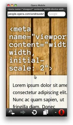
In addition to the above, you may want to specify the initial zoom factor for the viewing area. If you want to set the viewport of your page to be equal to the device’s width and have it zoom in by default with a factor of 2 for example, this property will come in handy. The code for that would look as follows:.
The Image above shows what this would look like — although it is not a particularly practical demonstration of the possibilities the initial scale setting has to offer, the underlying point should be clear: content is blown up with a factor of 2 upon first load.
https://dev.opera.com/articles/an-introduction-to-meta-viewport-and-viewport/#initial-scale
Some good references to checkout:
https://css-tricks.com/snippets/html/responsive-meta-tag/
https://css-tricks.com/probably-use-initial-scale1/