6

this is a problem with white spaces: I have multiple, float:left elements, that I need arranged in 2 columns, and, they all have different heights.

CSS multiple different height float left elements arranged in 2 columns

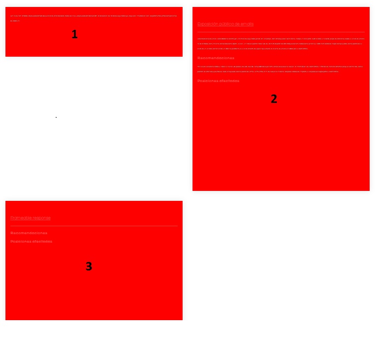
To make it easier, I need the element 3 in the picture, to be right after the element 1. Keeping the padding of course.

I'm 100% using Plain, let's say Vainilla CSS, and AngularJS. I would like to avoid to use any JS modules as the elements are being loaded and re-loaded almost permantly. Most important: 100% need to avoid Jquery.

important update:

Cannot use float:left, float:right approch (if child even or odd): Float multiple fixed-width / varible-height boxes into 2 columns

important update:

In some cases I do require to apply 2 elements, only, one at the bottom of the other. So I'm looking to apply a property to the element 1.

Community
  • 1
  • 1
Chris Russo
  • 450
  • 1
  • 7
  • 21

1 Answers1

7

Use css flex layout with a column direction. You can read a very good explanation from CSSTricks: https://css-tricks.com/snippets/css/a-guide-to-flexbox/

Or use a masonry approach with column css property:

#container {
    width: 100%;
    max-width: 700px;
    margin: 2em auto;
}
.cols {
    -moz-column-count:3;
    -moz-column-gap: 3%;
    -moz-column-width: 30%;
    -webkit-column-count:3;
    -webkit-column-gap: 3%;
    -webkit-column-width: 30%;
    column-count: 3;
    column-gap: 3%;
    column-width: 30%;
}
.box {
    margin-bottom: 20px;
}
.box.one {
    height: 200px;
    background-color: #d77575;
}
.box.two {
    height: 300px;
    background-color: #dcbc4c;
}
.box.three {
    background-color: #a3ca3b;
    height: 400px;
}
.box.four {
    background-color: #3daee3;
    height: 500px;
}
.box.five {
    background-color: #bb8ed8;
    height: 600px;
}
.box.six {
    background-color: #baafb1;
    height: 200px;
}
<div id="container" class="cols">
    <div class="box one"></div>
    <div class="box two"></div>
    <div class="box one"></div>
    <div class="box three"></div>
    <div class="box two"></div>
    <div class="box five"></div>
    <div class="box one"></div>
    <div class="box two"></div>
    <div class="box six"></div>
    <div class="box three"></div>
    <div class="box two"></div>
</div>
Jorgeblom
  • 3,330
  • 1
  • 23
  • 24
  • I'm curious about how you resolve it with flex. Please give an example. – Al Foиce ѫ Aug 31 '16 at 10:06
  • Actually you are right, with flex the order would not be the same, because it will end first column before starting second. – Jorgeblom Aug 31 '16 at 10:13
  • I couldn't solve it with flex, defining the container element as flex, solves the problem by making all the elements of the same height... not what i need. – Chris Russo Aug 31 '16 at 10:15
  • This snippet might actually work. – Chris Russo Aug 31 '16 at 10:16
  • I'm having again the same problem... might it be related with angular ng-bind? it's making all the divs the same height – Chris Russo Aug 31 '16 at 10:32
  • 1
    100% different behaviour between Firefox 48.0.2 and Chrome. In Chrome works more like expected, but breaks the divs anywhere it wants to create the 3 columns, as it can be seen on the last left div of the example. – Chris Russo Aug 31 '16 at 10:37
  • In Firefox, either way, doesn't work as expected, or doesn't work in combination with angularJs ng-binding functions. – Chris Russo Aug 31 '16 at 10:37
  • I know I'm late but if still needed, to avoid this cells being cut, check https://stackoverflow.com/a/58425109/6217195 - using "page-break-inside: avoid" solved my issue. – Rodrigo.A92 Dec 17 '19 at 13:48