I am a beginner in ggplot2. I am unable to use date_minor_breaks to show quarterly "ticks" on x-axis.
Here's my code:
x<-c(seq(1:12))
time<-c("2010Q1","2010Q2","2010Q3","2010Q4","2011Q1","2011Q2", "2011Q3","2011Q4","2012Q1","2012Q2","2012Q3","2012Q4")
z<-data.frame(type = x,time = time)
z$time = as.yearqtr(z$time)
z$time = as.Date(z$time)
ggplot(data = z, aes(x=time,y=type)) +
geom_point() +
scale_x_date(date_labels = "%Y",date_minor_breaks = "3 months",name = "Year") +
theme_tufte() +
theme(legend.position = "none")
I researched this topic on SO Formatting dates with scale_x_date in ggplot2 and on https://github.com/hadley/ggplot2/issues/542, and found that there were some issues reported on this topic. However, I didn't quite follow the conversation about changes to ggplot2 because it's been only 6 days since I started using ggplot2.
Here's the graph I got (it doesn't have any ticks)...
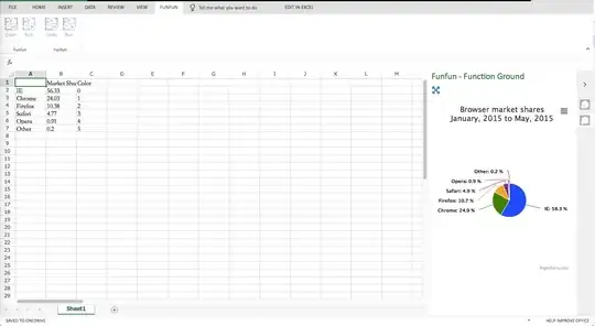
Here's a sample graph with "tick marks" generated from Excel. Please ignore values because my point of creating this Excel chart is to demonstrate what I am looking for--i.e. "quarterly ticks". I'd appreciate your help.


