1

I would like to use multiple geom_smooth layers in a single ggplot2 chart. When I try to do that, the color scheme gets screwed up. Here is an example demonstrating what is happening.

We construct a simple dataframe we want to visualize.

df = data.frame(x = c("a", "b", "c"),
             y1 = seq(1, 3),
             y1_upr = seq(2, 4),
             y1_lwr = seq(0, 2),
             y2 = seq(2, 4),
             y2_upr = seq(2.5, 4.5),
             y2_lwr = seq(1.5, 3.5))

We can visualize y1 and y2 easily.

plot_obj = ggplot(data = df, aes(x = x, group = 1)) + 
  geom_line(aes(y = y1, colour = "y1")) + 
  geom_line(aes(y = y2, colour = "y2")) +     
  scale_colour_manual("", breaks = c("y1", "y2"), values = c("blue", "red"))
plot_obj

enter image description here If we add one geom_smooth, the behavior is still as expected.

plot_obj + 
  geom_smooth(aes(y = y1, ymin = y1_lwr, ymax = y1_upr), stat="identity", fill="blue", alpha=0.2)
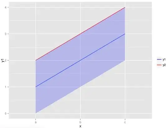
enter image description here Lastly, we add the second geom_smooth layer.

plot_obj + 
  geom_smooth(aes(y = y1, ymin = y1_lwr, ymax = y1_upr), stat="identity", fill="blue", alpha=0.2) + 
  geom_smooth(aes(y = y2, ymin = y2_lwr, ymax = y2_upr), stat="identity", fill="red", alpha=0.2)

enter image description here

Notice that the top line is no longer red in the last chart. Why is this happening and how can it be fixed? Thank you!


Caner
  • 678
  • 2
  • 8
  • 11
  • 1
    reshape your data, and add a grouping variable – user20650 Sep 07 '16 at 22:09
  • the `melt` answer gives the idea http://stackoverflow.com/questions/3777174/plotting-two-variables-as-lines-using-ggplot2-on-the-same-graph – user20650 Sep 07 '16 at 22:10
  • 1
    `geom_smooth` draws blue lines. So you'd need to use `color = "red"` in the `geom_smooth` layer if you want to add separate layers like this. You would have noticed it in both layers if one of your lines didn't happen to be blue. – aosmith Sep 07 '16 at 22:16
  • 2
    You can use `color=NA` to turn off the lines drawn by `geom_smooth` which is over-plotting your first lines. Or you can change the order of the layers (smooth first, then line). These are just other ways to solve the problem pointed out by @aosmith. (Although reshaping is a better long term strategy in my opinion.) – MrFlick Sep 07 '16 at 22:21

2 Answers2

5

Certainly reshaping your dataset will make things easier, and is the recommended approach. However, if you want to keep using separate layers:

As you haven't mapped a color for geom_smooth, it uses the default color of blue for the smoothed lines it drew. If you want just the ribbon, use geom_ribbon instead.

ggplot(data = df, aes(x = x, group = 1)) + 
    geom_line(aes(y = y1, colour = "y1")) + 
    geom_line(aes(y = y2, colour = "y2")) +     
    scale_colour_manual("", breaks = c("y1", "y2"), values = c("blue", "red")) +
    geom_ribbon(aes(ymin = y1_lwr, ymax = y1_upr), stat="identity", fill="blue", alpha=0.2) + 
    geom_ribbon(aes(ymin = y2_lwr, ymax = y2_upr), stat="identity", fill="red", alpha=0.2)

enter image description here

Otherwise you'll need to map your colors for each smooth layer within aes or set them manually to red and blue or NA outside of aes.

ggplot(data = df, aes(x = x, group = 1)) + 
    geom_line(aes(y = y1, colour = "y1")) + 
    geom_line(aes(y = y2, colour = "y2")) +     
    scale_colour_manual("", breaks = c("y1", "y2"), values = c("blue", "red")) +
    geom_smooth(aes(y = y1, ymin = y1_lwr, ymax = y1_upr, colour = "y1"), 
              stat="identity", fill="blue", alpha=0.2) + 
    geom_smooth(aes(y = y2, ymin = y2_lwr, ymax = y2_upr, colour = "y2"), 
              stat="identity", fill="red", alpha=0.2)

enter image description here

aosmith
  • 34,856
  • 9
  • 84
  • 118
3

I would probably do something closer to this:

library(dplyr)
df1 <- df %>%
    select(x,contains("y1")) %>%
    rename(y = y1, y_upr = y1_upr, y_lwr = y1_lwr) %>%
    mutate(grp = "y1")
df2 <- df %>%
    select(x,contains("y2")) %>%
    rename(y = y2, y_upr = y2_upr, y_lwr = y2_lwr) %>%
    mutate(grp = "y2")
df_all <- bind_rows(df1, df2)

ggplot(df_all,aes(x = x, y = y, ymin = y_lwr, ymax = y_upr, group = grp)) +
    geom_line(aes(color = grp)) + 
    geom_ribbon(aes(fill = grp), alpha = 0.2)

enter image description here

PatrickT
  • 10,037
  • 9
  • 76
  • 111
joran
  • 169,992
  • 32
  • 429
  • 468