JUSTIFY CONTENT
You are looking for the property value flex-end used in justify-content. Also remove the margin-left: auto; as it is not needed.
body {
  margin: 0;
  padding: 0;
  font-family: 'Helvetica Neue', Helvetica, Arial, sans-serif;
}
#menuStrip {
  position: relative;
  border-style: solid;
  border-width: 1px;
  height: 36px;
  padding: 0;
  margin: 0;
  background-color: black;
}
#menuContainer {
  position: relative;
  background-color: grey;
  border-style: solid;
  border-width: 1px;
  padding: 0;
  width: 96%;
  height: 98%;
  margin: 0 auto;
  display: flex;
  justify-content: flex-end;
}
#hh {
  position: relative;
  display: flex;
  align-self: center;
  font-size: 14px;
  width: 80px;
  border-style: solid;
  border-width: 1px;
  height: 50%;
}
#pp {
  position: relative;
  display: flex;
  height: 70%;
  width: 36px;
  align-self: center;
  justify-content: center;
  background-color: white;
  border-style: solid;
  border-width: 1px;
  padding: 0;
}
<div id="menuStrip">
  <div id="menuContainer">
    <div id="hh">Help</div>
    <div id="pp">XX</div>
  </div>
ORDER
To change the ordering like you ask in the comments, you will use the property order. It's pretty straight forward. The order default value of flex-items is 0. You can either use negative or positive values, such as -1, -2, 1, 2 etc.
You can either set this property in your first or second item, with different values depending which you prefer to change, they will both get the same result.
Declaring it in your first item using a positive value:
body {
  margin: 0;
  padding: 0;
  font-family: 'Helvetica Neue', Helvetica, Arial, sans-serif;
}
#menuStrip {
  position: relative;
  border-style: solid;
  border-width: 1px;
  height: 36px;
  padding: 0;
  margin: 0;
  background-color: black;
}
#menuContainer {
  position: relative;
  background-color: grey;
  border-style: solid;
  border-width: 1px;
  padding: 0;
  width: 96%;
  height: 98%;
  margin: 0 auto;
  display: flex;
  justify-content: flex-end;
}
#hh {
  position: relative;
  display: flex;
  align-self: center;
  font-size: 14px;
  width: 80px;
  border-style: solid;
  border-width: 1px;
  height: 50%;
  order: 1;
}
#pp {
  position: relative;
  display: flex;
  height: 70%;
  width: 36px;
  align-self: center;
  justify-content: center;
  background-color: white;
  border-style: solid;
  border-width: 1px;
  padding: 0;
}
<div id="menuStrip">
  <div id="menuContainer">
    <div id="hh">Help</div>
    <div id="pp">XX</div>
  </div>
Declaring it in the second one using a negative value:
body {
  margin: 0;
  padding: 0;
  font-family: 'Helvetica Neue', Helvetica, Arial, sans-serif;
}
#menuStrip {
  position: relative;
  border-style: solid;
  border-width: 1px;
  height: 36px;
  padding: 0;
  margin: 0;
  background-color: black;
}
#menuContainer {
  position: relative;
  background-color: grey;
  border-style: solid;
  border-width: 1px;
  padding: 0;
  width: 96%;
  height: 98%;
  margin: 0 auto;
  display: flex;
  justify-content: flex-end;
}
#hh {
  position: relative;
  display: flex;
  align-self: center;
  font-size: 14px;
  width: 80px;
  border-style: solid;
  border-width: 1px;
  height: 50%;
}
#pp {
  position: relative;
  display: flex;
  height: 70%;
  width: 36px;
  align-self: center;
  justify-content: center;
  background-color: white;
  border-style: solid;
  border-width: 1px;
  padding: 0;
  order: -1;
}
<div id="menuStrip">
  <div id="menuContainer">
    <div id="hh">Help</div>
    <div id="pp">XX</div>
  </div>
Simple order change interaction:
Note: Clicking the anchor element will change every odd flex item's order to -1.
body {
  margin: 0;
}
a {
  font-size: 2em;
  position: absolute;
  top: 30%;
  left: 50%;
  transform: translate(-50%, -30%);
  background-color: white;
}
.flex-container {
  counter-reset: flex-items;
  height: 100vh;
  background-color: peachpuff;
  display: flex;
  justify-content: space-around;
  /* Default Value */
}
.flex-item {
  counter-increment: flex-items;
  background-color: gold;
}
.flex-item:nth-child(even) {
  background-color: dodgerblue;
}
.flex-item::after {
  content: counter(flex-items);
  display: flex;
  justify-content: center;
  align-items: center;
  height: 100%;
  font-size: 3em;
}
.flex-container:target .flex-item:nth-child(odd) {
  order: -1;
}
<a href="#flex-container">Change Order</a>
<section id="flex-container" class="flex-container">
  <div class="flex-item"></div>
  <div class="flex-item"></div>
  <div class="flex-item"></div>
  <div class="flex-item"></div>
  <div class="flex-item"></div>
  <div class="flex-item"></div>
  <div class="flex-item"></div>
  <div class="flex-item"></div>
  <div class="flex-item"></div>
</section>
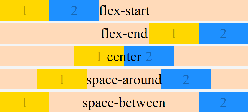
FURTHER EXPLANATION:
justify-content property accepts 5 different values:
- flex-start, which is the default.
- flex-end
- center
- space-between
- space-around
flex-start
body{
  margin: 0;
}
.flex-container {
  counter-reset: flex-items;
  height: 100vh;
  background-color: peachpuff;
  display: flex;
  justify-content: flex-start; /* Default Value */
}
.flex-item {
  counter-increment: flex-items;
  flex: 0 0 30%;
  background-color: gold;
}
.flex-item:nth-child(even) {
  background-color: dodgerblue;
}
.flex-item::after {
  content: counter(flex-items);
  display: flex;
  justify-content: center;
  align-items: center;
  height: 100%;
  font-size: 3em;
}
<section class="flex-container">
  <div class="flex-item"></div>
  <div class="flex-item"></div>
</section>
flex-end
body{
  margin: 0;
}
.flex-container {
  counter-reset: flex-items;
  height: 100vh;
  background-color: peachpuff;
  display: flex;
  justify-content: flex-end;
}
.flex-item {
  counter-increment: flex-items;
  flex: 0 0 30%;
  background-color: gold;
}
.flex-item:nth-child(even) {
  background-color: dodgerblue;
}
.flex-item::after {
  content: counter(flex-items);
  display: flex;
  justify-content: center;
  align-items: center;
  height: 100%;
  font-size: 3em;
}
<section class="flex-container">
  <div class="flex-item"></div>
  <div class="flex-item"></div>
</section>
center
body{
  margin: 0;
}
.flex-container {
  counter-reset: flex-items;
  height: 100vh;
  background-color: peachpuff;
  display: flex;
  justify-content: center;
}
.flex-item {
  counter-increment: flex-items;
  flex: 0 0 30%;
  background-color: gold;
}
.flex-item:nth-child(even) {
  background-color: dodgerblue;
}
.flex-item::after {
  content: counter(flex-items);
  display: flex;
  justify-content: center;
  align-items: center;
  height: 100%;
  font-size: 3em;
}
<section class="flex-container">
  <div class="flex-item"></div>
  <div class="flex-item"></div>
</section>
space-between
body{
  margin: 0;
}
.flex-container {
  counter-reset: flex-items;
  height: 100vh;
  background-color: peachpuff;
  display: flex;
  justify-content: space-between;
}
.flex-item {
  counter-increment: flex-items;
  flex: 0 0 30%;
  background-color: gold;
}
.flex-item:nth-child(even) {
  background-color: dodgerblue;
}
.flex-item::after {
  content: counter(flex-items);
  display: flex;
  justify-content: center;
  align-items: center;
  height: 100%;
  font-size: 3em;
}
<section class="flex-container">
  <div class="flex-item"></div>
  <div class="flex-item"></div>
</section>
space-around
body{
  margin: 0;
}
.flex-container {
  counter-reset: flex-items;
  height: 100vh;
  background-color: peachpuff;
  display: flex;
  justify-content: space-around;
}
.flex-item {
  counter-increment: flex-items;
  flex: 0 0 30%;
  background-color: gold;
}
.flex-item:nth-child(even) {
  background-color: dodgerblue;
}
.flex-item::after {
  content: counter(flex-items);
  display: flex;
  justify-content: center;
  align-items: center;
  height: 100%;
  font-size: 3em;
}
<section class="flex-container">
  <div class="flex-item"></div>
  <div class="flex-item"></div>
</section>
SUMMARY:
* {
  box-sizing: border-box;
}
body {
  margin: 0;
}
.flex-container {
  counter-reset: flex-items;
  background-color: peachpuff;
  display: flex;
  height: calc(20vh - .5em);
  justify-content: flex-start;
  margin-bottom: .5em;
  position: relative;
}
.flex-container:nth-child(2) {
  justify-content: flex-end;
}
.flex-container:nth-child(3) {
  justify-content: center;
}
.flex-container:nth-child(4) {
  justify-content: space-around;
}
.flex-container:nth-child(5) {
  justify-content: space-between;
}
.flex-container::after {
  position: absolute;
  display: flex;
  content: attr(data-justify-content);
  justify-content: center;
  align-items: center;
  height: 100%;
  width: 100%;
  font-size: 3em;
}
.flex-item {
  counter-increment: flex-items;
  flex: 0 0 20%;
  background-color: gold;
}
.flex-item:nth-child(even) {
  background-color: dodgerblue;
}
.flex-item::after {
  content: counter(flex-items);
  display: flex;
  justify-content: center;
  align-items: center;
  height: 100%;
  font-size: 3em;
  color: rgba(0, 0, 0, .3);
}
<section class="flex-container" data-justify-content="flex-start">
  <div class="flex-item"></div>
  <div class="flex-item"></div>
</section>
<section class="flex-container" data-justify-content="flex-end">
  <div class="flex-item"></div>
  <div class="flex-item"></div>
</section>
<section class="flex-container" data-justify-content="center">
  <div class="flex-item"></div>
  <div class="flex-item"></div>
</section>
<section class="flex-container" data-justify-content="space-around">
  <div class="flex-item"></div>
  <div class="flex-item"></div>
</section>
<section class="flex-container" data-justify-content="space-between">
  <div class="flex-item"></div>
  <div class="flex-item"></div>
</section>
MORE INFO:
You can find more info in these resources:
Codrops
CSS Tricks
Flexbox Cheatsheet
Stack Overflow Michael_B's Flexbox Post
Playground:
Flexbox Froggy