33

ng-animate-ref allows to create a transition from one dom node to another.

ng-animate uses all the css styles like position, font-size, font-color and more from the first dom element and the second dom element and creates a css 3 animation to move the element from state a to state b.

This is exactly what I need but unfortunately I can't use Angular 1 in the current project.

Is there any reusable way to achieve the same css3 animation without moving all styles from my css files to javascript?

To illustrate the problem please see the following example. As you can see the example has no custom javascript animation code at all but only javascript code which handles the state logic switching elements from list a to b.

The animation definition is written in pure css.

Demo:
https://codepen.io/jonespen/pen/avBZpO/

Preview:
Preview of the demo

jantimon
  • 36,840
  • 23
  • 122
  • 185
  • 2
    I made something somewhat similar to what you want [here](https://codepen.io/anon/pen/jrBvzw/) using vanilla jQuery. I used [this post](//stackoverflow.com/a/9893707/2280779) to make it. It doesn't have everything that you want (such as color fade and the center items moving out of the way) but it's not a bad 80/20 solution. I'll spend some more time on it tomorrow. – Danman Sep 25 '16 at 06:59
  • 1
    @Danman maybe http://stackoverflow.com/questions/4493449/copy-all-styles-from-one-element-to-another#comment37500602_4494603 might help but I would prefer a library with unit tests over a quick jquery snippet.. – jantimon Sep 25 '16 at 08:31
  • 1
    That does help a bit but even with that it wouldn't achieve perfect parity with what you want. It seems as if it's doing some css animation wizardry to achieve that exact effect. I couldn't find any libraries that have that kind of functionality out of the box but it's definitely something you could build yourself using a standard DOM animation library such as jQuery Animate in probably under 200 lines of code. – Danman Sep 26 '16 at 03:03
  • 11
    Questions asking us to **recommend or find a book, tool, software library, tutorial or other off-site resource are off-topic** for Stack Overflow as they tend to attract opinionated answers and spam. Instead, describe the problem and what has been done so far to solve it. – Makyen Sep 26 '16 at 22:16
  • The animation image shows that it is Jquery ui dragable! – SaidbakR Sep 27 '16 at 13:18
  • 4
    @jantimon Can you include what you have tried to solve the issue at Question? _"but I would prefer a library with unit tests over a quick jquery snippet"_ Why would a library be needed to achieve requirement? Though if using a library is a requirement, why would using jQuery to return expected result not be applicable? – guest271314 Sep 28 '16 at 23:38
  • What is your definition of `pure animation library` ? ... have you tried velocityjs http://velocityjs.org/ ? Do you require a full solution without Angular at all? – JFK Oct 01 '16 at 20:15
  • @Makyen thanks for trolling.. I removed the word library - hopefully the question fits your needs now .. – jantimon Oct 03 '16 at 10:46
  • @guest271314 I am looking for a reusable way not for a one time hack. Similar to angular-animate. As you can see in the codepen there is no NG-Animate javascript code at all so it doesn't know much about this certain example it just allows to use css3 animation and fills the gaps in between automatically. Is this also possible with jQuery? – jantimon Oct 03 '16 at 10:50
  • @martijn-pieters can you please reopen the edited question? – jantimon Oct 03 '16 at 10:55
  • @jantimon: done; thanks for updating the question. – Martijn Pieters Oct 03 '16 at 11:01
  • @jantimon _" There is no javascript animation code at all but only javascript code which changes the state from a to b. The animation logic is written in pure css."_ Are you sure about this? _"I am looking for a reusable way not for a one time hack."_ Not certain what you mean? You can adjust `css`, `javascript` in any way which you decide. IMVHO it would be a travesty to not award bounty, or since bounty is now expired, accepted answer, to @TTCC – guest271314 Oct 03 '16 at 14:31
  • 2
    @jantimon In the meantime, no "pure `css`" approaches appear at Question demonstrating where you have tried to resolve own Question? – guest271314 Oct 03 '16 at 14:38
  • @guest271314 of cause see the codepen in the question - it has no animation javascript.. My problem is way more complicated than in the simplified lists example from my question - so I am looking for a good way to solve it not for a jQuery animate example – jantimon Oct 03 '16 at 17:09
  • @jantimon _"it has no animation javascript"_ There is `javascript` used as part of approach to achieve animation. _"My problem is way more complicated than in the simplified lists example from my question - so I am looking for a good way to solve it not for a jQuery animate example"_ You should post a Question describing your actual issue, and the attempts which you have made to solve issue. Presently, there do not appear any attempts to solve own issue, other than codepen. – guest271314 Oct 03 '16 at 22:53
  • @jantimon http://chat.stackoverflow.com/rooms/124953/room-for-guest271314-and-jantimon – guest271314 Oct 05 '16 at 02:58

5 Answers5

18

Of course, jQuery animate can achieve it without any plugins.

Maybe there are not many lines of code, but they do have some complexity.

Here is what you want ( ps: jquery-ui only use to change color ).

$(document).ready(function() {
  var animating = false,
    durtion = 300;
  $('.items').on("click", ".items-link", function() {
    if (animating) return;
    animating = true;
    var $this = $(this),
      dir = $this.parent().hasClass("items-l") ? "r" : "l",
      color = dir == "l" ? "#0000FF" : "#F00000",
      index = $this.attr("data-index");

    var toItems = $('.items-' + dir),
      itemsLinks = toItems.find(".items-link"),
      newEle = $this.clone(true),
      nextEle = $this.next(),
      toEle;

    if (itemsLinks.length == 0) {
      toItems.append(newEle)
    } else {
      itemsLinks.each(function() {
        if ($(this).attr("data-index") > index) {
          toEle = $(this);
          return false;
        }
      });
      if (toEle) {
        toEle.before(newEle).animate({
          "marginTop": $this.outerHeight()
        }, durtion, function() {
          toEle.css("marginTop", 0);
        });
      } else {
        toEle = itemsLinks.last();
        toEle.after(newEle)
      }
    }

    nextEle && nextEle.css("marginTop", $this.outerHeight())
      .animate({
        "marginTop": 0
      }, durtion);

    var animate = newEle.position();
    animate["background-color"] = color;
    newEle.hide() && $this.css('position', 'absolute')
      .animate(animate, durtion, function() {
        newEle.show();
        $this.remove();
        animating = false;
      });
  });
});
.items {
  padding: 0;
  -webkit-transition: 300ms linear all;
  transition: 300ms linear all;
}
.items.items-l {
  float: left
}
.items.items-r {
  float: right
}
.items.items-l a {
  background: #0000FF
}
.items.items-r a {
  background: #F00000
}
.items a,
.items-link {
  color: #fff;
  padding: 10px;
  display: block;
}
.main {
  width: 100%;
}
<script type="text/javascript" src="//code.jquery.com/jquery-1.9.1.js">
</script>
<script type="text/javascript" src="//code.jquery.com/ui/1.9.2/jquery-ui.js">
</script>
<link rel="stylesheet" type="text/css" href="//code.jquery.com/ui/1.9.2/themes/base/jquery-ui.css">
<div class="main">
  <div class="items items-l">
    <a class="items-link" data-index="1" href="#">Item 1</a>
    <a class="items-link" data-index="2" href="#">Item 2</a>
    <a class="items-link" data-index="3" href="#">Item 3</a> 
    <a class="items-link" data-index="4" href="#">Item 4</a>
    </div>
    <div class="items items-r">
      <a href="#" class="items-link" data-index="5">Item 5</a>
      <a href="#" class="items-link" data-index="6">Item 6</a>
      <a href="#" class="items-link" data-index="7">Item 7</a>
      <a href="#" class="items-link" data-index="8">Item 8</a>
  </div>
  
Sᴀᴍ Onᴇᴌᴀ
  • 8,218
  • 8
  • 36
  • 58
TTCC
  • 935
  • 5
  • 12
  • I would like to keep the styles in css and not move them into javascript. Is this also possible? And is it possible without adding the entire jquery and jquery ui library? I also would prefer css3 animations over js animation.. just like in the codepen example – jantimon Oct 03 '16 at 10:48
  • @jantimon The original Question did not mention requirement was to use only `css`? In fact, are you sure that `javascript` is not used at the linked codepen which demonstrates expected effect? – guest271314 Oct 03 '16 at 14:33
  • It uses javascript only for the state logic not for the animation logic. This is what I am trying to achieve as well but without Angular 1 – jantimon Oct 03 '16 at 17:10
  • @jantimon _"It uses javascript only for the state logic not for the animation logic."_ What do you mean by "state logic" ? How do `.push()`, `.splice()` and `.indexOf()` affect "state logic"? _"also would prefer css3 animations over js animation.. just like in the codepen example"_ See right panel at codepen; the example at Question itself uses `javascript`. Can you include the attempts which you have made to solve Question using only `css`? – guest271314 Oct 03 '16 at 22:56
  • @guest271314 It feels to me that you are not trying to help but only trying to tell me that I am wrong. TTCC received already 120 reputation for his great answer but it is not what I was looking for. If you really looking for a constructive discussion ping me at http://chat.stackoverflow.com/rooms/17/javascript – jantimon Oct 04 '16 at 06:58
  • Hi, @jantimon, actually your example has many javascript animation logic which just have been done by Angular. You can't avoid using javascript to control styles and calculate new position value. – TTCC Oct 10 '16 at 03:57
  • @TTCC that's true but I would prefer to abstract it according to the SoC principle. What I mean is that there is no custom animation code. – jantimon Oct 10 '16 at 10:12
9

A plain javascript solution that uses:

  • HTMLElement.getBoundingClientRect to find differences between the old and new positions of element
  • css transition to animate
  • css transform to translate

Explanation of approach:

The core idea is to have the browser only calculate/reflow the DOM once. We'll take care of the transition between the initial state and this new one ourselves.

By only transitioning (a) the GPU accelerated transform property, on (b) a small selection of elements (all <li> elements), we'll try to ensure a high frame rate.

// Store references to DOM elements we'll need:
var lists = [
  document.querySelector(".js-list0"),
  document.querySelector(".js-list1")
];
var items = Array.prototype.slice.call(document.querySelectorAll("li"));

// The function that triggers the css transitions:
var transition = (function() { 
  var keyIndex = 0,
      bboxesBefore = {},
      bboxesAfter = {},
      storeBbox = function(obj, element) {
        var key = element.getAttribute("data-key");
        if (!key) {
          element.setAttribute("data-key", "KEY_" + keyIndex++);
          return storeBbox(obj, element);
        }
        
        obj[key] = element.getBoundingClientRect();
      },
      storeBboxes = function(obj, elements) {
        return elements.forEach(storeBbox.bind(null, obj));
      };
  
  // `action` is a function that modifies the DOM from state *before* to state *after*
  // `elements` is an array of HTMLElements which we want to monitor and transition
  return function(action, elements) {
    if (!elements || !elements.length) {
      return action();
    }
    
    // Store old position
    storeBboxes(bboxesBefore, elements);
    
    // Turn off animation
    document.body.classList.toggle("animated", false);
    
    // Call action that moves stuff around
    action();
    
    // Store new position
    storeBboxes(bboxesAfter, elements);
    
    // Transform each element from its new position to its old one
    elements.forEach(function(el) {
      var key = el.getAttribute("data-key");
      var bbox = {
        before: bboxesBefore[key],
        after: bboxesAfter[key]
      };
      
      var dx = bbox.before.left - bbox.after.left;
      var dy = bbox.before.top - bbox.after.top;
      
      el.style.transform = "translate3d(" + dx + "px," + dy + "px, 0)";
    });

    // Force repaint
    elements[0].parentElement.offsetHeight;

    // Turn on CSS animations
    document.body.classList.toggle("animated", true);
   
    // Remove translation to animate to natural position
    elements.forEach(function(el) {
      el.style.transform = "";
    });
  };
}());

// Event handler & sorting/moving logic
document.querySelector("div").addEventListener("click", function(e) {
  var currentList = e.target.getAttribute("data-list");
  if (currentList) {
    var targetIndex = e.target.getAttribute("data-index");
    var nextIndex = 0;

    // Get the next list from the lists array
    var newListIndex = (+currentList + 1) % lists.length;
    var newList = lists[newListIndex];
    
    for (nextIndex; nextIndex < newList.children.length; nextIndex++) {
      if (newList.children[nextIndex].getAttribute("data-index") > targetIndex) {
        break;
      }
    }
    
    // Call the transition
    transition(function() {
      newList.insertBefore(e.target, newList.children[nextIndex]);
      e.target.setAttribute("data-list", newListIndex);
    }, items);
  }
});
div { display: flex; justify-content: space-between; }


.animated li {
  transition: transform .5s ease-in-out;
}
<h2>Example</h2>
<div>
  <ul class="js-list0">
    <li data-index="0" data-list="0">Item 1</li>
    <li data-index="3" data-list="0">Item 2</li>
    <li data-index="5" data-list="0">Item 4</li>
    <li data-index="7" data-list="0">Item 6</li>
  </ul>

  <ul class="js-list1">
    <li data-index="4" data-list="1">Item 3</li>
    <li data-index="6" data-list="1">Item 5</li>
  </ul>
</div>

Edit:

To add support for other properties you'd like to animate, follow this 4 step approach:

  1. Add the css rule to the .animated transition property:

    transition: transform .5s ease-in-out,
                background-color .5s ease-in-out;
    
  2. Store the properties computed style before you modify the DOM:

    obj[key].bgColor = window
      .getComputedStyle(element, null)
      .getPropertyValue("background-color");
    
  3. After modifying, quickly set a temporary override for the property, like we already did for the transform prop.

    el.style.backgroundColor = bbox.before.bgColor;
    
  4. After turning on the css animations, remove the temporary override to trigger the css transition:

    el.style.backgroundColor = "";
    

In action: http://codepen.io/anon/pen/pELzdr

Please note that css transitions work very well on some properties, like transform and opacity, while they might perform worse on others (like height, which usually triggers repaints). Make sure you monitor your frame rates to prevent performance issues!

user3297291
  • 22,592
  • 4
  • 29
  • 45
  • This looks really impressive - does it also include the color changes? Could you please provide a codepen? – jantimon Oct 08 '16 at 09:33
  • Currently, it doesn't include the color changes. I've refactored it a bit to be more generic. In this codepen, I've shown how to include color support: http://codepen.io/anon/pen/pELzdr The basics: store the computed background color before your DOM modification, add a css transition for the property, set a temporary override on your transitioned elements to animate to new state. Look for the comments that say `Background color support` to see it in code. Please note that background color changes will affect your frame rate more since they aren't GPU accelerated (if I recall correctly) – user3297291 Oct 08 '16 at 12:46
  • I've also included an explanation on how to support other properties in an edit in my answer. – user3297291 Oct 08 '16 at 12:54
  • It looks like the easing is reset if you start a second animation before the first animation is complete – jantimon Oct 10 '16 at 10:11
  • @jantimon True. That's one of the downsides of wanting to manage transitions in CSS. The transition time is fixed for each alteration; whether you move an element 1 or 100 pixels, it'll always take the same amount of time. The same goes for the easing: if you change directions half-transition, a new one will start. If you want to support mid-transition updates, I believe you'll have to move away from CSS. You'll end up with a list of transitions that you update independently. I guess it's a trade of between a 100% perfect complex solution, or a rather simple 80% implementation... – user3297291 Oct 10 '16 at 10:23
  • You could of course also, like in the other answer, disable the click-event listener during transitions. Not sure if that's an approach that suits your requirements... – user3297291 Oct 10 '16 at 10:31
  • @jantimon its working, you can approve this as an answer – Bhaskara Arani Oct 10 '16 at 17:52
4

Because you already use jQuery, my answer was quite easy to make

$(function(){
  var move = function(){
    var data = [0,0]
    $('.items > li').each(function(){
      var $this = $(this)
      var height = $this.outerHeight(true)
      var side = ($this.hasClass('left') ? 0 : 1)
      $this.css('top', data[side])
      data[side]+=height
    })
  }
  $(window).on('resize', function(){
    move()
  })
  $(document).on('click', '.items > li', function(){
    $(this).toggleClass('left').toggleClass('right')
    move()
  })
  move()
  $('.items').removeClass('wait')
})
.items{
  margin: 0;
  padding: 0;
  list-style: none;
}

.items > li{
  display: table;
  position: absolute;
  padding: 10px;
  color: #fff;
  cursor: pointer;
  -webkit-user-select: none;
          user-select: none;
  transition: .3s ease;
}

.items.wait > li{
  visibility: hidden;
}

.items .left{
  left: 0;
  background-color: #1ABC9C;
}

.items .right{
  left: 100%;
  transform: translateX(-100%);
  background-color: #E74C3C;
}
<script src="https://ajax.googleapis.com/ajax/libs/jquery/2.0.0/jquery.min.js"></script>
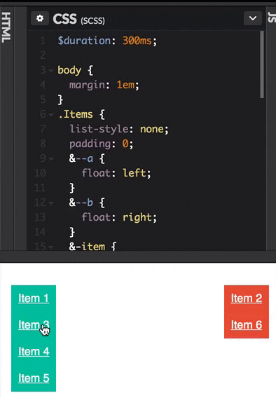
<ul class="items wait">
  <li class="left">Item 1<br />With some additional text</li>
  <li class="left">Item 2</li>
  <li class="left">Item 3</li>
  <li class="left">Item 4</li>
  <li class="right">Item 5</li>
  <li class="right">Item 6</li>
  <li class="right">Item 7</li>
  <li class="right">Item 8</li>
</ul>

The CSS makes sure that elements with class left are on the left, and the ones with class right are on the right, but because of the following two lines

left: 100%;
transform: translateX(-100%);

the left and transform value will be transitioned, but it will look as if right is set to 0.

The script recalculates everything on 3 occasions

  • document ready
  • window resize
  • when one of the items is being clicked

When you click one of the items, it will simply toggle it's class from left to right. After that, the recalculation is being done. It keeps a variable data, which keeps track of how high each column has gotten with each item that's in it, and moves every one after that that much from the top.

This script can account for elements with margin, padding, multiple lines and images, if you want.

Also, the list has a class wait, which hides all the elements until they're set for the first time. This prevents the user from seeing the items when they're not yet placed.

Hope this helps

Gust van de Wal
  • 5,211
  • 1
  • 24
  • 48
  • I don't want to change the markup - the markup is just an example for a way more complex markup where I move element between different wrappers and need to animate them. – jantimon Oct 06 '16 at 09:24
  • So you actually want the elements to swap parents, is that it? – Gust van de Wal Oct 06 '16 at 10:36
1

Just copy paste this to your HTML page, this is exactly what you need

/* CSS */

#sortable {
 list-style-type: none;
 margin: 0;
 padding: 0;
 width: 500px;
}
#sortable li {
 margin: 0 125px 0 3px;
 padding: 0.4em;
 font-size: 1.4em;
 height: 18px;
 float: left;
 color: #fff;
 cursor: pointer;
}
#sortable li:nth-child(odd) {
 background: #01BC9C;
}
#sortable li:nth-child(even) {
 background: #E54A2D;
}
#sortable li span {
 position: absolute;
 margin-left: -1.3em;
}
<!-- HTML -->

<!doctype html>
<html lang="en">
<head>
<meta charset="utf-8">
<meta name="viewport" content="width=device-width, initial-scale=1">
<title>Try with this</title>
<link rel="stylesheet" href="//code.jquery.com/ui/1.12.1/themes/base/jquery-ui.css">
<link rel="stylesheet" href="/resources/demos/style.css">

<script src="https://code.jquery.com/jquery-1.12.4.js"></script>
<script src="https://code.jquery.com/ui/1.12.1/jquery-ui.js"></script>
<script>
  $( function() {
    $( "#sortable" ).sortable();
    $( "#sortable" ).disableSelection();
  } );
  </script>
</head>
<body>
<ul id="sortable">
  <li class="ui-state-default">Item 1</li>
  <li class="ui-state-default">Item 2</li>
  <li class="ui-state-default">Item 3</li>
  <li class="ui-state-default">Item 4</li>
  <li class="ui-state-default">Item 5</li>
  <li class="ui-state-default">Item 6</li>
  <li class="ui-state-default">Item 7</li>
</ul>
</body>
</html>
Jishnu V S
  • 8,164
  • 7
  • 27
  • 57
  • Unfortunately, this is not exactly what he wants. See the demo he included (https://codepen.io/jonespen/pen/avBZpO?editors=0100) for more details – Luka Kerr Oct 01 '16 at 04:05
  • I am not looking for drag an drop. I am looking for an abstraction of the animation - just style two states and animate in between. – jantimon Oct 03 '16 at 10:51
1

I was inspired by all the great previous posts and turned it into a library which allows to use ng-animate without angular.

The library is called Animorph

I solved the described example with almost no custom javascript code (as the heavy parts are all in the library).

Please note that right now it doesn't sort the lists but is focused only on the animation part.

Codepen: http://codepen.io/claudiobmgrtnr/pen/NRrYaQ

Javascript:

  $(".left").on("click", "li.element", function() {
    $(this).amAppendTo('.right', {
      addClasses: ['element--green'],
      removeClasses: ['element--golden']
    });
  });
  $(".right").on("click", "li.element", function() {
    $(this).amPrependTo('.left', {
      addClasses: ['element--golden'],
      removeClasses: ['element--green']
    });
  });

SCSS:

body {
  margin: 0;
  width: 100%;
  &:after {
    content: '';
    display: table;
    width: 100%;
    clear: both;
  }
}

ul {
  list-style-type: none;
  padding: 0;
}

.element {
  width: 100px;
  height: 30px;
  line-height: 30px;
  padding: 8px;
  list-style: none;
  &--golden {
    background: goldenrod;
  }
  &--green {
    background: #bada55;
  }
  &.am-leave {
    visibility: hidden;
  }
  &.am-leave-prepare {
    visibility: hidden;
  }
  &.am-leave-active {
    height: 0;
    padding-top: 0;
    padding-bottom: 0;
  }
  &.am-enter {
    visibility: hidden;
  }
  &.am-enter-prepare {
    height: 0;
    padding-top: 0;
    padding-bottom: 0;
  }
  &.am-enter-active {
    height: 30px;
    padding-top: 8px;
    padding-bottom: 8px;
  }
  &.am-enter,
  &.am-move,
  &.am-leave {
    transition: all 300ms;
  }
}

.left {
  float: left;
}

.right {
  float: right;
}
  • Wow cool this pretty close to what I was looking for - do I have to use the `am` prefix? – jantimon Oct 11 '16 at 17:34
  • Glad you like it. No, the name space is fully configurable. – I'll update the docs soon and implement some more examples – Claudio Baumgartner Oct 11 '16 at 17:36
  • Nice work, Claudio! Could you maybe explain your approach and how it differs from the other answers? If I understand it correctly, you're duplicating the node to have (1) a node that animates to a hidden display mode, (2) a node that animates to the new position, and (3) a node that clears up space at the new position? Does this make heaving a fixed height via css a requirement? – user3297291 Oct 12 '16 at 07:43
  • Thx, nice to hear you like it. My approach is heavily inspired by the principle how ng-animate from angular.js works. Yes exactly, it creates two clones and to uses one as a placeholder and the other one as the animated element. If you want to animate the height of an element, you have to use fixed heights (for now). At least while the animation is running. – Claudio Baumgartner Oct 12 '16 at 13:50