I am developing a kind of a visual emulator for an app.
Here is what I would like:

The above image is a iphone wireframe. I would like to insert a div or any other element within the bounds of the iphone screen.
I did search for iframe. However html5 does not support scrollview. So I was looking for a way to do it another way.
I am using bootstrap 3 and would like it to be responsive(FYI).
EDIT So I tried Soviut's answer:
This is part of my HTML:
<div id="page" class="row">
    <div id="iOS" class="col-md-6">
        <div id="iphone-wireframe" class="container">
            <div class="content">
                <h1>This is heading</h1>
                <p>This is some content This is some content This is some content This is some content This is some
                    content This is some content This is some content This is some content.</p>
                <p>This is some content This is some content This is some content This is some content This is some
                    content This is some content This is some content This is some content.</p>
                <p>This is some content This is some content This is some content This is some content This is some
                    content This is some content This is some content This is some content.</p>
                <p>This is some content This is some content This is some content This is some content This is some
                    content This is some content This is some content This is some content.</p>
                <p>This is some content This is some content This is some content This is some content This is some
                    content This is some content This is some content This is some content.</p>
                <p>This is some content This is some content This is some content This is some content This is some
                    content This is some content This is some content This is some content.</p>
                <p>This is some content This is some content This is some content This is some content This is some
                    content This is some content This is some content This is some content.</p>
                <p>This is some content This is some content This is some content This is some content This is some
                    content This is some content This is some content This is some content.</p>
                <p>This is some content This is some content This is some content This is some content This is some
                    content This is some content This is some content This is some content.</p>
                <p>This is some content This is some content This is some content This is some content This is some
                    content This is some content This is some content This is some content.</p>
                <p>This is some content This is some content This is some content This is some content This is some
                    content This is some content This is some content This is some content.</p>
                <p>This is some content This is some content This is some content This is some content This is some
                    content This is some content This is some content This is some content.</p>
            </div>
        </div>
    </div>
I also tweaked the CSS to make it more responsive by using percentage etc and by mimicking img-responsive characteristics.
Part of my CSS:
.container {
    width: 65%;
    height: 90%;
    margin-top: 40px;

    background-image: url("/assets/res/img/iPhone-wireframe.png");
    background-repeat: no-repeat;
    background-size: contain;
    background-position: center;
}

.content {
    margin: 81px auto auto;
    width: 67.5%;
    height: 75.5%;
    background: #FFF;
    overflow: auto;
}
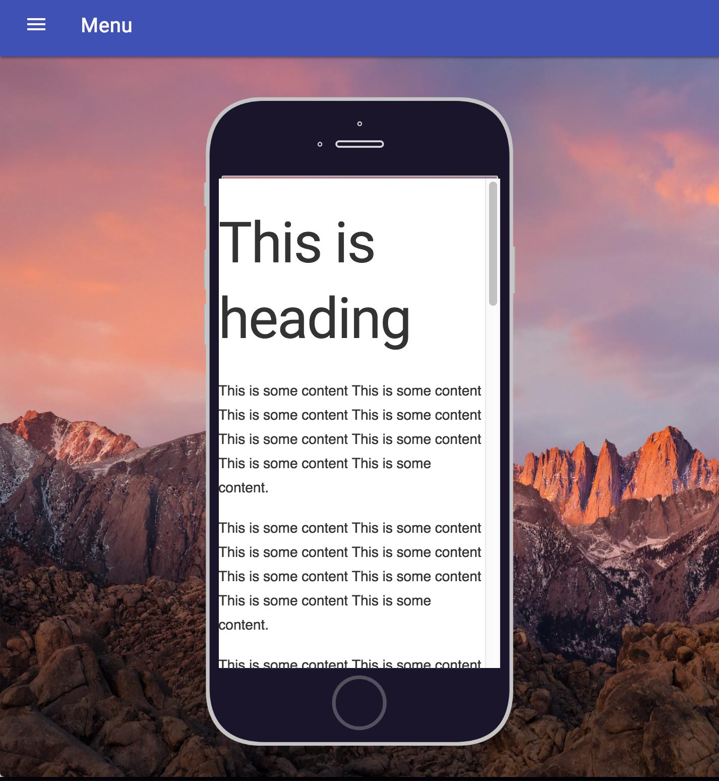
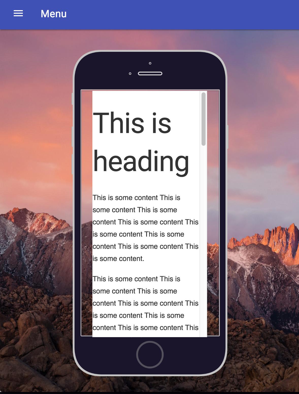
Result is perfect for when it was tweaked. It is responsive as well, but the image and text are not responsive in sync. I don't know how to explain this in words so I'll just display by pictures:
When perfect:
When not so perfect: