1

image

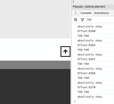
I'm having an issue whereby, when the page loads, images take a little bit of time to load in, which is not only ugly but breaks the functionality of a scroll-up button (which needs to be absolutely positioned at the bottom of the page once we've scrolled down to the bottom of the page - however, on page load, the images aren't taking any space, and thus the JS calculates the length of the page incorrectly). Normally you'd set a height and width directly on the image, but since the image dimensions change depending on the screen width, as demonstrated in the image above (on mobile, it's fluid, so I can't manually set a width/ height based on breakpoints), I'm unable to do it.

Might someone know of a solution that can set the height of the images depending upon their width?

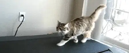
Since people don't seem to get why I need to absolutely position my scroll button: https://i.gyazo.com/65629a7e2642e192165596755c5b408b.gif

bluebu
  • 43
  • 4
  • We got flex for this kind of applications... It Can help you.. just set width of 250 - 300px; and height auto... It shall adjust itself for all different screen size. – Tirthraj Barot Sep 20 '16 at 10:42
  • if your scroll-up button needs to be absolutely positioned, then you should rethink your layout. – Simon Hänisch Sep 20 '16 at 10:51
  • Is your scroll-up button positioned absolute, like mentioned? Or fixed? If yes you should try `position: fixed;` in this case. The button will be relative to the browser window. – AlexG Sep 20 '16 at 10:58
  • either you use position fixed as AlexG suggested, or if you use position:absolute depending on the space occupied by the images, i suggest you use a setTimeout function for the scroll button to appear only after the imgs are loaded. – Mihai T Sep 20 '16 at 11:03
  • @SimonHänisch It's absolutely positioned when we hit the bottom of the page, such that it doesn't lie on top/ behind the footer. – bluebu Sep 20 '16 at 11:07
  • @bluebu there is a trick using the fact that `padding-bottom` is relative to the width of an element, see this fiddle: https://jsfiddle.net/6eo6wm1r/ . So if you know the aspect ratio of your images (i. e. it's the same for all), you can preset the height of your elements. Maybe it helps. – Simon Hänisch Sep 20 '16 at 12:50

2 Answers2

1

As far as I can see all your images have the same proportion, so why not set only the width and set the height to auto?

The image will scale according to it's aspect ratio.

But your problem with the JS calculation is more of a JS timing problem, not CSS. I guess the calculation function is fired too early.

And another thing:

The absolutely positioned button doesn't have to have a calulated position... instead of a calculated "top" value set a fixed "bottom" value depending on your needs and maybe hide it until a certain scroll-point is reached to make sure it's not there on initial load / before loading max items.

// EDIT: "setTimeout" as it was suggested in the comments should be your last straw if all else fails. Rethink your layout and positioning and try the other solutions before resorting to timeouts. All they do is make stuff more complicated and unreliable.

Foaster
  • 658
  • 5
  • 13
0

You should be more specific to image size to avoid long time browser rendering. If you do not tell the browser the size of your images it will build it once to display all the text, and then it will wait until an image is downloaded and rebuild it to wrap the text around it. It will do this for all your images.

To make images responsive you can set apply this in your css file:

img {
    width: 100%;
    height: auto;
    dysplay:block;
}

I see that you have some not found images that breaks your layout. There is a small JS solution for this:

<img src="imagenotfound.gif" alt="Image not found" onerror="this.onerror=null;this.src='imagefound.gif';" />

You can read more about this here: https://stackoverflow.com/a/9891041

Community
  • 1
  • 1
catalin
  • 31
  • 4