0

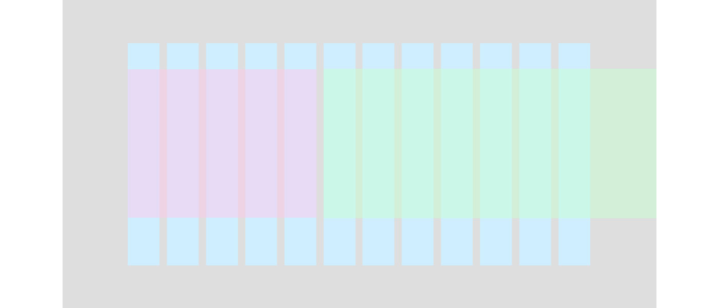
Please refer to the image below. I have a grid set up (using Bourbon Neat). The first pink element fits normally over 5 columns, but the green element needs to start on the 6th column but ends breaking out of the grid and touching the edge of the browser. I'm fairly sure that this isn't possible without using javascript, but hopefully I can be proved wrong!

Any ideas how to accomplish this?

EDIT: This needs to work with max-width on the outer-container!

enter image description here

Example HTML:

<div class="container">
 <div class="pink"></div>
 <div class="green"></div>
</div>

Bourbon:

.container{
  @include outer-container();
}
.pink{
  @include span-columns(5);
}
.green{
  @include span-columns(7);
  // What to do here???
}
Chris
  • 439
  • 4
  • 20
  • It will be very helpful if you make jsfiddle.net – smalinux Sep 22 '16 at 06:14
  • If this is presentational only and not containing content then...http://stackoverflow.com/questions/28565976/css-how-to-overflow-from-div-to-full-width-of-screen – Paulie_D Sep 22 '16 at 11:40

2 Answers2

0

In this case I don't see a reason to use grid altogother, since you are really only using it to get certain size on first column. You can set up a breakpoint past certain minimum size which de-grids your layout and then you can simply move 2nd "column" around with absolute positioning.

If you intend to have the overflowing part of 2nd column used for purely design purposes and it will contain no content, you can render it using 2nd columns pseudoelements :before or :after with absolute positioning.

  • But without the grid, how can the pink (and the green) be positioned so they line up with the rest of the page (which is using the grid)? – Chris Sep 22 '16 at 07:28
  • You can use use grid for pink element and then absolutely offset the green one by pink's width + column gutter. Is that what you mean? – Miroslav Foltýn Sep 23 '16 at 23:00
0

I have a solution. It's not the prettiest, but I do think it generally honors the Neat system. On CodePen: https://codepen.io/alexbea/pen/LRxXpO.

The pink and green (purple and teal in my example) end up being wrapped in their own containers, which do the work of aligning to the grid. The second column breaks out by using a negative right margin equal to the padding. Using vw for the padding allows for simple consistency in this case. You might need to adjust the value there for your case.

HTML

<div class="container">
 <div class="first"><div class="pink"></div></div>
 <div class="second"><div class="green"></div></div>
</div>

SCSS

.container {
  @include outer-container(100%);
  @include pad(2vw);
}

.first { @include span-columns(5); }
.second { @include span-columns(7); }

.pink,
.green { height: 100px; }

.pink { background-color: pink;}
.green {
  background-color: green;
  margin-right: -2vw;
}
alexbea
  • 1,311
  • 14
  • 25
  • Thanks for the input! This works, but not when there is a max-width for the outer-container. That's the real problem I'm facing. – Chris Sep 23 '16 at 01:30
  • Fair enough. That wasn't a factor you mentioned in the posting. As Sohaib Mohammed mentioned, you'll have a lot more success getting good answers if you provide a working demo of your problem code. One solution would be to use vw for padding instead of percentage. You can do this as shown in my updated answer. – alexbea Sep 23 '16 at 12:58
  • Hey if I use margin-right: -12.06vw; I get what I want - thanks! I was trying to create a fiddle but couldn't figure out how to import bourbon neat. https://codepen.io/anon/pen/XjrvZE – Chris Sep 26 '16 at 00:41
  • Nice. Be careful using "magic numbers" like that (-12.06vw). If you can use something in Neat or a consistent variable the styles will be less fragile. In a real project I'd have put my `2vw` into a Sass variable. And Codepen.io lets you import Bourbon, Neat, and other libraries in the CSS panel's settings for future use. – alexbea Sep 26 '16 at 18:44