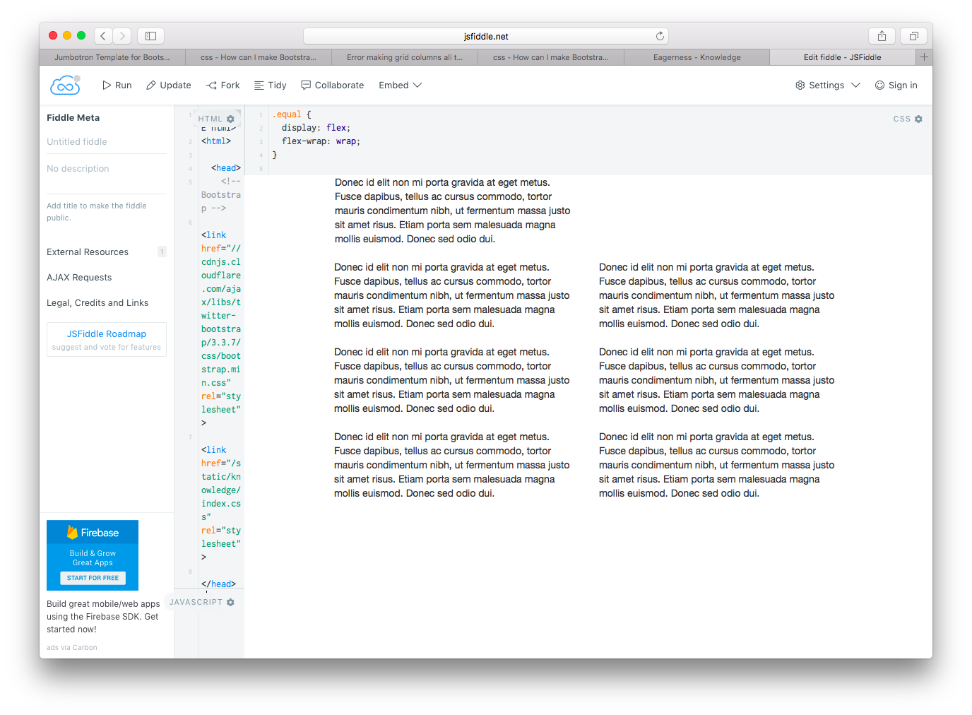
I'm trying to align grid columns vertically according to this answer. However, the top-right corner of the output is a piece of mysterious blank, and I have no idea how to fill it.
This is what I see in my browser (Safari Version 9.1.2 (11601.7.7)):
Here is my code:
.equal {
  display: flex;
  flex-wrap: wrap;
}
.equal > div[class^='col-'] {
  display: flex;
  flex-direction: column;
}
@media screen and (min-width: 768px) {
  .equal2,
  .equal2 > div[class*='col-'] {
    display: -webkit-box;
    display: -moz-box;
    display: -ms-flexbox;
    display: -webkit-flex;
    display: flex;
    flex: 1 0 auto;
  }
}
<!DOCTYPE html>
<html>
<head>
<!-- Bootstrap -->
<link href="//cdnjs.cloudflare.com/ajax/libs/twitter-bootstrap/3.3.7/css/bootstrap.min.css" rel="stylesheet">
</head>
<body>
<div class="container">
<div class="row equal">
<div class="col-xs-6 col-lg-4">
<p style="word-wrap: break-word;">Donec id elit non mi porta gravida at eget metus. Fusce dapibus, tellus ac cursus commodo, tortor mauris condimentum nibh, ut fermentum massa justo sit amet risus. Etiam porta sem malesuada magna mollis euismod. Donec sed odio dui.
<p>
</div>
</div>
</div>
</body>
</html>
