57

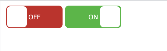
On my project I wanted to add a text on my existing toggle code.So I wanted like this, When toggles ON it should display the text "ON" and display the "OFF" text if toggles off. I can't change it to other toggle because it's already have a backend using it. I just wanted only to input "ON" and "OFF" text. Thank you.

Here is my code

  .switch input {
  display: none;
}

.slider {
  position: absolute;
  cursor: pointer;
  top: 0;
  left: 0;
  right: 0;
  bottom: 0;
  background-color: #ca2222;
  -webkit-transition: .4s;
  transition: .4s;
}

.slider:before {
  position: absolute;
  content: "";
  height: 26px;
  width: 26px;
  left: 4px;
  bottom: 4px;
  background-color: white;
  -webkit-transition: .4s;
  transition: .4s;
}

input:checked+.slider {
  background-color: #2ab934;
}

input:focus+.slider {
  box-shadow: 0 0 1px #2196F3;
}

input:checked+.slider:before {
  -webkit-transform: translateX(26px);
  -ms-transform: translateX(26px);
  transform: translateX(26px);
}


/* Rounded sliders */

.slider.round {
  border-radius: 34px;
}

.slider.round:before {
  border-radius: 50%;
<label class="switch"><input type="checkbox" id="togBtn"><div class="slider round"></span></div></label>
Dmitry
  • 123
  • 1
  • 8
KennethLazos
  • 731
  • 2
  • 6
  • 8

7 Answers7

130

You could do it like this:

.switch {
  position: relative;
  display: inline-block;
  width: 90px;
  height: 34px;
}

.switch input {display:none;}

.slider {
  position: absolute;
  cursor: pointer;
  top: 0;
  left: 0;
  right: 0;
  bottom: 0;
  background-color: #ca2222;
  -webkit-transition: .4s;
  transition: .4s;
}

.slider:before {
  position: absolute;
  content: "";
  height: 26px;
  width: 26px;
  left: 4px;
  bottom: 4px;
  background-color: white;
  -webkit-transition: .4s;
  transition: .4s;
}

input:checked + .slider {
  background-color: #2ab934;
}

input:focus + .slider {
  box-shadow: 0 0 1px #2196F3;
}

input:checked + .slider:before {
  -webkit-transform: translateX(55px);
  -ms-transform: translateX(55px);
  transform: translateX(55px);
}

/*------ ADDED CSS ---------*/
.on
{
  display: none;
}

.on, .off
{
  color: white;
  position: absolute;
  transform: translate(-50%,-50%);
  top: 50%;
  left: 50%;
  font-size: 10px;
  font-family: Verdana, sans-serif;
}

input:checked+ .slider .on
{display: block;}

input:checked + .slider .off
{display: none;}

/*--------- END --------*/

/* Rounded sliders */
.slider.round {
  border-radius: 34px;
}

.slider.round:before {
  border-radius: 50%;}
<label class="switch">
 <input type="checkbox" id="togBtn">
 <div class="slider round">
  <!--ADDED HTML -->
  <span class="on">ON</span>
  <span class="off">OFF</span>
  <!--END-->
 </div>
</label>

Or pure CSS:

.switch {
  position: relative;
  display: inline-block;
  width: 90px;
  height: 34px;
}

.switch input {display:none;}

.slider {
  position: absolute;
  cursor: pointer;
  top: 0;
  left: 0;
  right: 0;
  bottom: 0;
  background-color: #ca2222;
  -webkit-transition: .4s;
  transition: .4s;
   border-radius: 34px;
}

.slider:before {
  position: absolute;
  content: "";
  height: 26px;
  width: 26px;
  left: 4px;
  bottom: 4px;
  background-color: white;
  -webkit-transition: .4s;
  transition: .4s;
  border-radius: 50%;
}

input:checked + .slider {
  background-color: #2ab934;
}

input:focus + .slider {
  box-shadow: 0 0 1px #2196F3;
}

input:checked + .slider:before {
  -webkit-transform: translateX(26px);
  -ms-transform: translateX(26px);
  transform: translateX(55px);
}

/*------ ADDED CSS ---------*/
.slider:after
{
 content:'OFF';
 color: white;
 display: block;
 position: absolute;
 transform: translate(-50%,-50%);
 top: 50%;
 left: 50%;
 font-size: 10px;
 font-family: Verdana, sans-serif;
}

input:checked + .slider:after
{  
  content:'ON';
}

/*--------- END --------*/
<label class="switch">
<input type="checkbox" id="togBtn">
<div class="slider round"></div>
</label>
Dhruv Arne
  • 113
  • 3
  • 14
Goombah
  • 2,835
  • 2
  • 12
  • 22
  • 1
    how can i set the value checked programmatically after form load based on a condition? i have used pure css version of your answer and new to web dev. – Rakibul Haq Jan 01 '18 at 08:30
  • 1
    got my answer, use a variable and use an inline php echo inside the input tag..thanks anyway. – Rakibul Haq Jan 01 '18 at 08:50
  • How can I make the first option ada compliant? – Metropolis Jun 18 '18 at 00:36
  • 1
    It's probably best to use `em`s for sizing and such so it's more easily responsive: http://jsfiddle.net/d0g4tbcj/ – Zach Saucier Aug 18 '18 at 13:50
  • 3
    `document.getElementById('togBtn').checked` is the right way to get its value. Was trying val() before and didn't worked. Might help someone. – Mohsin Mar 13 '20 at 07:17
20

.switch {
  position: relative;
  display: inline-block;
  width: 90px;
  height: 34px;
}

.switch input {display:none;}

.slider {
  position: absolute;
  cursor: pointer;
  top: 0;
  left: 0;
  right: 0;
  bottom: 0;
  background-color: #ca2222;
  -webkit-transition: .4s;
  transition: .4s;
}

.slider:before {
  position: absolute;
  content: "";
  height: 26px;
  width: 26px;
  left: 4px;
  bottom: 4px;
  background-color: white;
  -webkit-transition: .4s;
  transition: .4s;
}

input:checked + .slider {
  background-color: #2ab934;
}

input:focus + .slider {
  box-shadow: 0 0 1px #2196F3;
}

input:checked + .slider:before {
  -webkit-transform: translateX(55px);
  -ms-transform: translateX(55px);
  transform: translateX(55px);
}

/*------ ADDED CSS ---------*/
.on
{
  display: none;
}

.on, .off
{
  color: white;
  position: absolute;
  transform: translate(-50%,-50%);
  top: 50%;
  left: 50%;
  font-size: 10px;
  font-family: Verdana, sans-serif;
}

input:checked+ .slider .on
{display: block;}

input:checked + .slider .off
{display: none;}

/*--------- END --------*/

/* Rounded sliders */
.slider.round {
  border-radius: 34px;
}

.slider.round:before {
  border-radius: 50%;}
<label class="switch"><input type="checkbox" id="togBtn"><div class="slider round"><!--ADDED HTML --><span class="on">Confirmed</span><span class="off">NA</span><!--END--></div></label>
Pka
  • 209
  • 2
  • 2
  • 1
    Welcome to Stack Overflow. Could you add a short explanation of what you changed in the code and why does it solve the problem? – JJJ Oct 04 '18 at 05:46
  • Please add a comments to your code - explaing author why this is answer to his/her question. – marverix Oct 04 '18 at 10:53
5
    .switch
    {
            width: 50px;
            height: 30px;
            position: relative;
            display:inline-block;
    }

    .switch input
    {
            display: none;
    }

    .slider
    {
            position: absolute;
            top: 0;
            bottom: 0;
            right: 0;
            left: 0;
            cursor: pointer;
            background-color: gray;
            border-radius: 30px;

    }
    .slider:before
    {

        position: absolute;
        background-color: #fff;
        height: 20px;
        width: 20px;
        content: "";
        left: 5px;
        bottom: 5px;
        border-radius: 50%;
        transition: ease-in-out .5s;
    }

    .slider:after
    {
        content: "Off";

        color: white;
        display: block;
        position: absolute;
        transform: translate(-50%,-50%);
        top: 50%;
        left: 70%;
        transition: all .5s;
        font-size: 10px;
        font-family: Verdana,sans-serif;
    }

    input:checked + .slider:after
    {
        transition: all .5s;
        left: 30%;
        content: "On"

    }
    input:checked + .slider
    {
        background-color: blue;

    }

    input:checked + .slider:before
    {
        transform: translateX(20px);
    }


    **The HTML CODE**

    <label class="switch">

                <input type="checkbox"/>

                 <div class="slider">

                </div>
        </label>


If You want to add long text like activate or Deactivate

just make few changes 

.switch
{
        width:90px
}
.slider:after
{
     left: 60%; //as you want in percenatge
}
input:checked + .slider:after
{
       left:40%; //exactly opposite of .slider:after 
}

and last

input:checked + .slider:before
{
    transform: translateX(60px); //as per your choice but 60px is perfect
}

content as per your choice where you have witten "On" and "Off"

Suraj Amble
  • 51
  • 1
  • 2
5

Square version of the toggle can be added by modifying the border radius

.switch {
  position: relative;
  display: inline-block;
  width: 90px;
  height: 36px;
}

.switch input {display:none;}

.slider {
  position: absolute;
  cursor: pointer;
  top: 0;
  left: 0;
  right: 0;
  bottom: 0;
  background-color: #ca2222;
  -webkit-transition: .4s;
  transition: .4s;
  border-radius: 6px;
}

.slider:before {
  position: absolute;
  content: "";
  height: 34px;
  width: 32px;
  top: 1px;
  left: 1px;
  right: 1px;
  bottom: 1px;
  background-color: white;
  transition: 0.4s;
  border-radius: 6px;
}

input:checked + .slider {
  background-color: #2ab934;
}

input:focus + .slider {
  box-shadow: 0 0 1px #2196F3;
}

input:checked + .slider:before {
  -webkit-transform: translateX(26px);
  -ms-transform: translateX(26px);
  transform: translateX(55px);
}

.slider:after {
  content:'OFF';
  color: white;
  display: block;
  position: absolute;
  transform: translate(-50%,-50%);
  top: 50%;
  left: 50%;
  font-size: 10px;
  font-family: Verdana, sans-serif;
}
input:checked + .slider:after {
  content:'ON';
}
<label class="switch">
  <input type="checkbox" id="togBtn">
  <div class="slider"></div>
</label>

enter image description here

Asif Karim Bherani
  • 1,023
  • 1
  • 13
  • 25
5

Have a look on this example

.switch {
        width: 50px;
        height: 17px;
        position: relative;
        display: inline-block;
    }

        .switch input {
            display: none;
        }

        .switch .slider {
            position: absolute;
            top: 0;
            bottom: 0;
            right: 0;
            left: 0;
            cursor: pointer;
            background-color: #e7ecf1;
            border-radius: 30px !important;
            border: 0;
            padding: 0;
            display: block;
            margin: 12px 10px;
            min-height: 11px;
        }

            .switch .slider:before {
                position: absolute;
                background-color: #aaa;
                height: 15px;
                width: 15px;
                content: "";
                left: 0px;
                bottom: -2px;
                border-radius: 50%;
                transition: ease-in-out .5s;
            }

            .switch .slider:after {
                content: "";
                color: white;
                display: block;
                position: absolute;
                transform: translate(-50%,-50%);
                top: 50%;
                left: 70%;
                transition: all .5s;
                font-size: 10px;
                font-family: Verdana,sans-serif;
            }

        .switch input:checked + .slider:after {
            transition: all .5s;
            left: 30%;
            content: "";
        }

        .switch input:checked + .slider {
            background-color: #d3d6d9;
        }

            .switch input:checked + .slider:before {
                transform: translateX(15px);
                background-color: #26a2ac;
            }
<label class="switch">
                                        <input type="checkbox" />
                                        <div class="slider"></div>
                                    </label>
Malik Zahid
  • 593
  • 5
  • 13
1

Here I made a toggle button with CSS:

.switch {
  position: relative;
  display: inline-block;
  width: 100%;
  height: 34px;
}

.switch input {display:none;}

.slider {
  position: absolute;
  cursor: pointer;
  top: 0;
  left: 0;
  right: 0;
  bottom: 0;
  background-color: #ca2222;
  -webkit-transition: .4s;
  transition: .4s;
}

.slider:before {
  position: absolute;
  content: "";
  height: 26px;
  width: 26px;
  left: 4px;
  bottom: 4px;
  background-color: white;
  -webkit-transition: .4s;
  transition: .4s;
}

input:checked + .slider {
  background-color: #2ab934;
}

input:focus + .slider {
  box-shadow: 0 0 1px #2196F3;
}

input:checked + .slider:before {
  -webkit-transform: translateX(165px);
  -ms-transform: translateX(165px);
  transform: translateX(200px);
}

/*------ ADDED CSS ---------*/
.on
{
  display: none;
}

.on, .off
{
  color: white;
  position: absolute;
  transform: translate(-50%,-50%);
  top: 50%;
  left: 50%;
  font-size: 10px;
  font-family: Verdana, sans-serif;
}

input:checked+ .slider .on
{display: block;}

input:checked + .slider .off
{display: none;}

/*--------- END --------*/

/* Rounded sliders */
.slider.round {
  border-radius: 34px;
}

.slider.round:before {
  border-radius: 50%;}

Here is the HTML code of toggle button with text:

<input type="checkbox" id="togBtn">
<div class="slider round">
    <!--ADDED HTML -->
    <span class="on">BOOKED</span>
    <span class="off">AVAILABLE</span>
    <!--END-->
</div>
Dhruv Arne
  • 113
  • 3
  • 14
-3

try this

.switch {
  position: relative;
  display: inline-block;
  width: 60px;
  height: 34px;
}

.switch input {display:none;}

.slider {
  position: absolute;
  cursor: pointer;
  top: 0;
  left: 0;
  right: 0;
  bottom: 0;
  background-color: #ccc;
  -webkit-transition: .4s;
  transition: .4s;
}

.slider:before {
  position: absolute;
  content: "";
  height: 26px;
  width: 26px;
  left: 4px;
  bottom: 4px;
  background-color: white;
  -webkit-transition: .4s;
  transition: .4s;
}

input:checked + .slider {
  background-color: #2196F3;
}

input:focus + .slider {
  box-shadow: 0 0 1px #2196F3;
}

input:checked + .slider:before {
  -webkit-transform: translateX(26px);
  -ms-transform: translateX(26px);
  transform: translateX(26px);
}

/* Rounded sliders */
.slider.round {
  border-radius: 34px;
}

.slider.round:before {
  border-radius: 50%;
}
<!doctype html>
<html>
<head>
<meta charset="utf-8">
<title>Untitled Document</title>
</head>

<body>

<h2>Toggle Switch</h2>

<label class="switch">
  <input type="checkbox">
  <div class="slider"></div>
</label>

<label class="switch">
  <input type="checkbox" checked>
  <div class="slider"></div>
</label><br><br>

<label class="switch">
  <input type="checkbox">
  <div class="slider round"></div>
</label>

<label class="switch">
  <input type="checkbox" checked>
  <div class="slider round"></div>
</label>

</body>
</html>
Jishnu V S
  • 8,164
  • 7
  • 27
  • 57
vinit
  • 115
  • 1
  • 2
  • 13