You just need to remove the margin from the .row class and the padding from the .col classes.
.row-no-padding {
margin-left: 0;
margin-right: 0;
}
[class*="col-"], /* Elements whose class attribute begins with "col-" */
[class^="col-"] { /* Elements whose class attribute contains the substring "col-" */
padding-left: 0;
padding-right: 0;
}
Note: In the demo we will be using !important for code snippet specificity purposes. In production
just reference this classes below bootstrap.css.
Code Snippet:
.row {
border: .1em dashed dodgerblue;
}
.row-no-padding {
margin-left: 0 !important;
margin-right: 0 !important;
}
[class*="col-"],
[class^="col-"] {
padding-left: 0 !important;
padding-right: 0 !important;
}
<link href="https://maxcdn.bootstrapcdn.com/bootstrap/3.3.7/css/bootstrap.min.css" rel="stylesheet" />
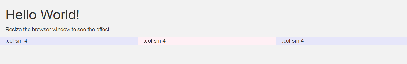
<div class="container">
  <h1>Hello World!</h1>
  <p>Resize the browser window to see the effect.</p>
  <div class="row row-no-padding">
    <div class="col-sm-4" style="background-color:lavender;">.col-sm-4</div>
    <div class="col-sm-4" style="background-color:lavenderblush;">.col-sm-4</div>
    <div class="col-sm-4" style="background-color:lavender;">.col-sm-4</div>
  </div>
</div>
EDIT:
What the OP actually wants is to have a child element wider than its parent.
Even though this can be achieved in different ways, I do not recommend it.
The best approach is to use different containers for content. That's why Bootstrap has a class named .container-fluid. You just set the padding value to 0 in this class and you're good to go.
Code Snippet:
body {
margin: 0;
}
main {
background-color: coral;
}
.container-fluid--no-padding {
padding-left: 0 !important;
padding-right: 0 !important;
}
.row {
  border: .1em dashed dodgerblue;
}
.row-no-padding {
  margin-left: 0 !important;
  margin-right: 0 !important;
}
[class*="col-"],
[class^="col-"] {
  padding-left: 0 !important;
  padding-right: 0 !important;
}
<link href="https://maxcdn.bootstrapcdn.com/bootstrap/3.3.7/css/bootstrap.min.css" rel="stylesheet" />
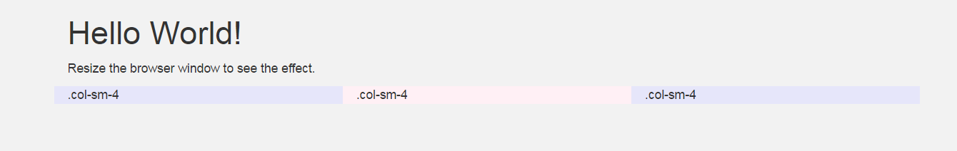
<main>
<div class="container">
<h1>Hello World!</h1>
<p>Resize the browser window to see the effect.</p>
</div>
<div class="container-fluid container-fluid--no-padding">
<div class="row row-no-padding">
<div class="col-sm-4" style="background-color:lavender;">.col-sm-4</div>
<div class="col-sm-4" style="background-color:lavenderblush;">.col-sm-4</div>
<div class="col-sm-4" style="background-color:lavender;">.col-sm-4</div>
</div>
</div>
<div class="container">
<h1>Hello World!</h1>
<p>Resize the browser window to see the effect.</p>
</div>
</main>
FURTHER EXPLANATION:
How does the .container class in Bootstrap works?
The .container class sets a fixed width to its element in different viewports, using CSS media queries.
Since Bootstrap is mobile first, the value of the width property in the .container class is auto (Block level element default width). It then changes accordingly to its viewport with the queries.
You can see what it does here:
.container {
  margin-right: auto;
  margin-left: auto;
  padding-left: 15px;
  padding-right: 15px;
}
@media (min-width: 768px) {
  .container {
    width: 750px;
  }
}
@media (min-width: 992px) {
  .container {
    width: 970px;
  }
}
@media (min-width: 1200px) {
  .container {
    width: 1170px;
  }
}
The .container-fluid class properties are just the ones below:
.container-fluid {
  margin-right: auto;
  margin-left: auto;
  padding-left: 15px;
  padding-right: 15px;
}
 and what I have now: