0

I have a shift calendar for a local fire department that I built using foundation5 responsive css framework. Everything works great when viewing in my browser and resizing the window.
example:

enter image description here

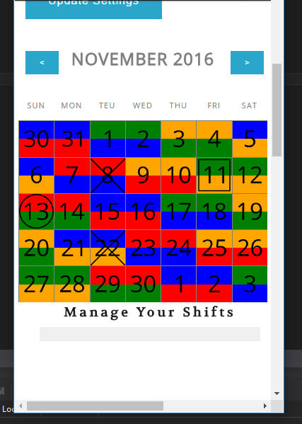
However, when I view this on an iPhone the calendar days are moved one block up.

enter image description here

Here is my css:

.calRow {
    max-width:100%;
}
.calMonth, .calPrev, .calNext {
    text-transform:uppercase;
    font-weight:bold;
    color:gray;
    font-size:1.7em;
    margin:15px 0;
    text-align:center;
}
.calMonth {
    text-align:center;
}
.calPrev {
    text-align:left;
}
.calNext {
    text-align:right;
}
.pCal ul li {
    text-align:center;
    height:0;
    padding:0 0 14.28571%;
    border-left:solid 1px gray;
    border-top:solid 1px gray;
    position: relative;
}
.pCal ul li:after {
    content:'';
    display: block;
    margin-top: 100%;
}
.pCal ul li dl {
    position:relative;
    padding:0;
    margin:0;
    top:0;
    height:100%;
}

.pCal ul li dl dt {
    padding:0;
    margin:0;
}
.pCal ul li.calHead {
    font-size:0.8em;
    border:none;
    color:gray;
    height:25px;
    margin-bottom:-20px;
}
.calToday {
    border-bottom:0.5em solid lightGrey;
}

.calDay {
    position:relative;
    padding:15%;
    margin:0;
    top:-100%;
}

.calLayer2, .calLayer3, .calLayer4 {
    position:relative;
    padding:0;
}
.calLayer2 {
    top:-200%;
}
.calLayer3 {
    top:-300%;
}
.calLayer4 {
    top:-400%;
}

/*  SHIFT HEIGHT / SIZE STYLES  */

.shift2 {
    height:50%
}
.shift3 {
    height:33.33%
}
.shift4 {
    height:25%
}


/* OVERLAY STYLES  */
.calX img{
    width:100%;
    padding-top:2%;
}
.calCircle img{
    width:100%;
    padding:9% 7%;
}
.calSquare img {
    width:100%;
    padding:7%;
}

.pCal .calDayParts {
    position: absolute;
    top: 0;
    bottom: 0;
    width: 100%;
}

.pCal .calDayOverlay {
    position: absolute;
    top: 0;
    bottom: 0;
    height: auto;
    width:100%;
}
.calLayer1, .calLayer2, .calLayer3 {
    position: absolute;
    top: 0;
    bottom: 0;
    width: 100%;
}

Can someone help me figure out why this is or at least suggest a way to debug it.

Thanks

EDIT 1 JS FIDDLE LINK

GO HERE for jsfiddle example - same issue is present when viewed on phone

side note, this answer has instructions on how to use iPhone over local network to connect to localhost of IIS on windows PC

Community
  • 1
  • 1
J King
  • 4,108
  • 10
  • 53
  • 103
  • this may be trivial but did you set up your HTML files with the `` tags Zurb recommends? – heyitsjhu Oct 14 '16 at 03:09
  • yeah, the rest of the site performs as expected, its just this one area and only when viewed on mobile device. It looks correct when using the built in chrome mobile emulator in dev tools – J King Oct 14 '16 at 03:23

2 Answers2

1

It's difficult to debug without being able to inspect the site first hand. From first glance though, I would try adding a float and clear to the .calRow class, provided it is what it sounds like (the rows that make up the calendar).

.calRow {
    float: left;
    clear: both;
    width: 100%;
}

Keep in mind by floating the calendar rows you will most likely need to also float the calendar container.

If that doesn't solve the problem it's most likely related to your absolute positioned elements not being positioned relatively to their parent element.

EDIT: I should add, if you have access to safari, an iPhone and a cord to plug the iPhone into your desktop. You can inspect the site using safari on your desktop by going to 'Develop' > 'iPhone'. More info on remote debugging here.

Jesse
  • 429
  • 6
  • 12
  • thanks jesse, I will try some of those things but if you want you can send me an email: jordan ATSIGN krisis DOT ca and I will send you a link to the site – J King Oct 14 '16 at 06:24
  • thanks, I'm on a PC - looking into accessing IIS from iPhone on same wifi network – J King Oct 14 '16 at 06:35
  • I added a link to a js fiddle with a sample that is pretty close – J King Oct 14 '16 at 06:41
0

Okay, so the problem was not with the css exactly. There were other styles bleeding into my styles. I placed this css inside an angular2 component and "encapsulated" the css, then it worked without the positioning error. It wraps the code in a shadow dom

I never did find out what style was bleeding into mine but the problem is now solved.

J King
  • 4,108
  • 10
  • 53
  • 103