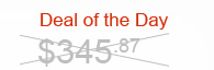
I need to cross out this text, as shown in the image, for a website. Does anyone know how this can be done ?
I need to cross out this text, as shown in the image, for a website. Does anyone know how this can be done ?
You can use :before and :after pseudo elements to create lines and transform: rotate()
div {
  font-size: 35px;
  color: #aaa;
  position: relative;
  display: inline-block;
}
sup {
  font-size: 20px;
}
div:after,
div:before {
  position: absolute;
  content: '';
  top: 50%;
  left: 0;
  width: 100%;
  height: 2px;
  background: black;
}
div:before {
  transform: rotate(20deg);
}
div:after {
  transform: rotate(-20deg);
}
<div>$345<sup>.87</sup>
</div>
You can achieve this result by using ::before and ::after transformation properties:
<p class="dotd">deal of the day: </p>
<h1 class="cross">$341,95</h1>

.dotd {
     color: red;
}
.cross {
    position: relative;
    display: inline-block;
}
.cross::before, .cross::after {
    content: '';
    width: 100%;
    position: absolute;
    right: 0;
    top: 50%;
}
.cross::before {
    border-bottom: 2px solid red;
    -webkit-transform: skewY(-10deg);
    transform: skewY(-10deg);
}
.cross::after {
    border-bottom: 2px solid red;
    -webkit-transform: skewY(10deg);
    transform: skewY(10deg);
}
js fiddle: https://jsfiddle.net/shx3n4ho/1/
Check this
p{
  font-size:25px;
  display:block
}
.cross {
    position: relative;
    display: inline-block;
}
.cross::before, .cross::after {
    content: '';
    width: 100%;
    position: absolute;
    right: 0;
    top: 50%;
}
.cross::before {
    border-bottom: 2px solid gray;
    -webkit-transform: skewY(-10deg);
    transform: skewY(-10deg);
}
.cross::after {
    border-bottom: 2px solid gray;
    -webkit-transform: skewY(10deg);
    transform: skewY(10deg);
}
<p>
Deal of the day
<span class="cross">365</span>
</p>