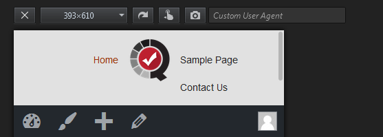
I have two navigation bar in my header and the center of it is my logo. I am using WordPress and also include the classes of bootstrap. I have a problem regarding in mobile view or something between max-width of 700+ pixels. My navigation menu got destructed when i make it below 700 pixels. I provided a screenshot to determine my problem.
Also here is my site: http://bxuwp.codebox.ph/
Here is the screenshot of my problem:
Here is my code:
<div class="navbar navbar-inverse navbar-fixed-top">
    <div class="container-fluid">

    <button type="button" class="navbar-toggle" data-toggle="collapse" data-target=".navbar-collapse">
            <span class="sr-only">Toggle navigation</span>
            <span class="icon-bar"></span>
            <span class="icon-bar"></span>
            <span class="icon-bar"></span>
     </button>

    <div class="logo-wrapper">

        <div class="logo">
            <?php if ( get_theme_mod( 'm1_logo' ) ) : ?>
            <a href="<?php echo esc_url( home_url( '/' ) ); ?>" id="site-logo" title="<?php echo esc_attr( get_bloginfo( 'name', 'display' ) ); ?>" rel="home">
            <img src="<?php echo get_theme_mod( 'm1_logo' ); ?>" alt="<?php echo esc_attr( get_bloginfo( 'name', 'display' ) ); ?>"></a>
            <?php else : ?>
                  <img class="logo" src="<?php echo get_bloginfo('template_url') ?>/images/qmark_logo.png"/>
            <?php endif; ?>
        </div>
    </div>

    <div class="half">
        <ul class="left-navlist">
            <?php
            $args = array(
                  'container'      => 'div',
                  'container_class'   => 'collapse navbar-collapse pull-right',
                  'container_id'      => 'bs-example-navbar-collapse-1',
                  'menu'        => 'left',
                  'menu_class'        => 'nav navbar-nav',
                  'fallback_cb'       => 'wp_bootstrap_navwalker::fallback',
                  'walker'            => new wp_bootstrap_navwalker()
            );
            ?>
            <?php wp_nav_menu($args); ?>
        </ul>
    </div>
    <div class="half">
        <ul class="right-navlist">
            <?php
            $args1 = array(
                  'container'      => 'div',
                  'container_class'   => 'collapse navbar-collapse',
                  'container_id'      => 'bs-example-navbar-collapse-1',
                  'menu'        => 'right',
                  'menu_class'        => 'nav navbar-nav',
                  'fallback_cb'       => 'wp_bootstrap_navwalker::fallback',
                  'walker'            => new wp_bootstrap_navwalker()
            );
            ?>
            <?php wp_nav_menu($args1); ?>
        </ul>
    </div>
    </div>
    </div>
Here is my little custom CSS for bootstrap navbar:
.navbar-fixed-top {
    min-height: 95px;
}
.navbar-inverse .navbar-nav > .open > a, .navbar-inverse .navbar-nav > .open > a:focus, .navbar-inverse .navbar-nav > .open > a:hover {
    background-color: #e1e1e1;
    color: #fff;
}
.navbar-inverse {
    border-radius: 0px;
    margin-bottom: 0;
    background-color: #e1e1e1;
    border-color:#e1e1e1;
    font-size: 16px;
}
.navbar-inverse .navbar-nav > .active > a, .navbar-inverse .navbar-nav > .active > a:focus, .navbar-inverse .navbar-nav > .active > a:hover {
    background-color: #e1e1e1;
    color: #993300;
}
.navbar-inverse .navbar-nav > li > a {
    color: #252525;
}
.logo-wrapper {
    text-align: center;
    margin-bottom: -65px;
}

.logo {
    margin-top: 5px;
    max-width: 80px;
    display: inline-block;
}
.half {
    width: 50%;
    display: block;
    float: left;
}

.right-navlist {
    padding-left: 60px;
}

.left-navlist {
    text-align: right;
    padding-right: 60px;
}
