258

I just switched to bootstrap 4 and reworking all my html and scss to work with it and I cant seem to find how to put a group of nav-items on the right side of the navbar. This is my navbar code:

<nav class="navbar navbar-full navbar-dark bg-primary">
        <button class="navbar-toggler hidden-md-up" type="button" data-toggle="collapse" data-target="#navbarResponsive" aria-controls="navbarResponsive" aria-expanded="false" aria-label="Toggle navigation"></button>
        <%= link_to "Living Recipe", recipes_path(sort_attribut: "popularity", sort_order: :desc), class: "navbar-brand" %>
        <div class="collapse navbar-toggleable-sm" id="navbarResponsive">   
            <ul class="nav navbar-nav float-md-left">
                <li class="nav-item">
                    <%= form_tag(recipes_path, :method => "get", id: "search-form", class: "form-inline") do %>
                            <%= text_field_tag :search, params[:search], placeholder: "Search Recipes", class: "form-control col-md-8" %>
                    <% end %>
                </li>
                <li class="nav-item dropdown">
                    <a class="nav-link dropdown-toggle" href="http://example.com" id="responsiveNavbarDropdown" data-toggle="dropdown" aria-haspopup="true" aria-expanded="false">Browse</a>
                    <div class="dropdown-menu" aria-labelledby="responsiveNavbarDropdown">
                        <%= link_to "Popular", recipes_path(sort_attribute: "popularity", sort_order: :desc), class: "dropdown-item" %>
                        <%= link_to "Newest", recipes_path(sort_attribute: "created_at", sort_order: :desc), class: "dropdown-item" %>
                        <%= link_to "Most Updated", recipes_path(sort_attribute: "most_active", sort_order: :desc), class: "dropdown-item" %>
                        <%= link_to "Most Saved", recipes_path(sort_attribute: "save_count", sort_order: :desc), class: "dropdown-item" %>
                    </div>
                </li>
            </ul>
            <ul class="nav navbar-nav float-md-right">
                <% if user_signed_in? %>
                    <li class="dropdown">
                        <a class="nav-link dropdown-toggle" href="http://example.com" id="navbarDropdownMenuLink" data-toggle="dropdown" aria-haspopup="true" aria-expanded="false">
                            <%= current_user.displayname.present? ? "D-ring" : current_user.firstname %>
                        </a>
                        <div class="dropdown-menu" aria-labelledby="responsiveNavbarDropdown">
                            <%= link_to "Profile", user_path(current_user.id), class: "dropdown-item" %>
                            <%= link_to "Recipe Box", user_saved_recipes_path(current_user.id), class: "dropdown-item" %>
                            <%= link_to "Add Recipe", new_recipe_path, class: "dropdown-item" %>
                            <%= link_to "Submitted Recipes", user_path(current_user.id), class: "dropdown-item" %>
                            <%= link_to "Sign Out", destroy_user_session_path, :method => :delete, class: "dropdown-item" %>
                        </div>
                    </li>
                <% else %>
                    <li class="nav-item">
                        <%= link_to "Create Account", '', data: {:'toggle' => 'modal', :'target' => '#signupModal'}, class: "nav-link" %>
                    </li>
                    <li class="nav-item">
                        <%= link_to "Login", '', data: {:'toggle' => 'modal', :'target' => '#loginModal'}, class: "nav-link" %>
                    </li>           
                <% end %>
            </ul>
        </div>
    </nav>

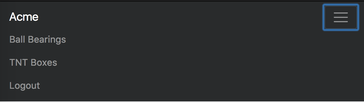
And this is the screenshot of what it looks like

enter image description here

Irfan wani
  • 4,084
  • 2
  • 19
  • 34
DRing
  • 6,825
  • 6
  • 29
  • 45
  • 2
    Latest solution based on alpha 6 http://stackoverflow.com/a/41513784/171456 – Carol Skelly May 19 '17 at 13:11
  • 1
    According to the [bootstrap 4 alpha 6 documentation](https://v4-alpha.getbootstrap.com/components/navbar/), you can use `ml-auto` on the `
      ` element you want to float right in the navbar.
    – rootr Jul 29 '17 at 19:51

8 Answers8

440

TL;DR:

Create another <ul class="navbar-nav ml-auto"> for the navbar items you want on the right.
ml-auto will pull your navbar-nav to the right where mr-auto will pull it to the left.

Tested against Bootstrap v4.5.2

<!DOCTYPE html>
<html lang="en">
<head>
  <link rel="stylesheet" href="https://stackpath.bootstrapcdn.com/bootstrap/4.5.2/css/bootstrap.min.css"/>
  <style>
    /* Stackoverflow preview fix, please ignore */
    .navbar-nav {
      flex-direction: row;
    }
    
    .nav-link {
      padding-right: .5rem !important;
      padding-left: .5rem !important;
    }
    
    /* Fixes dropdown menus placed on the right side */
    .ml-auto .dropdown-menu {
      left: auto !important;
      right: 0px;
    }
  </style>
</head>
<body>
<nav class="navbar navbar-expand-lg navbar-dark bg-primary rounded">
  <a class="navbar-brand" href="#">Navbar</a>
  <ul class="navbar-nav mr-auto">
    <li class="nav-item active">
      <a class="nav-link">Left Link 1</a>
    </li>
    <li class="nav-item">
      <a class="nav-link">Left Link 2</a>
    </li>
  </ul>
  <ul class="navbar-nav ml-auto">
    <li class="nav-item">
      <a class="nav-link">Right Link 1</a>
    </li>
    <li class="nav-item dropdown">
      <a class="nav-link dropdown-toggle" href="#" id="navbarDropdown" role="button" data-toggle="dropdown" aria-haspopup="true" aria-expanded="false">            Dropdown on Right</a>
      <div class="dropdown-menu" aria-labelledby="navbarDropdown">
        <a class="dropdown-item" href="#">Action</a>
        <a class="dropdown-item" href="#">Another action with a lot of text inside of an item</a>
      </div>
    </li>
  </ul>
</nav>
<script src="https://code.jquery.com/jquery-3.2.1.slim.min.js"></script>
<script src="https://maxcdn.bootstrapcdn.com/bootstrap/4.0.0/js/bootstrap.min.js"></script>
<script src="https://cdnjs.cloudflare.com/ajax/libs/popper.js/1.12.9/umd/popper.min.js"></script>
</body>
</html>

As you can see additional styling rules have been added to account for some oddities in Stackoverflows preview box.
You should be able to safely ignore those rules in your project.

As of v4.0.0 this seems to be the official way to do it.

EDIT: I modified the Post to include a dropdown placed on the right side of the navbar as suggested by @Bruno. It needs its left and right attributes to be inverted. I added an extra snippet of css to the beginning of the example code.
Please note, that the example shows the mobile version when you click the Run code snippet button. To view the desktop version you must click the Expand snippet button.

.ml-auto .dropdown-menu {
    left: auto !important;
    right: 0px;
}

Including this in your stylesheet should do the trick.

Busti
  • 5,492
  • 2
  • 21
  • 34
  • 26
    Use `ml-auto` for Alpha 6 as explained here: http://stackoverflow.com/questions/41513463/align-navbar-item-to-the-right-in-bootstrap-4-alpha-6 – Carol Skelly Jan 26 '17 at 22:03
  • 1
    Please note that `pull-*-*` has deprecated, use `float-*-*` instead. `float-xs-*` seem not working in alpha6 so use `float-right` – andreaem Apr 12 '17 at 09:37
  • for alpha 6 check this https://jsbin.com/kemawa/edit?output – Kamal Alseisy Jun 13 '17 at 13:07
  • 5
    The correct answer is add the class `ml-auto` to the `
      `
    – Tamb Sep 19 '17 at 20:09
  • I fixed the answer for bootstrap V4 **Beta**. – Busti Sep 23 '17 at 02:05
  • 2
    This solution `ml-auto` is so non-intuitive on Bootstrap's part, it's sickening. (FYI: This was not a knock to the answer) – FastTrack Jan 15 '18 at 19:20
  • @FastTrack Check out the initial alpha4 answer [here](https://stackoverflow.com/revisions/40193892/1). It is much more intuitive and even had support for different screen sizes. – Busti Jan 17 '18 at 00:18
  • Most of the solutions presented here work, but when it's dropdown that is pushed to the right, the dropdown menu is misplaced and its content overflow out of the screen – Bruno Mar 21 '18 at 12:36
  • @Bruno I updated the answer to include a dropdown example. It requires a little bit of extra css to work correctly. – Busti Mar 23 '18 at 00:16
  • They should put what `ml-auto` and `mr-auto` do in the navbar docs https://getbootstrap.com/docs/4.0/components/navbar/ – kiko carisse Jun 12 '18 at 20:13
  • wow bs4 really made it all straighforwrd – AShah Feb 08 '20 at 11:59
283

In last versions, it is easier. Just put a ml-auto class in the ul like so:

<ul class="nav navbar-nav ml-auto">
Andres Felipe
  • 4,292
  • 1
  • 24
  • 41
40

This should work for alpha 6. The key is the class "mr-auto" on the left nav, which will push the right nav to the right. You also need to add navbar-toggleable-md or it will stack in a column instead of a row. Note I didn't add the remaining toggle items (e.g. toggle button), I added just enough to get it to formatted as requested. Here are more complete examples https://v4-alpha.getbootstrap.com/examples/navbars/.

<!DOCTYPE html>
<html lang="en">
<head>
    <link href="https://maxcdn.bootstrapcdn.com/bootstrap/4.0.0-alpha.6/css/bootstrap.min.css" rel="stylesheet" />
</head>
<body>
    <nav class="navbar navbar-toggleable-md navbar-light bg-faded">
        <div class="container">
            <a class="navbar-brand" href="#">Navbar</a>
            <ul class="nav navbar-nav mr-auto">
                <li class="nav-item active">
                    <a class="nav-link" href="#">Home</a>
                </li>
                <li class="nav-item">
                    <a class="nav-link" href="#">Link</a>
                </li>
                <li class="nav-item">
                    <a class="nav-link" href="#">Link</a>
                </li>
            </ul>
            <ul class="nav navbar-nav">
                <li class="nav-item">
                    <a class="nav-link" href="#">Link on the Right</a>
                </li>
            </ul>
        </div>
    </nav>
</body>
davidkonrad
  • 83,997
  • 17
  • 205
  • 265
Matthew
  • 1,148
  • 10
  • 17
  • Although your solution works but, we should all agree that whatever solution we use is a workaround, Bootstrap 4 is far from stable and, the rules and naming conventions are constantly changing in way that slows down any development. Thank you for helping us to pass this dilemma until we grab a stable version. **UPDATE** you should put all classes of `navbar-toggleable-*` so that the navs don't stack up in all screen sizes. – Mohyaddin Alaoddin Mar 18 '17 at 16:29
  • Not working in JSFiddle using Bootstrap 4. – GuardianX Sep 12 '21 at 13:29
16

Navbar expanded

Navbar collapsed

I have a working codepen with left- and right-aligned nav links that all collapse into a responsive menu together using .justify-content-between on the parent tag: https://codepen.io/epan/pen/bREVVW?editors=1000

<nav class="navbar navbar-toggleable-sm navbar-inverse bg-inverse">
  <button class="navbar-toggler navbar-toggler-right" type="button" data-toggle="collapse" data-target="#navbar"     aria-controls="navbarNavAltMarkup" aria-expanded="false" aria-label="Toggle navigation">
    <span class="navbar-toggler-icon"></span>
  </button>
  <a class="navbar-brand" href="#">Acme</a>
  <div class="collapse navbar-collapse justify-content-between" id="navbar">
    <div class="navbar-nav">
      <a class="nav-item nav-link" href="#">Ball Bearings</a>
      <a class="nav-item nav-link" href="#">TNT Boxes</a>
    </div>
    <div class="navbar-nav">
      <a class="nav-item nav-link" href="#">Logout</a>
    </div>
  </div>
</nav>
epan
  • 372
  • 3
  • 14
14

In Bootstrap 4 alpha-6 version, As navbar is using flex model, you can use justify-content-end in parent's div and remove mr-auto.

<div class="collapse navbar-collapse justify-content-end" id="navbarText">
  <ul class="navbar-nav">
    <li class="nav-item active">
      <a class="nav-link" href="#">Home <span class="sr-only">(current)</span></a>
    </li>
    <li class="nav-item">
      <a class="nav-link" href="#">Link</a>
    </li>
    <li class="nav-item">
      <a class="nav-link disabled" href="#">Disabled</a>
    </li>
  </ul>
</div>

This works like a charm :)

Ankit Balyan
  • 1,319
  • 19
  • 31
1

With Bootstrap v4.0.0-alpha.6: Two <ul>s (.navbar-na), one with .mr-auto and one with .ml-auto:

<nav ...> 
  ...     
  <div class="collapse navbar-collapse">
    <ul class="navbar-nav mr-auto">
      <li class="nav-item active">
        <a class="nav-link" href="#">Home <span class="sr-only">(current)</span></a>
      </li>
      <li class="nav-item">
        <a class="nav-link" href="#">Left Link </a>
      </li>
    </ul>
    <ul class="navbar-nav ml-auto">
      <li class="nav-item">
        <a class="nav-link" href="#">Right Link </a>
      </li>
    </ul>
  </div>
</nav>
BSB
  • 1,516
  • 13
  • 14
-1

In my case, I was looking for a solution that allows one of the navbar items to be right aligned. In order to do this, you must add style="width:100%;" to the <ul class="navbar-nav"> and then add the ml-auto class to your navbar item.

Sean Whelan
  • 299
  • 4
  • 14
-1

Here and easy Example.

<!-- Navigation bar-->

<nav class="navbar navbar-toggleable-md bg-info navbar-inverse">
    <div class="container">
        <button class="navbar-toggler" data-toggle="collapse" data-target="#mainMenu">
            <span class="navbar-toggler-icon"></span>
            </button>
        <div class="collapse navbar-collapse" id="mainMenu">
            <div class="navbar-nav ml-auto " style="width:100%">
                <a class="nav-item nav-link active" href="#">Home</a>
                <a class="nav-item nav-link" href="#">About</a>
                <a class="nav-item nav-link" href="#">Training</a>
                <a class="nav-item nav-link" href="#">Contact</a>
            </div>
        </div>
    </div>
</nav>
  • This doesn't explain anything, the code doesn't easily show what is intended and the worst part if your `style="1width: 100%"` simply wont work, also you should use the class `w-100` not style attributes... – Ash Sep 11 '17 at 15:35